 In the conclusion of our two-part video tutorial on CSS layout and design, we will take the layout we created in the beginning of this tutorial and begin to apply graphics and other visual stylings to it, in order to achieve the look we are going for.
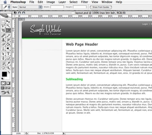
In Part Two, we will be looking at how to identify the basic graphic elements we need. From slicing the images out of our original Photoshop document to optimizing the images in Photoshop to applying the images correctly to our page, we do it all in this tutorial.
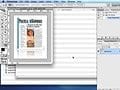
We start by breaking our Photoshop document down into the basic graphic elements we need to achieve our design goals, and then proceed to optimize each graphic element. Once created, we apply graphics to our page using a variety of CSS techniques that can be intimidating to designers. By the end of this tutorial, we will have quickly made a basic web page using HTML and CSS that almost exactly matches our original Photoshop document.
Please feel free to download and review the additional files provided below.
Software Used: Adobe Photoshop CS2, TextMate
Additional Files: CSS_layout.zip
View Tutorial
This video tutorial requires Flash Player version 8 or above. Please forward us your ideas for additional video tutorials, via our Contact Us form.