
In 2016, ecommerce websites may start to look a lot more alike as designers use a similar set of user interface design patterns, employ cards and card-like layouts, and even use similar ways to get new email subscribers.
Often changes in site design are the result of changes in site usage. In 2016, mobile site use is driving nearly every trend on this list. Design patterns are providing shoppers with similar and convenient shopping experiences. Card layouts work as well on a smartphone as they do on a large screen, and even dynamic content may improve experiences across devices.
1. Common User Interface Design Patterns
In software development, and by extension ecommerce site design and development, a design pattern is a reusable solution to a common problem. User interface design patterns, more specifically, are possible solutions to common user interface challenges, like how to make a navigation menu that is easy to use on a smartphone.
In the past few years, site designers have been settling, in a sense, on several widely used design patterns. This is particularly true for responsive designs displayed on smartphones or for sites that rely on CSS frameworks like Bootstrap or Foundation.
This trend toward design pattern continuity could have two possible impacts on ecommerce site design.
First, sites may start to look a lot alike. Page designs will be variations on a theme, not dramatically different layouts.
Second, shoppers may find that the similarities between ecommerce sites make them easier to use and navigate. Following these patterns may make for a better shopping experience, particularly on mobile devices.
Several common user interface design patterns can be seen on each site.
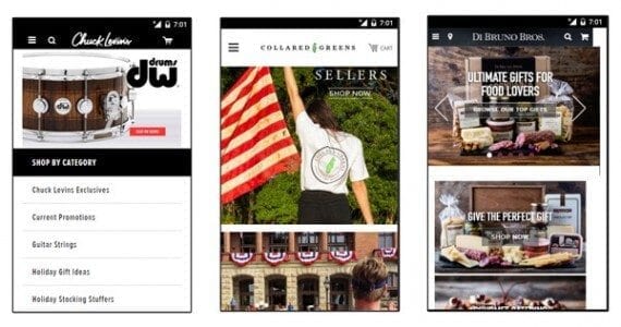
As an example of this trend, look on a smartphone at the ecommerce websites in the image above: Chuck Levin’s, an online music store; Collared Greens, a clothing store; and Di Bruno Bros., a gourmet food store. Notice that each site places a “hamburger” menu, featuring three horizontal lines at the top of the interface. Each site has a search in the header behind a magnifying glass icon, and each site has a shopping cart icon in the header. And all three sites show a graphic of a featured item.
In 2016, expect to see common user interface design patterns even more frequently.
2. Card and Card-like Layouts
In the website design vernacular, a “card” encapsulates images, text, and other resources associated with a single topic. Cards are a way of organizing different topics in a way that is at once pleasing to the eye and easy to use. Card layouts also lend themselves well to responsive designs.
Cards are, in fact, a design pattern as described above. This particular pattern is just starting to heat up, if you will, and could become much more prevalent in ecommerce design in 2016.
As background, cards and card layouts appear in a few different design guidelines, but their inclusion as a component in Google’s Material Design (and, therefore, in Android) may have helped this design pattern’s popularity.
Many ecommerce examples can be found. On the Lord & Taylor website, cards are used to featured categories or products.
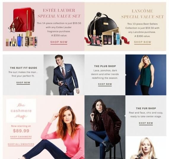
On the Lord & Taylor website, cards are used to feature categories or products.
In a similar way, Rejuvenation uses a card-like layout, featuring large product images, to organize its home page.

Rejuvenation uses a card-like layout, featuring large product images, to organize its home page.
As a final example, Belk uses cards for various sale items.
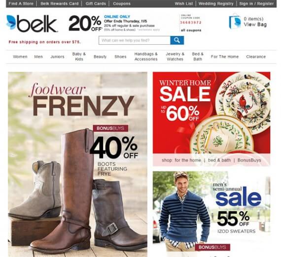
Belk uses a card layout to promote sales.
3. Pop-ups and Interruption Merchandising
So-called pop-up advertising was, perhaps, one of the most hated forms of online promotion ever. The first pop-ups, in the 1990s, opened new browser windows with ads or even whole websites in them. Many pop-ups were deceptive. Consumers generally hated these ads. Pop-up blocking services became common and, before long, web browsers were blocking these disruptive ads too.
Interestingly, this sort of interruption marketing is making a comeback in website design. In its present form, the pop-up is a modal, typically offering a discount in exchange for joining an email list or following the site’s various social media profiles.
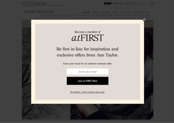
The Ann Taylor site is just one example of a large, omni-channel retailer using modals on-site to promote email subscriptions.
The driver is the fact that email marketing is one of the most powerful tools available to online sellers. Marketers understand that if they can get more email subscribers, they can get more sales. Thus, they use any means, seemingly, to attract subscribers.
In 2016, these pop-ups will become so common that perhaps as many as a third of the National Retail Federation’s top retailers will use them. Marketers will be selective though. Pop-ups probably won’t show up every time you visit the site. In some cases, you will have to take some action, like scrolling, to display the modal.
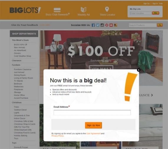
Big Lots also uses a pop-up to promote email subscriptions.
4. Large Photography and Videos
“A picture is worth a thousand words,” and a video might be worth a few million words. In 2016, ecommerce sites will feature large pictures and an increasing number of videos. What’s more, designers and developers will optimize how these rich materials are delivered to boost site performance on all platforms.
You do not need to look too far to see examples of big pictures on ecommerce sites. Open the Best Made site and you are greeted with a full-wide lifestyle photo.
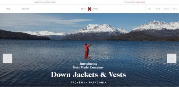
Best Made features a massive lifestyle photo on its home page.
5. Dynamic Views
Many, if not most, online stores display products or lists of products that are static, meaning they are laid out on the server and delivered to the user’s web browser. When the shopper makes a change to an option or filter, the browser contacts the server and gets a new static page.
Watch for this to change in 2016, as more sites begin to use dynamic views that rely on JavaScript and Ajax. To see a compelling example of this, visit the JadoPado site and search for something. Notice that with each new keystroke, the products displayed on the page change dynamically.
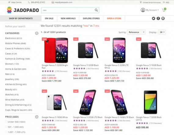
JadoPado’s site search is dynamic and easy to use.


 Hostinger Reframes Site-Free Ecommerce
 AI Visibility Scores Are Useless
 New Ecommerce Tools: July 1, 2026
 India Ecommerce Paths for Foreign Sellers
 New Ecommerce Tools: July 7, 2026
 A Subtle Google Ads Bidding Change
 SEO for AI, Low Traffic, No Clicks