Ready or not, the holiday shopping season is upon us. To be competitive, online storeowners should take necessary steps to bring shoppers into their sites, and then convert those shoppers into buyers.
Here are seven tweaks to encourage more visitors to make a purchase. It all boils down to providing key information and eliminating fluff.
Ditch Sliders and Auto-run Carousels
It’s a long-running argument. Do sliders, auto-run carousels, and animated GIFs help or hurt conversions? These features look cool, but they can be distracting, especially on mobile devices?
A plethora of studies (including this one documented at LeadPages) show that sliders have about a 1 percent click-through rate. Similar results were found for auto-running carousels. Heat maps show us visitors often ignore them, and mobile shoppers have difficulty recognizing the content within them.
Instead, focus on what’s most important. Use hero images or grids to show off the latest and greatest.

Most big etailers have ditched sliders and opted for compelling, large graphics. This graphic at Macy’s links to all the major sections.
Don’t Auto-play Anything
People shopping while at work or the doctor’s office — among other places — get irritated when sound erupts from their speaker.
Instead, for video, select a compelling thumbnail to entice them to watch, or to save the site to watch it later. For audio, create a compelling graphic.
Minimize Number of Related, Recommended Products
Every product page should call most of the viewer’s attention to the product itself. There are typically two ways someone lands on a particular page: He either searched for it (via a search engine or in-site), or he browsed for it. The former is looking for something specific; the latter has already made a selection from a group of products from a category or landing page.
Instead, display just a handful of other products below all the important details for the product the page is designed to showcase.
Ditch Strike-through Pricing
Unless the full price is displayed in a large font size, strike-throughs make the original number difficult to read.
Instead, use “Was” or “Originally” labels on smaller sized, original prices. Also, put a “Sale” label on the lower price.
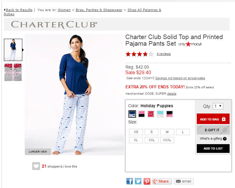
Macy’s lists the $42.00 original price, followed by the $29.40 sale price in red.
—
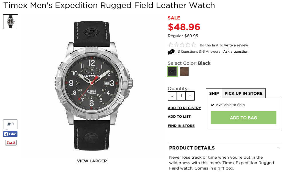
Kohls.com lists the $48.96 sale price in big, bold red. The $69.95 regular price appears much smaller below the sale price.
Simplify Displaying Percent Savings
Most stores give out 10 percent savings like candy. Savings of 20 percent or more are ideal. Displaying percent style savings across the board could be deterring people from buying.
Instead, if you want to display the percentage saved, limit it to products where it’s 20 percent or more. Even better, round the number (down, not up) to one that ends in a 5 or a 0. It’s easier to read and customers wanting to check your math can do it more quickly — 25 percent translates better than 27 percent, and 30 percent better than 31 percent.
Change the Timing on Popovers
There’s nothing you can display in a popover that you can’t display on the page itself. Popovers that load immediately may get you more email signups, but that can also translate to fewer sales. The holiday season is a time when you want to get the sale before the email.
Instead, use a top banner or a timed pop-up that displays after the shopper has had the time to look around a bit.

Offering a coupon? Old Navy puts it right in the top banner — “USE CODE ENJOY.” It also uses a popover box that takes up little space. It doesn’t really need both, though.
Clean up the Checkout Pages
I’ve written about this many times. I can’t write about it enough. Ask for only what you need. Label all fields clearly, and make it clear what the next step is.
Also, for payment types and shipping methods, consider using radio buttons or “select one” menus instead of standard drop-down menus. This cuts down confusion on what methods are actually available. For inline payments, such as PayPal Express and Amazon Payments that must load in certain areas, add another link for credit card checkout.
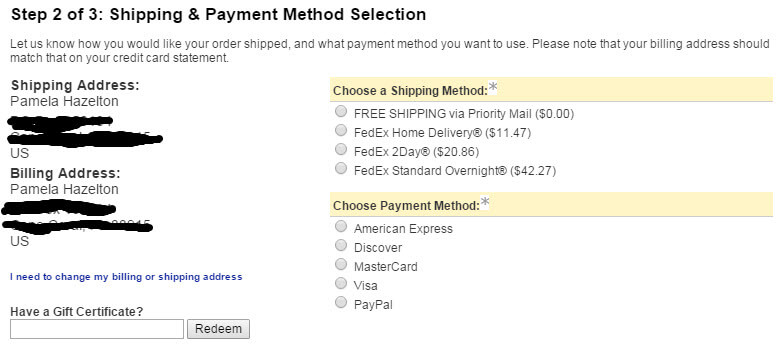
Radio buttons are one way to make it clear that shoppers have choices. Source: Van Halen Store.
There are likely many things you can adjust on your ecommerce site to help. But these key changes can serve as a great starting point.
Do you have some changes you’ve implemented just for holiday seasons in the past? Please share what you did and how the changes performed.


