
In 2017, ecommerce websites will really be mobile websites. Designers may begin to think of the site design as mobile and adapt that design to larger laptop and desktop screens. We may also expect Google’s “Material Design,” which was built for mobile, to grow in influence.
Website design is a slow-moving continuum. An influential site like Google, Apple, or Amazon will introduce a design concept and web designers will often incorporate the concept soon after. Or perhaps a user pattern will change, and designers will seek to find a way to respond, slowly learning from what other designers have done.
So when we describe site design trends for a particular year, like 2017, we are really trying to take a snapshot of the current state of website design and imagine what aspects of that current state will continue to grow in importance.
The most significant change, then, could be in how designers think about their designs. In the past, when I thought about a site, I tended to imagine it in its desktop form. The responsive mobile view of the site was the change. But on my most recent projects, the site’s true identity (at least to me) is its mobile form.
1. Web Design Is Mobile Design
Ecommerce website design has evolved. If you read an article about design trends a few years ago, it might have mentioned responsive or adaptive design.
The idea then was to transform your site’s desktop design so that it could be used on a mobile device. Over time, some even touted mobile first design. Designers sometimes put mobile CSS statements higher in the document, but they probably still thought of the site as its desktop version.
For 2017, turn that idea on its head. For many online stores, most site visitors (if not most customers) will use mobile devices to shop. This means that websites will be designed for mobile and made responsive or adaptive for larger screens. Designers will think of the site in its mobile form.
Here are a few possible examples of this trend played out on desktop screens.
- More sites will use hidden (hamburger) menus. This has been the trend for a couple of years. It will become more popular.
- Sites will use the full width of the screen. Mobile designs often fill most of the horizontal space, using relatively small gutters. Look for this on desktop designs, too. Relatively fewer pages will be centered with lots of white space.
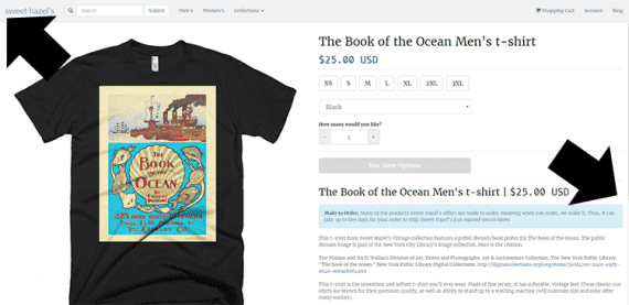
Notice on this product detail page that there are very small margins on the left and right — the content almost completely fills the screen’s width. This is an example of a mobile design pattern influencing the desktop version of a site.
- Large images, buttons, and icons. Large finger-friendly icons from mobile designs will be enormous on desktop screens.
2. Material Design’s Influence Grows
Google released its Material Design motif in 2014, on Android devices. Material Design was a way for Google to at least influence if not control how Android applications and interfaces looked and behaved. It was a way to brand, if you will, Android.
Material Design was also a pretty intuitive way to lay out a mobile app or an ecommerce website.
Many online stores have already adopted card-like layouts (which is central to Material Design) and responsive animations and transitions (also part of Material Design), and these will only continue in 2017.
Expect Material Design’s influence to grow in 2017 as more sites adopt it or borrow from it.
3. Long Scrolls and Lazy Loading
On a mobile device, it can sometimes make more sense in terms of page load times and performance to add objects to the current view rather than loading a completely new view or page.
As a result, look for web designers to create pages that scroll to great lengths, loading objects (think portions of the page) only as they are needed.
A product category page on an ecommerce site is a good example. In 2017, a page may load with, say, 10 products available. As the user scrolls (swipes vertically), the page will continue to add more products. A shopper could see 50, 100, or more products before being asked to load a new page.
4. Hamburgers on the Left
This one will be a small and subtle change: Hamburger menus are moving to the left. If a web designer used the Bootstrap framework and followed the Bootstrap 3 Navbar example, that design tended to end up with a hamburger menu on the right side of the navigation.
Lots of websites followed this pattern. But Google and other leading sites have started placing their hamburger menus on the left so that those menus are among the first things a user finds on the page, even when he is using an assistive device like a screen reader.
Google has begun to place hamburger menus on the left of the interface for many of its applications.
5. Cinemagraphs, or the Return of the GIF
The animated GIF image may be making something of a comeback in 2017, albeit in a more subtle form called the cinemagraph.
A cinemagraph is really a still picture, a photograph to which a small, repeating animation has been added. The effect is a sort of mini-video experience more subtle than the animations on Ling’s Cars, but still eye catching.
Cinemagraphs may appear as background images, category headers, home page banners, and even product images. Time will tell if cinemagraphs boost engagement and conversions or if they are just a fad.
Advanced Adaptation and Bright Colors
There are several other ecommerce design trends that I could have included on this list. Two of them, however, deserved a mention.
First, look for advanced adaptation or improved responsiveness. Now sites adapt to screen size or device. But soon sites could adapt to specific users, changing layout based on age, visual acuity, or even if they are left or right handed.
Second, there could be an explosion of color in web design in 2017. Minimalism has dominated site design for a few years. As a reaction, we may see lots of bright colors.


 Hostinger Reframes Site-Free Ecommerce
 AI Visibility Scores Are Useless
 New Ecommerce Tools: July 1, 2026
 India Ecommerce Paths for Foreign Sellers
 New Ecommerce Tools: July 7, 2026
 AI Forces Affiliates to Innovate or Die
 SEO for AI, Low Traffic, No Clicks