Ecommerce should see significant spikes this holiday season. However, merchants must consider the need for speedy, no-hassle checkout processes to lower abandons, especially from shoppers on mobile devices.
What follows are six tweaks to streamline an ecommerce checkout.
6 Tweaks to Streamline the Checkout Process
Address payment error messages. According to Paysafe, an electronic payments provider, about 10 percent of initial credit and debit card transactions fail. The most common reasons are:
- Wrong card number,
- Too many charges or attempts in a short time,
- Limit reached on the card.
What occurs after a decline determines if the consumer finalizes the purchase. By default, most shopping carts display a simple “decline” message. But that’s neither clear enough nor encouraging for the shopper to try again.
While decline codes may not indicate the actual issue, a positive message can ease concerns, such as:
Oops, there’s a problem with your card number. Please re-enter your number, expiration date, and security code.
However, this doesn’t provide motivation to continue should the card decline again. That’s where offering an alternative payment method comes into play. Since many consumers have preferred payment methods, it’s ideal to offer at least two non-credit card options, such as PayPal and Apple Pay.
Thus, a better message could state:
Oops, there’s a problem with your card number. Please re-enter your number, expiration date, and security code. Alternatively, you can pay via PayPal or Apple Pay.
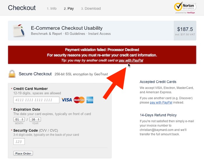
Baymard Institute, a research firm, says 2 to 5 percent of would-be customers receive a decline message. By modifying the alert, it was able to capture about 30 percent of those orders.

Baymard Institute’s test provides a more detailed decline notice and link to an alternate payment method.
Ease the surprise of address verification fails. Pop-up messages from real-time address verification can be alarming. By explaining the reason for wanting the shopper to accept the suggested address, you can eliminate confusion.
For example:
We want to make sure your order reaches you. According to the USPS, this is your properly formatted address. Please confirm.
This verbiage changes the message from an alert to a helpful tip. It can also assist shoppers to identify typos that could route packages to the wrong destination.
Append delivery days to shipping methods. Customers want to know when they can expect delivery. By displaying transit times, you help them choose the best method and decrease order status requests. When disclosing “arrives in X days,” take into consideration processing time. Most shoppers consider the countdown to start once they place the order.
Eliminate all unnecessary fields. The trick to decreasing cart abandonment during checkout is to remove all distractions, including collecting info that’s unnecessary for payment or fulfillment. For example, most shoppers would prefer not to provide a phone number or details about how they found the store. Beyond unnecessary info, make as many fields optional as possible.
Define every error. Red asterisks can be hard to catch. Rather than displaying a top of page error, display messages next to or beneath each problematic field. This combats two common issues:
- The top-of-page error may not appear on the screen, or the error that displays further down the page may be missed.
- What’s wrong isn’t always apparent. Shoppers get frustrated if an entry appears correct and there’s no defined issue.
Include a discrete link to edit the cart. While you don’t want to promote leaving the checkout, making it easy for shoppers to edit the cart can save a sale. A simple link within the cart contents section will suffice.


