As more online retailers seek to provide a good mobile shopping experience, expect to see a significant number of site redesigns in 2014. These redesigned sites are likely to follow many popular design trends that are currently impacting entertainment sites, publishing sites, and mobile applications.
Ecommerce platforms like Magento, Shopify, or even WooCommerce (on WordPress) can have a strong influence on how online shops are designed. This can make it more difficult for online merchants to simply redesign a site to keep up with the latest fad. But in 2014, even those sellers that take an “if it isn’t broken, don’t fix it” approach to website design may be forced to do some remodeling thanks to the continued growth in mobile Internet traffic. In fact, some predict that in 2014 mobile Internet usage will pass desktop Internet usage, and mobile-based ecommerce might account for 30 percent of Internet retail sales.
Given that ecommerce business are likely to be resigning to support mobile, these sites may also follow other important web design trends.
1. Responsive Design
Mobile is going to be the primary driver for ecommerce web design in 2014, but don’t expect Internet retailers to abandon desktop users. Rather, responsive design, which has already been a trend in ecommerce site design, will to continue to grow in popularity, allowing online sellers to provide a good shopping experience regardless of the device a shopper is using.
As a subset, if you will, of responsive design, you may see more site designers using the CSS Flexible Box Layout Module. This is a proposed World Wide Web Consortium standard that is enjoying relatively good support across browsers, including at least partial support in Chrome 31, Firefox 25, Internet Explorer 10, Safari 7, Opera 18, iOS Safari 7, Android Browser 2.1, Blackberry Browser 10, and IE Mobile 10.
Three resources will help those unfamiliar with the Flexible Box Layout Module. These include CSS-Tricks’ “A Complete Guide to Flexbox,” the Mozilla Developer Network’s “Using CSS Flexible Boxes,” and Philip Walton’s “Solved by Flexbox.”
2. Finger Friendly Interfaces
The focus on mobile and what many call mobile-first site design is also likely to lead to more finger-friendly interfaces in 2014, since on tablets and smartphones most users are interacting with the web page using fingertips or, perhaps, a stylus.
In the context of ecommerce website design there are perhaps two impacts of the trend toward finger friendliness.
First, expect to see fewer content sliders. These sliders have long been popular on websites since they allow merchants to show a lot of information in a relatively small amount of screen space, but they tended to have relatively small next buttons that can make them a bit more difficult to manage on a smartphone.
Next, be on the lookout for larger navigation buttons and links, as site designers try to make it easier for shoppers to browse site hierarchies or click links.
3. Flat Design
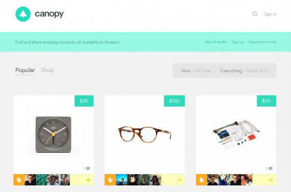
Flat design can be seen in the Windows 8 interface, in Apple’s iOS 7, and in dozens of popular websites. This aesthetic tends to avoid drop shadows or similar — focusing on strong colors, and interesting fonts.
This design trend has a few advantages at present. It often leads to simple user interfaces that are relatively easy to make responsive. It tends to use graphics in a way that leads to relatively smaller file sizes and, therefore, faster loading pages, and it can be a differentiator for sites.
Sites like Canopy, which allows users to find and share products available on Amazon, offers a good example of how flat design is likely to be applied in ecommerce site design.
4. More Content on One Page
In 2014, expect to see site designers and developers adding more content to individual pages in at least two ways.
Quick views, which allow shoppers to get additional product information without leaving a product category page, are likely to continue to grow in popularity since that makes it particularly easy for mobile shoppers to learn more about products without having to load additional pages.
Also look for pages to become longer, perhaps, even scrolling “infinitely” like Tumblr or Pinterest.
5. Interesting Fonts
Online typography has been exploding, if you will, in the past few years, and this trend is not going to slow down in 2014.
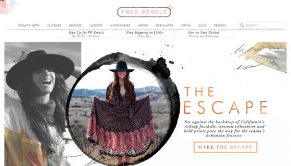
Expect to see sites using distinctive, brand supporting fonts to convey an online store’s feel. To see examples of typography in action on an ecommerce site, visit Free People, Design by Humans, Afends, or the Yellow Bird Project.
6. Great Big Graphics
This particular trend may seem counterintuitive in the context of mobile Internet use and the overall design to provide a better mobile experience. But it turns out that big graphics really is relative to screen size, and with a bit of good site development, designers can deliver big graphics appropriate for a user’s device.
Relatively larger graphics that link to products, also tend to make for finger-friendly user interfaces, which is another reason this trend will grow.
Sites like Born, Hagger, and Tommy Bahama serve as examples.
7. Video and Other Rich Content
Mobile video consumption is on the rise, more than doubling last year, so it is clear that consumers don’t mind watching videos on tablets or even on smartphones.
In this context, video gives online retailers an excellent medium for providing useful content and detailed product information. Look for more retailers to begin including video or other rich media content in content marketing and in product descriptions.


