Editor’s Note: This article was originally published by Web Marketing Today. Practical Ecommerce acquired Web Marketing Today in 2012. In 2016, we merged the two sites, leaving Practical Ecommerce as the successor.
If you could only have two things in an email, they would the subject line and the call to action. I wrote about subject lines a few months back, in “7 Ways to Improve Email Subject Lines (and a Sneaky Way to Test).” But the call to action has been left unexamined until now. So here are seven of the best ways to nail the call to action in your next email campaign, and in all your email campaigns to come.
1. Make the Call to Action Short
This is the most common and damaging mistake with email calls to action, or any call to action. The marketer or the writer does not take the time to distill the call to action down to its essentials. Any more than five words in a call to action is too long.
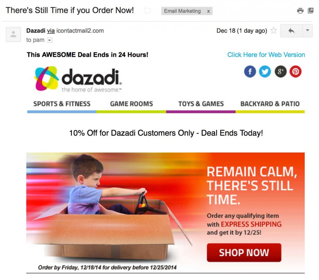
I spent some time clicking through recent emails from ecommerce sites. There was an intriguing trend for the call to action “Shop now.” None of the retailers ever used more than four words for its call to action. This email from Dazadi, a home recreation retailer, is a good example.

An example of a two-word call to action: “Shop Now.”
2. Tell People What to Do
For some of you, this will be Call To Action 101. For others, it might be a revelation. Either way, everyone should remember this tip for calls to action: Tell people exactly what you want them to do.
To illustrate this, imagine you are meeting your prospect in the hallway of a busy office. You are holding a large poster board. It’s your email message. Your prospect is on her way to a meeting.
You hold the poster board right up to your prospect, at eye level. You now have one short sentence, perhaps just a phrase, to say to her before she has to dash off. What would you say? What do you want her to do? That’s your call to action.
Some conversion experts describe this practice of telling people what to do a different way. They say, “Make your calls to action instructional.” That’s almost the same as saying, “Tell people what to do.” But it hints at a copywriting pattern that can be helpful.
For example, one of the finest examples of calls to action on the web is from an Amazon product page. This page completely ignores the “one call to action” rule we’ll discuss in a moment — but it is a product page, not an email. But it proves over and over again how prevalent instructional calls to action are.
There are ten major calls to action on the Amazon product page. Here’s the copy for each one.
- Look inside
- Send me the link
- Buy now with 1-Click
- Give as a Gift
- Add to Wish List
- Send sample now
- Shop now
- Go
- Get your Kindle here
- Share
See a pattern? All these begin with a verb. A short verb. This is the essence of an instructional call to action. It’s also remarkably simple.
3. Urge People to Respond Now
If you study effective direct mail copywriting examples, as Kathryn Aragon did for the Crazy Egg blog, you’ll notice a pattern so prevalent it almost becomes boring. All the calls to action end with “today” — as in “Sign up today,” “Mail this postcard today,” “Get started on your new life today.”
Nowadays, we have a shorter timeframe than just today. We want people to respond now. Fortunately, “now” is probably the most ideal call to action word. It’s super-short, so you can add it to almost any call to action and still follow my first tip — “Make Call to Action Short” — above. “Now” is also a common and immediately understood word. It’s about as simple and as clear as you can get. Even toddlers understand “now.”
Amazon also understands this. Three out of the ten major calls to action on its product page include the word “now.” So go add that word to your calls to action. Now.
4. Have One Call to Action
You’ll usually get better results if you limit yourself to just one call to action. Here’s an example of how powerfully this can work from WhichTestWon. Philips Sonicare, a manufacturer of electric toothbrushes, sent the two emails to its house list. Version A had one call to action. Version B has four different calls to action. So how did these two emails do?
WhichTestWon reports: “Version A … increased clicks by 371% and sales by an astounding 1,617% (a lift from a .15% conversion rate to a 1.9% conversion rate).”
Despite test results like that, do you absolutely insist on having more than one call to action? Then at least try to give the most important call to action priority over the others. Common ways to do this are to make one call to action larger, or to make one call to action a bold color and the secondary call to action a muted color.
Another twist on more than one call to action is use multiple calls to action, but they all urge people to do the same thing. Each call to action is just phrased differently. For example, one call to action could day, “Download my report.” Another could say, “Find out more.” Both take people to the same landing page to do the same thing.
5. Make the Call to Action Stand Out
Some conversion experts use an interesting trick to see if a call to action pops enough. They blur their eyes or look away from the page. Then they look back quickly and see which element they notice first.
This is an imprecise method, but it gives you an idea of how clear a call to action needs to be. It needs to be as visible, or even more visible, than the hero shot (the image of the product or the report) or the headline. The call to action needs to be visible enough that it’s the first or second thing you notice.
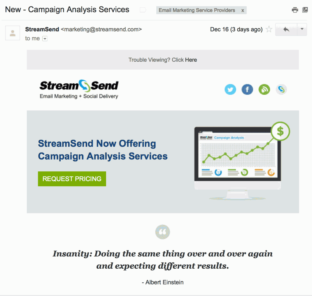
So how do you do this? First, you use a color people will notice. StreamSend, an email-marketing provider, effectively used one color from its palette in this email, below. The next most visible thing in this email that is the color (green) for “Request Pricing” is the same as the dollar sign, which is not a bad association to make.

This call to action — “Request Pricing” — uses a color from the email’s overall palette.
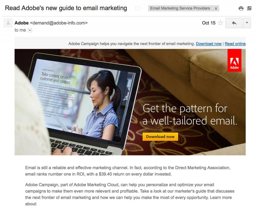
This email from Adobe goes a step further.

This yellow button — “Download Now” — pops mostly because of its color, not its size.
I would have liked that yellow button, above, be about twice the size. That’s the second way to make your call to action stand out. At the very least, make your call to action large enough for people on mobile devices to be able to click it with their finger. To do that you’ll need a button at least 50 x 50 pixels. But why make it hard for people? Make the button 75 pixels wide or wider on each side.
The final prescription for making the call to action visible is to put it above the fold. Where the fold falls depends on which device someone is using. But if you put the call to action in the top section of your email, and test it on several different preview tools (almost all email service providers offer a way to view your emails on dozens of devices before you send), you’ll be fine.
6. Repeat the Call to Action
I mentioned direct mail campaigns above. Here’s another trick from the copywriting greats: Use a postscript. People read postscripts more often than they read body copy, so adding your call to action a second time as a postscript is a good way to lift response.
A twist on this is to repeat your headline in your call to action. This is a trick that’s used by conversion copywriters. It’s most often used for landing pages, but there’s a strong chance it will work in an email too. It’s definitely worth testing.
7. Test Everything
What the best thing you can do to write better calls to action? Start testing. Almost every email service provider now offers A/B split testing. It’s a feature you should use. After subject lines, the next best thing to test is your emails’ calls to action.
One last word about email calls to action: Make sure they will appear even if a subscriber has their images turned off. Many email clients still have images turned off by default. Make sure those subscribers can still respond to your email. Some simple CSS or HTML markup is usually the best fix. Your coded buttons will look just as good as an image would. This tiny, simple fix has been known to increase response rates by more than 20 percent. If you’re not doing it, don’t go home tonight until this gets done.


