In 2015, responsive, mobile-friendly ecommerce websites will stop being a competitive advantage and start to become a necessity for doing business online. This change will also impact how online retail and business-to-business sites are designed.
Dr. Anil Gupta, an author and business consultant, describes a competitive advantage as being something that a company is faster, better, or more efficient at — cheaper, if you like — than its competitors. For the past few years, having a mobile optimized website was something of a competitive advantage for online sellers, but in 2015 mobile-ready design is no longer a way to get ahead of the competition. It is a requirement.
Mobile design, then, is becoming so prominent and important that it is likely to influence ecommerce design in general. What follows are six web design trends that could impact how ecommerce sites are built or redesigned in 2015.
1. Hidden Menus
Mobile site design has required that some common and necessary site elements are hidden until they needed. As an example, global navigation or even product navigation is vital for an ecommerce site, but it can also be in the way on a small screen when a shopper is doing something other than navigating.
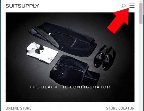
Thus, hidden menus (sometimes called hamburger menus because of the icon most often used to represent them) have risen in popularity. For example, one can find hidden menus on nearly all Google sites, and on the responsive site for Suitsupply, a men’s apparel company.
In 2015, some shoppers may find that online sellers use hidden menus even when a site is viewed on a desktop or laptop with a relatively larger screen. Trendy design firms are already starting to do this. As an example, London-based branding agency Pollen displays a hidden menu on its home page even when the site is viewed at 1,920-by-1,080 pixels.
In the ecommerce world, however, there may be one subtle change to hidden menus. There is evidence that some, if not many, people don’t yet understand what the hamburger menu icon means. So don’t be surprised if many retailers use the icon and the word “menu” in tandem.
2. Responsive Design for Large Screens
As previously mentioned, responsive design for mobile devices has nearly become a requirement for success in ecommerce, but there are some compelling reasons to design for large screens too.
For example, many smart televisions or game consoles, like the Xbox One, transform the television into an Internet-enabled device. One retailer in the Northwest reported that nearly 10 percent of its site traffic currently comes from devices with a screen resolution of 1,920 pixels wide or wider, indicating relatively large desktop monitors or televisions.
Other sites, particularly in the business-to-business space, may also have visitors using relatively large screens. Chris Lake, Econsultancy’s director of product development, wrote in April 2014 that 20 percent of his company’s site traffic came from visitors using devices with a screen resolution of at least 1,920 pixels wide, while about 18 percent came from mobile devices.
Lake also suggested looking at online seller Firebox as an example of a company that had done a good job of using responsive design to fill even a large screen.
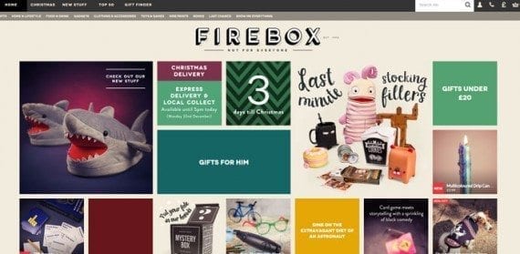
The Firebox website’s responsive design is not just good for mobile devices; it also fills up larger screens.
3. Flexible and Large Typography
Many in the web design industry believe that 2015 could be a notable year for typography, particularly flexible and large typography that works well in the context of a responsive design.
In an article about the trends that top designers are watching, Richard Rutter of Clearleft, a design firm, said that “web typography has come on in leaps and bounds over the past five years, as designers have been able to use more fonts and learn how to use them better. However homogeneity and conservatism in use of type is rife. This needs to change in order for websites and brands to stand out. Be bolder with your type choices — still be legible — but be different.”
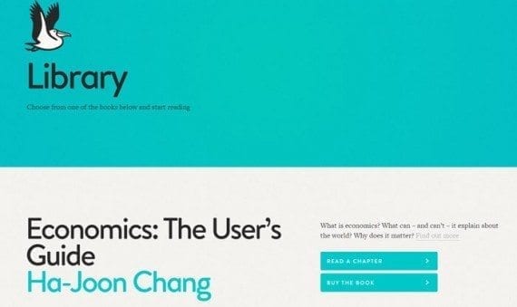
These bolder designs will also need to be managed within the context of responsive design so that the text flows well whether it is displayed on a relatively small mobile screen or on a large desktop monitor.
4. Large Photography
Site speed is extremely important, and many website designers have, in recent years, done away with large images, in part, to make sites load faster on mobile devices. But with improved responsive design techniques and adaptive images, it is possible to serve relatively fast-loading but large images.
These large images can help ecommerce businesses sell more. Expect to see these much larger images in a couple of places.
First, home pages will include very large images. The Tommy Bahama site, as an example, has a history of using large, attractive images on its home page.
Second, don’t be surprised if product detail page photographs begin to grow too, some reaching dimensions of more than 1,000 pixels wide.
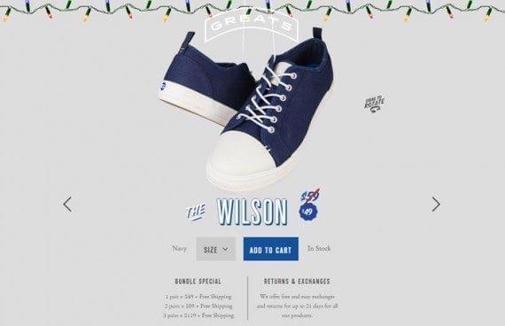
Greats, on online shoe store, uses large images on its product detail pages, and one can even rotate those images 360 degrees.
5. Video Content and Backgrounds
For years, marketing and ecommerce experts have been touting the benefits of video, including videos that help to sell products and content marketing videos that help to attract customers.
In 2015, look for more ecommerce businesses to use video on product detail pages, in blogs, on YouTube, and even as background images for home pages.
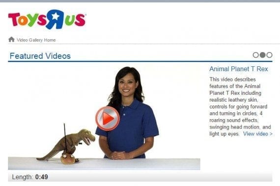
Toys”R”Us uses video to help demonstrate products.
6. Material Design
Material design is a “visual language” that Google developed to marry classic design principles with innovative technologies. It is a way of unifying user experience across platforms so that there are similar looks, conventions, and interactions regardless of what sort of Internet enabled device someone is using.
This is a somewhat cerebral approach to web and application design. Google used material design on the most recent updates to Android, and it is at least possible that some ecommerce operations will adopt material design in 2015.

