Visit an ecommerce group on Facebook or LinkedIn, and you’ll likely find one question asked repeatedly: “How do I use AdWords [or other advertising platform] more effectively, to get more people to buy?”
In most cases, these people are asking the wrong question. They are also receiving the wrong answers.
It is easy to be sold on spending money to market online. It’s even easier to run through a monthly advertising budget in mere days. But most of the time, the reason for poor results isn’t so much with ad targeting as it is poorly designed pages and websites. For that reason, no merchant should spend money on ads that lead visitors to pages that aren’t built for conversion.
There are, in my experience, three primary reasons people don’t convert from pay-per-click posts and ads.
- The ad copy doesn’t truly represent the product. The consumer is taken to a page that has little to do with the marketing copy.
- The landing page is poorly designed visually. It’s not appealing to the eye — other elements are distracting users or the layout is weak.
- The landing page isn’t designed for the consumer to take action. Every page needs a definitive call to action. This is especially important when you are spending money to send people to that page.
While the ad copy itself can be easily addressed, the landing page design and its content takes some time. It’s critical to enlist testers and study analytics to determine what works and what doesn’t. No matter how well you think your product pages and landing pages are, there is always room for improvement.
Here are common reasons people bounce after clicking an ad that represents the product appropriately.
Why Shoppers Bounce after Clicking an Ad
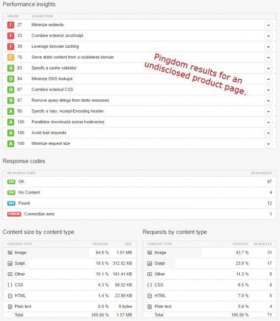
Slow loading pages. Make sure you are speed testing your website. Google has a free tool for this, and Pingdom will show you which scripts or elements are bogging things down.
Too-technical or lengthy product names. The product name (or title) is not a description. Be concise, and use simple words.
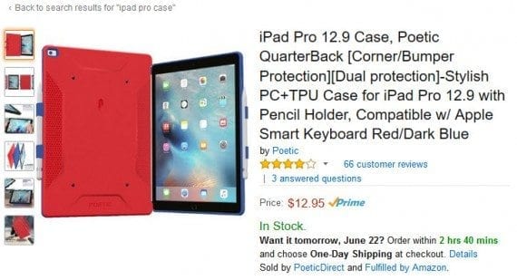
Electronics and mobile accessories often have lengthy product names on Amazon. Those names are typically difficult to read, though, and should be avoided.
Poorly formatted pricing. Make the price stand out, but be careful about using specialized fonts and strike-throughs (which many times make original prices difficult to read). Also, be careful about listing manufacturers’ recommended prices on products that never sell at that price — shoppers are learning that this type of pricing display doesn’t necessarily mean it’s a deal.
Bad images. Images are either good or bad. If it’s an out-of-focus photo, or one that doesn’t truly represent the product, it’s bad. Be sure you’re displaying the best possible images for each product.
Calling attention to no customer reviews. Customer reviews can help sell products better than product descriptions. The lack of a review feature may send some shoppers looking for feedback elsewhere. And highlighting the fact no one has rated a product can also send the message that no one is actually buying from you. This makes some wonder if they should take the risk giving you money when they can likely find the product elsewhere.
Do not call attention to the lack of any review. Gone are the days that people feel honored to “be the first,” telling others what they think.
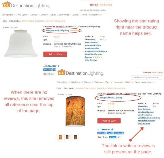
Destination Lighting is careful about drawing attention to the lack of customer reviews on certain products. In the “Satin White Bell” glass shade example, at top, the existence of five star reviews is shown prominently. But the “Art Glass Cylinder” shade has no review and the merchant, appropriately, avoids stating “No reviews” or similar language.
No sense of urgency. A bookmark or “save” of a product rarely indicates a potential sale. In fact, the chances of shoppers returning to your product page are slim. By creating a sense of urgency, you increase the chance of converting in real time. But honest sale prices, value propositions (I addressed this in a previous post), limited availability, and social proof all lend weight to the overall urgency one feels when considering a purchase. Just be careful about overstating the need to purchase now, which can have an adverse effect.
Not highlighting free shipping offers and guarantees. People want to save on shipping, and they want to know they can return products if they don’t like them. Be sure to include this vital information on landing and specific product pages, rather than listed solely in the site’s navigation.
Not being human when writing copy. Be honest about what a product does (and what it doesn’t do, if necessary), and use words everyone can understand.
Turn on the Ads, Slowly
As always, testing and analytics will tell you if things are working. After making some key changes, look for a decrease in bounce rates and increase in conversions. The bounce rate will tell you if people are interested, while conversions will tell you the success of getting them to click that call to action.
Once you’ve got things in place to actually convert visitors into customers, it’s time to turn on those ad campaigns — a little at a time — and pay close attention. Start with a low budget until you’re sure you’ve ironed out all the kinks.

