In “Color Psychology and Online Marketing,” I addressed how different colors and color combinations send different messages. In this article, I’ll list some sites that illustrate this principle.
Red
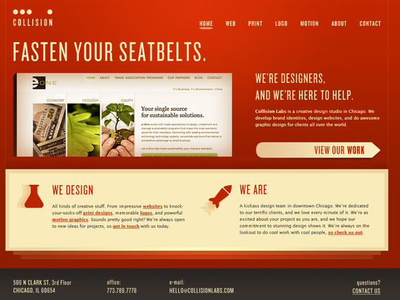
Collision Labs
Collision Labs uses an almost orange shade of red that gives off an energy and sense of urgency. Notice also the change in atmosphere by using a beige color instead of white.
Nightclubapps.com
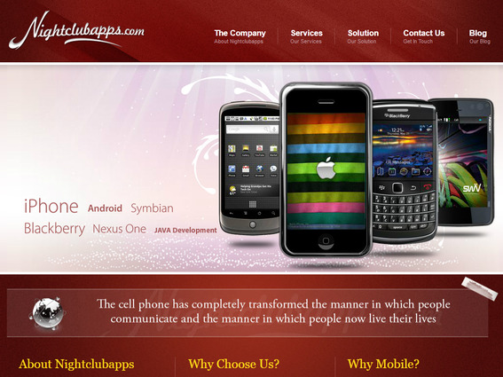
Nightclubapps.com
Nightclubapps.com uses a darker shade of red that is associated more with passion and desire than energy.
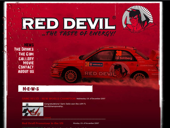
Red Devil
The Red Devil site sets itself apart by capitalizing on the urgency, danger, and violence linked with the color red.
Orange

Heliocare
Heliocare creates a joyful atmosphere by mixing bright oranges with a light colored background. By using orange beside yellows and reds, the site creates both a sense of urgency and a feeling of optimism.

Formag
Formag uses orange and black for a site that is powerful and aggressive. This is an excellent example of how mixing colors can change their meanings.
Yellow
Bzzy
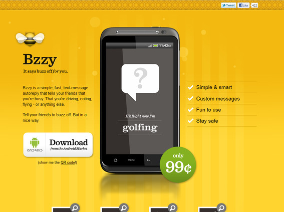
Bzzy
Bzzy is slightly more orange than other yellow sites showcased here. This gives Bzzy just a hint of red’s energy while creating a happy, sunshine-like site.
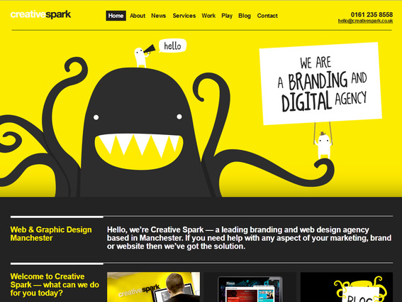
Creative Spark
Creative Spark uses an intense yellow that some might consider too strong. However, Creative Spark did choose to use a dark grey rather than black. This basic change helped tone down the contrast.
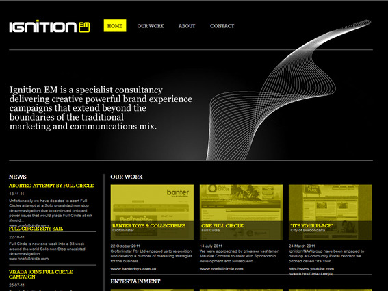
Ignition EM
Ignition EM’s yellow approach is a bit different from the first two examples. Notice how using yellow as a color secondary to black creates more energy than happiness or sunshine. In many cases, however, having yellow text on black could cause excessive eyestrain. Ignition gets away with it by only using yellow for some titles.
Green
Girl Scouts
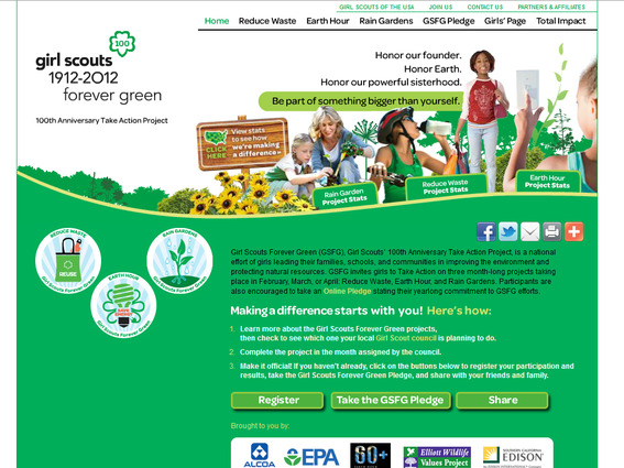
Girl Scouts
The Girl Scouts website uses a bright, happy green color to give the site a natural energy.
Wathen-Castanos
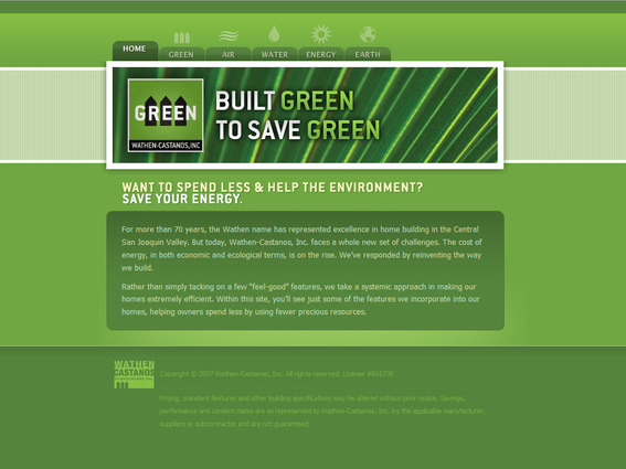
Wathen-Castanos
Comparing Wathen-Castanos to the Girl Scouts site illustrates how different greens send different messages. The greens used on this site tie it with nature and the environment.

Monster Energy
The way the Monster Energy site uses green as a secondary color to black gives the green more of an unnatural energy, something not common with green. Note how context and combination altered the mood created by green in this example.
Blue
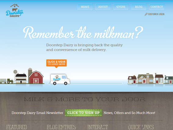
Doorstep Dairy
The light blue used on the Doorstep Dairy site creates a friendly, calm atmosphere.
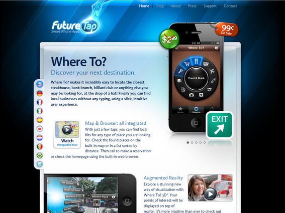
FutureTap
FutureTap combines blues and blacks for the trust and security of blue with the elegance and power of black. The light blues used in the copy area make the content just a little bit friendlier.
High Class Events
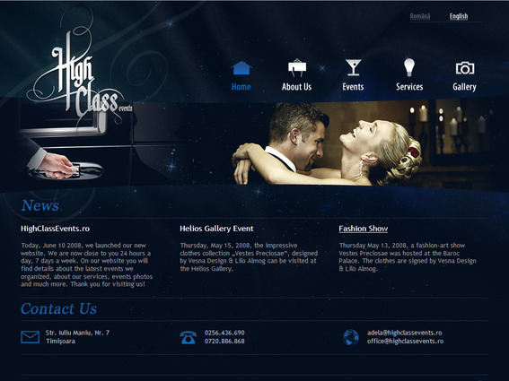
High Class Events
Dark blues create a secure, responsible atmosphere on the High Class Events site while black gives the site a feeling of classiness and power.
Purple
Celtica
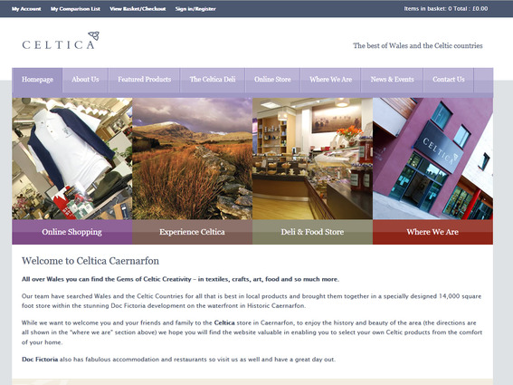
Celtica
Celtica uses white and light purples to create a calm, creative atmosphere. Context helps prevent the light purples from creating an overt feeling of love and romance.
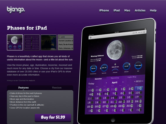
Bjango
The Bjango site capitalizes on the royalty and wisdom of purple.
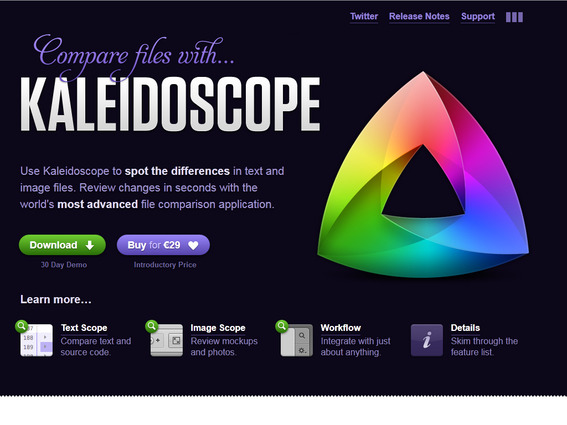
Kaleidoscope
Kaleidoscope mixes both dark and light purples to combine the feelings of dignity and status with creativity. Notice while both Kaleidoscope and Bjango use black and dark purple, the light purples in Kaleidoscope create an entirely different mood.
Pink
Heartbreaker
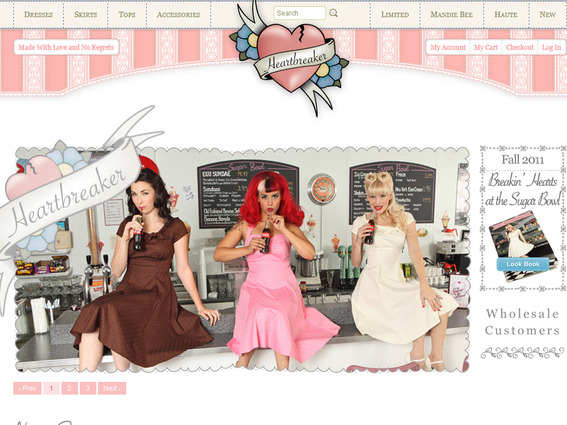
Heartbreaker
Heartbreaker uses pastel pinks and white for a calm, feminine site. The images give the site an edgier feel, another example of how context is essential.
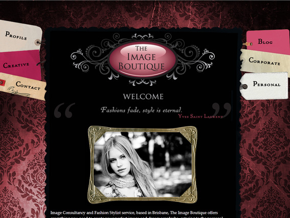
The Image Boutique
The Image Boutique uses pink with black to create an atmosphere of elegance, power, romance, and femininity.
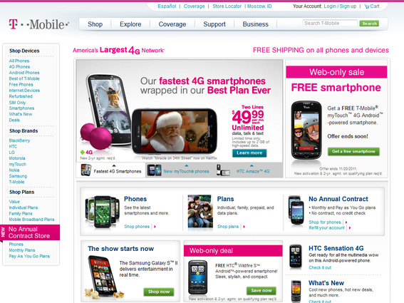
T-Mobile
Notice how the T-Mobile site doesn’t convey romance, love, calm, femininity or friendship. In fact, the T-Mobile pink has more characteristics of red than pink.
Gold and Silver
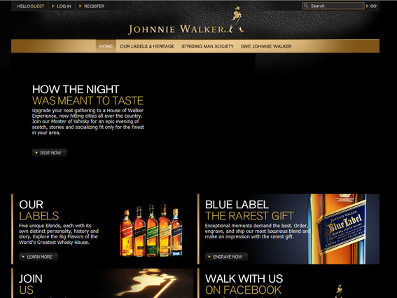
Johnnie Walker
Johnnie Walker uses gold and black for an atmosphere of prestige, elegance, wealth, and expensive tastes.
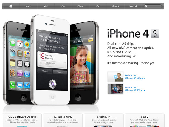
Apple
Apple’s site is a perfect example of the use of silver in site design. Prestigious, scientific, and cold in a way that reminds us of Apple products.
Black and White
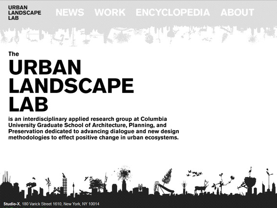
Urban Landscape Lab
The Urban Landscape Lab site uses white to create an empty feeling while maintaining a positive atmosphere.
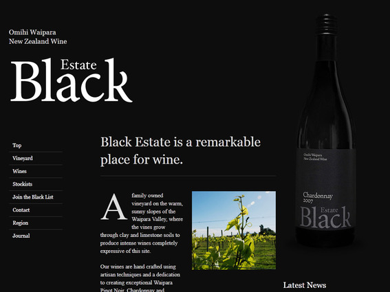
Black Estate Vineyard
Black Estate Vineyard utilizes the power and elegance associated with black for its site. Unlike a site with excessive white space, black space doesn’t feel empty at all.
Context and Combination
In many of the examples above, color meanings aren’t fixed. Not only will context alter the message of color, color combinations can create whole new atmospheres altogether. Keep context and color combinations in mind when working with color to create a mood.


