Colors and color combinations send different messages. Oftentimes for websites, colors intuitively create a mood or atmosphere. Color psychology takes this intuition and identifies common themes among certain colors. These color signals can be used to send stronger messages online.
Color and Culture
Before examining the emotions and ideas for different colors, I want to emphasize that this is not an exact science. Color has a lot to do with culture. For example, in Western culture, the color yellow is sometimes associated with cowardice. However, in Japan, yellow often represents courage. This might be an extreme example — from different parts of the globe — but it does illustrate that colors can have different meanings for different people.
What’s Behind Colors?
Research has shown that certain colors come with associations — especially in the context of something else. You already subconsciously make connections between certain colors and emotions.

Looking at the list, below, you may realize how accurate some of these associations are.
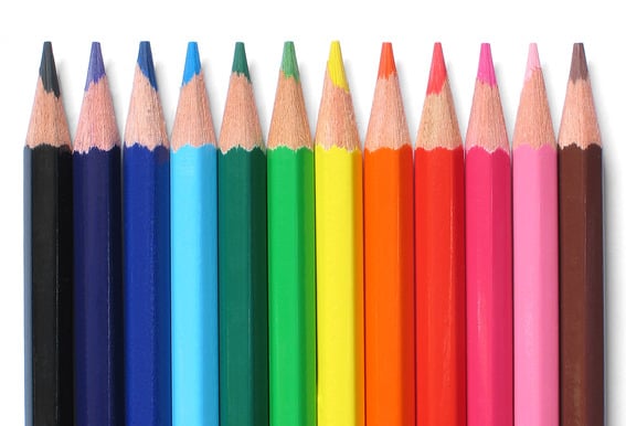
Red. Energy, a sense of urgency, passion, desire, love, anger, violence, and danger. Love and anger seem to contradict each other here. This is where context becomes important. If you think about red in the context of Valentine’s Day, you probably aren’t thinking about anger. Likewise, if you think about red in the context of war, you probably aren’t associating it with love. Red is also the color of stoplights and stop signs, indicating a potential danger. Because of this, red is sometimes indirectly associated with stopping. Another interesting fact about the color red is that it can physically increase heart rates, respiration, and metabolism. If you’ve ever felt anxious shopping in a Target, this could be the reason why.
Orange. Joy, aggression, change, and calls to action. Orange falls somewhere between red and yellow on the emotional spectrum. It is stronger than yellow but friendlier than red. Darker shades of orange can also be associated with the autumn season and the earth.
Yellow. Optimism, sunshine, hope, energy, and happiness.
Yellow is a good color for adding cheerfulness to your site. Be careful, however, if overused yellow can be hard on the eyes. Yellow is also sometimes associated with cowardice, as mentioned above.
Yellow can be cheerful, but if overused, it’s hard on the eyes.
Blue. Trust, security, calm, responsibility, friendliness. The color blue is often used by banks and businesses to create an atmosphere of trust and responsibility. The meaning behind blue will vary depending on its shade and hue more than some other colors. For example, darker blues denote more security while lighter blues are seen as more friendly.
Green. Wealth, natural energy, renewal and the environment.
Green is another color where the exact shade of green can drastically change the meaning behind it. There is a big difference between a green associated with wealth and a green associated with the environment. Green can also be associated with jealousy or envy. Again, this is a situation where context is important. Green is also the easiest color on the eyes.
Purple. Royalty, creativity, wisdom, dignity, status. Lighter purples can also be associated with love and romance. Here is an example of how color psychology is not an exact science. While purple is often linked with creativity, I personally associate creativity with the color orange.
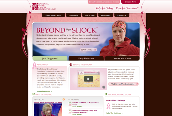
Pink. Romance, love, calm, femininity, and friendship. Pink traditionally is associated with femininity and is seldom used in design to target men. Because of its calming effect, the color pink has been used to paint the locker rooms of opposing sports teams. Pink is a good example of how the meanings behind colors can shift. Today, many would associate pink with breast cancer awareness.
White: light, goodness, innocence, pureness, and minimalism.
White. White has a positive connotation and can be used with just about any color. On its own, white can give off the feeling of emptiness.
Black. Power, elegance, prestige, and classiness. On the opposite end of the spectrum from white, black is another color that can be used with just about any other color.
Gold. Prestige, illumination, wealth, and expensive things. Gold is frequently used as a secondary color. When used as a primary color in design, gold often takes on the properties of yellow.
Silver. Prestige, cold, scientific. Silver is very similar to gold but it evokes a colder emotion rather than the happier, brighter feeling associated with gold.
Color Variations and Combinations
Using variations of the colors above can help push an emotional connection one way or another. For example, as I mentioned previously, light blues tend to be friendlier while dark blues tend to be more reliable. Lighter greens seem calmer while brighter greens seem more energetic. This is where color-theory terms like hue, value, and saturation become important and should be considered with context when creating an atmosphere from color.
Notice both sites use different greens and create two different atmospheres.
Similar to the emotional shifts caused by lightening or darkening a color, different color combinations evoke different emotional responses. Black and red send a different emotional message than white and red. For a simpler example, we can think about color combinations associated with holidays. Red, white, and green in combination can be reminiscent of Christmas. Black and orange are associated with Halloween. Red, orange, and brown have ties with autumn and Thanksgiving. You can begin to see how using different colors in combination can create new feelings or atmospheres.
Color and Brand Identity
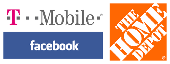
In addition to emotional associations, colors can create new links to brands. When thinking about colors in the context of brands, you’re likely to get entirely new associations. For example, thinking of orange might remind you of The Home Depot or Reese’s Peanut Butter Cups. Magenta might remind you of T-Mobile. Silver might make you think of Apple. Blue might bring to mind Chase Bank or Facebook. Notice with this last example that saturation plays an important role in the message the color blue sends. The blue color used by Facebook is unique and easy to spot.
Logos can be associated with certain colors.
It has also been proven that color improves memory. In the case of brands, color has been shown to improve brand recognition by as much as 85 percent. This is a statistic that shouldn’t be ignored. So whether you are developing a website or building a brand, consider colors to deliver the appropriate theme.


