
Bootstrap, a popular HTML, CSS, and JavaScript framework, is a good tool for laying out responsive ecommerce product detail pages.
The Bootstrap framework makes it easy to lay out responsive ecommerce product detail pages. Small business owners and even novice site designers can use Bootstrap to build a professional looking page.
Bootstrap is one of the most popular HTML, CSS, and JavaScript frameworks for developing responsive web pages. Thousands of websites use Bootstrap. It can also be used in combination with most ecommerce platforms, so that Shopify themes, LemonStand designs, and WooCommerce templates, as examples, may be built with Bootstrap.
In “Build Fixed, Responsive Navigation with Bootstrap,” I explained how to use Bootstrap to create fixed navigation headers on smaller, mobile screens. In this article, I will describe how you might use Bootstrap to lay out an ecommerce product detail page. I will introduce the Bootstrap grid system, address a few of Bootstrap’s built-in classes, work with Bootstrap’s tabbed navigation, and provide examples of blending your own CSS with Bootstrap.
You can add Bootstrap into your project in a couple of ways. For this example, I placed a link to Bootstrap in the head section of the HTML document.
<link
 href="https://maxcdn.bootstrapcdn.com/bootstrap/3.3.6/css/bootstrap.min.css"
 rel="stylesheet"
integrity="sha384-1q8mTJOASx8j1Au+a5WDVnPi2lkFfwwEAa8hDDdjZlpLegxhjVME1fgjWPGmkzs7"
 crossorigin="anonymous"
>
I also referenced the jQuery and Bootstrap’s JavaScript file via a content delivery network. These scripts were included just before the page’s closing body tag.
 <script
     src="https://code.jquery.com/jquery-2.2.2.min.js"
     integrity="sha256-36cp2Co+/62rEAAYHLmRCPIych47CvdM+uTBJwSzWjI="
     crossorigin="anonymous"></script>
 <script
     src="https://maxcdn.bootstrapcdn.com/bootstrap/3.3.6/js/bootstrap.min.js"
     integrity="sha384-0mSbJDEHialfmuBBQP6A4Qrprq5OVfW37PRR3j5ELqxss1yVqOtnepnHVP9aJ7xS"
     crossorigin="anonymous"></script>
Start with Bootstrap’s Grid-based Layout
Ease of use is one of Bootstrap’s greatest strengths. It includes just about everything most web designers will want for just about any project. Not the least of these is Bootstrap’s responsive, mobile-first grid system.
This grid allows you to lay out your product detail page without writing a lot of custom CSS. The grid items will flow up to 12 columns as the size of the device increases.
Each Bootstrap grid is wrapped in an HTML element with a “container” class or a “container-fluid” class. The latter will produce a full-width layout, while the former will have a fixed width.
<div class=”container”>
 ...
</div>
Within each Bootstrap grid container, you place rows or, more specifically, HTML elements with a “row” class. Typically, these will be div or section elements.
<div class=”container”>
 <div class=”row”>
    …
 </div>
</div>
Next, rows should include one or more elements with column-related classes. Bootstrap has four, grid-related options: extra small, small, medium, and large. These options specify a breakpoint for the grid system. In this example, I will use a medium grid (md).
<div class=”container”>
 <div class=”row”>
   <div class=”col-md-6”>
    …
   </div>
 </div>
</div>
Each of the Bootstrap grid options has specific characteristics useful for laying out a page for each device.
Remember, Bootstrap is mobile first. Its default setup is aimed at smartphones. Media queries are used to address specific layouts for larger device or screen sizes.
Apply the Bootstrap Grid to Your Product Detail Page
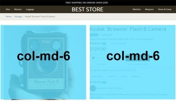
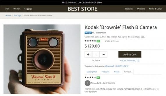
The product section is made up of two halves, each spanning six of the available 12 columns.
The product detail page I am building is divided in half. It uses two, six-column wide div elements, surrounded by a row and a container.
<div class="container" id="product-section">
  <div class="row">
   <div class="col-md-6">
    … [this is the product image]
   </div>
   <div class="col-md-6">
    …[this is the product information]
   </div>
  </div><!-- end row -->
 </div><!-- end container -->
Since I am using the medium grid option, on screens narrower than 992 pixels, these two sections — the product image and the product information — will be full width. But on screens with at least 992 pixels, the two sections will split the available space.
Here is the code used for the product image. Remember that this is inside of a row, which, in turn, is inside of a container.
<div class="col-md-6">
 <img
  src="040516-brownie-flash.jpg"
  alt="Kodak Brownie Flash B Camera"
  class="image-responsive"
 />
</div>
The “image-responsive” class is a Bootstrap feature. It will add a maximum width, equal to the width of the image’s parent element. This means the image will adjust to screen size with the rest of the layout.
Nesting Grids
Bootstrap’s grids can be nested, meaning you can put a grid within a grid. This is how I will manage the product information section of the page. To use a nested grid, I include an additional row element.
As an example, here is the code used for the product title.
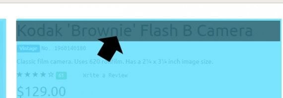
<div class="col-md-6">
 <div class="row">
  <div class="col-md-12">
   <h1>Kodak 'Brownie' Flash B Camera</h1>
 </div>
</div><!-- end row-->
The first div element represents the six columns in the row it shares with the image. Within these six columns, I am adding a new row, which has a fresh set of 12 somewhat narrower columns.
<div class="col-md-6">
 <div class="row">
Bootstrap grids can be nested. In this case, the product information section, including the product name, uses a nested grid.
Inside of the row, we have a div element set to take up all 12 of the available grid columns. Inside of this column, we have an h1 element for the actual product name.
<div class="col-md-12">
 <h1>Kodak 'Brownie' Flash B Camera</h1>
</div>
The next section of product information includes a label with the word, “Vintage,” and the product’s stock keeping unit (SKU) number. To lay this out, I use a new Bootstrap row, just like I did for the product name.
<div class="row">
 <div class="col-md-12">
  <span class="label label-primary">Vintage</span>
  <span class="monospaced">No. 1960140180</span>
 </div>
</div><!-- end row -->
The classes “label” and “label-primary” are built into Bootstrap. All that I need to do to get the label is specify these classes.
The “monospaced” class is an example of how easy it is to mix Bootstrap and my own CSS. In this case, the class name specifies a font, Ubuntu Mono.
To use this font, which is available via Google Fonts, add a link in head section of the HTML document.
<link href='https://fonts.googleapis.com/css?family=Ubuntu+Mono' rel='stylesheet' type='text/css'>
Next, create the class that will apply the font. This can be added to an external or even internal style sheet.
.monospaced { font-family: 'Ubuntu Mono', monospaced ; }
Moving down and through the product information, the next section, which includes a brief description, is also a nested row.
<div class="row"> <div class="col-md-12"> <p class="description"> Classic film camera. Uses 620 roll film. Has a 2¼ x 3¼ inch image size. </p> </div> </div><!-- end row -->
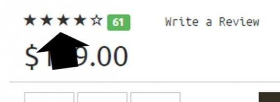
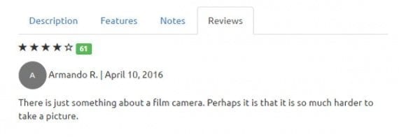
The page’s review section makes use to two Bootstrap features: glyphicons and the ability to target screen readers.
<div class="row">
 <div class="col-md-3">
  <span class="sr-only">Four out of Five Stars</span>
  <span class="glyphicon glyphicon-star" aria-hidden="true"></span>
  <span class="glyphicon glyphicon-star" aria-hidden="true"></span>
  <span class="glyphicon glyphicon-star" aria-hidden="true"></span>
  <span class="glyphicon glyphicon-star" aria-hidden="true"></span>
  <span class="glyphicon glyphicon-star-empty" aria-hidden="true"></span>
  <span class="label label-success">61</span>
 </div>
 <div class="col-md-3">
  <span class="monospaced">Write a Review</span>
 </div>
</div><!-- end row -->
First, notice the span element with the “sr-only” class. This text, which describes the product’s rating, will be read on screen readers to aid with accessibility, but not shown visually on the page.
<span class="sr-only">Four out of Five Stars</span>
The next five span elements each represent a Bootstrap glyphicon. This icon graphic will be used to show the products rating, but hidden from screen readers.
The stars in the review rating are Bootstrap glyphicons.
Bootstrap has 295 glyphicons to choose from. These icons can be used anywhere in your project.
The key takeaway here is that each of these sections is part of the nested Bootstrap grid. This nested grid lays out the entire product information section.
Here is the code that places everything from the product price to information for telephone orders.
<div class="row">
 <div class="col-md-12 bottom-rule">
  <h2 class="product-price">$129.00</h2>
 </div>
</div><!-- end row -->

<div class="row add-to-cart">
 <div class="col-md-5 product-qty">
  <span class="btn btn-default btn-lg btn-qty">
   <span class="glyphicon glyphicon-plus" aria-hidden="true"></span>
  </span>
<input class="btn btn-default btn-lg btn-qty" value="1" />
  <span class="btn btn-default btn-lg btn-qty">
   <span class="glyphicon glyphicon-minus" aria-hidden="true"></span>
  </span>
 </div>
 <div class="col-md-4">
  <button class="btn btn-lg btn-brand btn-full-width">
   Add to Cart
  </button>
 </div>
</div><!-- end row -->

<div class="row">
 <div class="col-md-4 text-center">
  <span class="monospaced">In Stock</span>
 </div>
 <div class="col-md-4 col-md-offset-1 text-center">
  <a class="monospaced" href="#">Add to Shopping List</a>
 </div>
</div><!-- end row -->
<div class="row">
 <div class="col-md-12 bottom-rule top-10"></div>
</div><!-- end row -->

<div class="row">
 <div class="col-md-12 top-10">
  <p>To order by telephone, <a href="tel:18005551212">please call 1-800-555-1212</a></p>
 </div>
</div><!-- end row -->
As you examine the code, notice that I continue to have nested row elements. I am also continuing to blend or mix Bootstrap classes with custom CSS as I need them. As an example, consider the code for the plus symbol in the product quantity section.
<span class="btn btn-default btn-lg btn-qty">
 <span class="glyphicon glyphicon-plus" aria-hidden="true"></span>
</span>
The classes “btn,” “btn-default,” and “btn-lg” are all part of Bootstrap. They will make the element look like a button, set its color (default in this case), and make the button large, respectively. The “btn-qty” class is custom CSS specific to this project. It has the singular job of making each of the three quantity buttons, if you will, the same size.
.add-to-cart .btn-qty {
  width: 52px;
  height: 46px;
}
Bootstrap puts rounded corners on buttons, so a separate CSS declaration using the “add-to-cart” class in conjunction with the Bootstrap “btn” class removes these.
.add-to-cart .btn { border-radius: 0; }
Notice also a few more useful Bootstrap classes in the row with the “In Stock” message and the “Add to Shopping List” link.
<div class="row">
 <div class="col-md-4 text-center">
  <span class="monospaced">In Stock</span>
 </div>
 <div class="col-md-4 col-md-offset-1 text-center">
  <a class="monospaced" href="#">Add to Shopping List</a>
 </div>
</div><!-- end row -->
First, the “text-center” class does exactly what you would expect. Bootstrap also offers “text-left,” “text-right,” “text-justify,” and “text-nowrap” — each does exactly what its name implies.
For the Add to Shopping List section, notice that there is an offset class. This functionally repositions this grid element one column to the right. This is done to line up the Add to Shopping List link with the Add to Cart button above it on relatively larger screens.
Working with Bootstrap’s Navigation Tabs
Using CSS and JavaScript, Bootstrap offers an easy-to-implement tabbed navigation solution. This is what I will use to lay out the tabbed sections —description, features, notes, and reviews — at the bottom of the product information area.
For the example product detail page, Bootstrap’s nav tabs are used to put a lot of information into relatively little space on the page.
The markup for the tab navigation comes in two parts. The first represents the actual tabs.
<!-- Nav tabs -->
<ul class="nav nav-tabs" role="tablist">
 <li role="presentation" class="active">
  <a href="#description"
   aria-controls="description"
   role="tab"
   data-toggle="tab"
  >Description</a>
 </li>
 <li role="presentation">
  <a href="#features"
   aria-controls="features"
   role="tab"
   data-toggle="tab"
  >Features</a>
 </li>
 <li role="presentation">
  <a href="#notes"
   aria-controls="notes"
   role="tab"
   data-toggle="tab"
   >Notes</a>
 </li>
 <li role="presentation">
  <a href="#reviews"
   aria-controls="reviews"
   role="tab"
   data-toggle="tab"
  >Reviews</a>
 </li>
</ul>
Notice that I start, in this case, with an unordered list, giving it the classes “nav” and “nav-tabs.” It also has the “tablist” role.
<ul class="nav nav-tabs" role="tablist">
Each of the individual tabs is a list item with a link inside. The active tab is the one that will be displayed when the page is loaded. The href attribute in each link points to the target tab pane’s id attribute, which I will consider next.
The second half of the tab navigation represents the tab panes. Here is the tab pane code with the actual content removed so that you can see the pane structure.
<!-- Tab panes -->
<div class="tab-content">
 <div role="tabpanel" class="tab-pane active" id="description">
  ...
 </div>
 <div role="tabpanel" class="tab-pane top-10" id="features">
  ...
 </div>
 <div role="tabpanel" class="tab-pane" id="notes">
  ...
 </div>
 <div role="tabpanel" class="tab-pane" id="reviews">
  ...
 </div>
</div>
Each pane in nav tab can include content of any sort, including text or even rich media.
Each pane has a role, class, and id. The id is what corresponds to the link in the tab section. Each pane can contain any sort of content you want. Here, for example, is the specific content from the description pane.
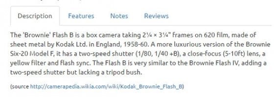
<div role="tabpanel" class="tab-pane active" id="description"> <p class="top-10"> The 'Brownie' Flash B is a box camera taking 2¼ × 3¼" frames on 620 film, made of sheet metal by Kodak Ltd. in England, 1958-60. A more luxurious version of the Brownie Six-20 Model F, it has a two-speed shutter (1/80, 1/40 +B), a close-focus (5-10ft) lens, a yellow filter and flash sync. The Flash B is very similar to the Brownie Flash IV, adding a two-speed shutter but lacking a tripod bush. </p> <p> <small> (source <a href="http://camerapedia.wikia.com/wiki/Kodak_Brownie_Flash_B">http://camerapedia.wikia.com/wiki/Kodak_Brownie_Flash_B</a>) </small> </p> </div>
This is all you need to do. With jQuery and Bootstrap’s JavaScript running on the page, these tabs will work.
Summing Up
In this article, I described how you can use Bootstrap to lay out a product detail page. I discussed the Bootstrap grid system, showed you a few of Bootstrap’s many classes, and set up tabbed navigation.
Remember, Bootstrap layouts can be used with most ecommerce platforms.
See the next installment in Armando Roggio’s series on using Bootstrap, at “Make an Impressive Ecommerce Footer in Bootstrap.”


 Hostinger Reframes Site-Free Ecommerce
 AI Visibility Scores Are Useless
 New Ecommerce Tools: July 1, 2026
 India Ecommerce Paths for Foreign Sellers
 New Ecommerce Tools: July 7, 2026
 AI Forces Affiliates to Innovate or Die
 SEO for AI, Low Traffic, No Clicks