Web forms are the final hurdle shoppers and site visitors must traverse before registering for a newsletter or making a purchase. Even small improvements in the form can make a big difference in a business’s bottom line.
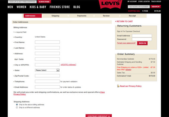
No company wants to be hard to do business with. Businesses want to please shoppers and make it easy for them to buy or interact. Web forms, even well designed ones, often stand between a customer and what that customer wants. If a shopper wants to buy, say, a pair of jeans from the Levi’s store, the shopper will need to get past Levi’s checkout form first.

Forms, such as this one from Levi’s, lie between a user and what that user wants.
With this in mind, here are five tips that you can use to boost conversion rates — whether you’re asking for a sale or a simple registration.
Ask Fewer Questions
A web form’s entire purpose is to gather information, such as a name, address, shipping data, billing information, and more, much more. But avoid the temptation to ask more than you actually need.
A classic example is “Where did you hear about us?” This is a simple enough question aimed at helping the marketing department determine how a shopper arrived at the checkout. But it is just one more question in the way of a conversion. And it is something that can be answered with analytics or attribution tracking, rather than as a question on a form.
The key is to get the information that you need as succinctly as possible.
Be Specific About What You Want
Each time a user encounters a form, that user need to decide what information the form is seeking, whether or not to provide the information, and how to provide the information. Although this takes less than a second, it is important to be as clear and specific as possible when labeling or arranging forms.
“Use field labels that your audience will understand. Your labels should be clear and descriptive – but also, short. If extra clarification is needed, use contextual help rather than a long, wordy label,” wrote Lora Edwards of Maxpoint Interactive — a marketing firm that focuses on local, in-store sales — on that company’s blog.
Also consider where you place labels. Luke Wroblewski, author of the book Web Form Design: Filling in the Blanks, suggests that “top align” labels are the easiest for users to parse.
Create a Clear Path
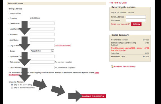
In his book, Wroblewski also points out that there should be a clear path from one form input to the next, so that a user knows exactly what to do. This path should be both visually recognizable when you look at the form and it should be clear when a user tabs from one field to the next. Notice the clear path in the Levi’s checkout form.

The Levi’s checkout form has a clear path to completion.
Effectively, you want the user to see how to succeed.
Provide Help and Feedback
There is almost nothing worse than having a user complete a form and then rejecting that the submission because some bit of information is improperly formatted or overlooked. The experience is that the user must repeat processing and completing the form.
Instead of letting this happen, provide help and validation as the form is being filled out. This help might be a bit of text explaining how a form’s input should be formatted or it might just explain why you need the information.
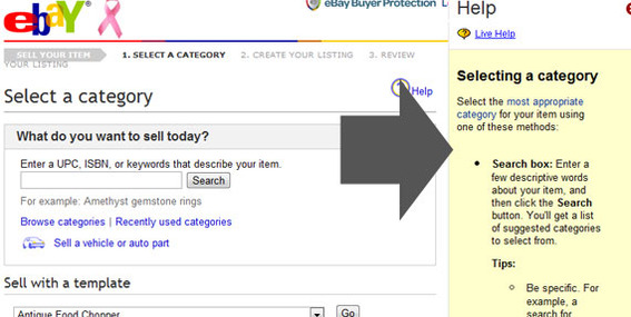
An excellent example of form help can be seen on eBay, when a seller is listing a product. The form includes a help column on the right that does not interfere with the path, but provides feedback as needed.

eBay’s “sell an item” form is a good example of using help text.
Test
A form’s complexity and aim can have a significant effect on its performance and usability. So more than anything else, test important forms. Monitor, as an example, conversion rates for a checkout form when it has top-aligned labels, then check the labels to be left-aligned and see if there is any change in conversions. Do the same for the path to completion or other form aspects, each time seeking to optimize your form for success.


