If you’re planning on redesigning an ecommerce site, don’t follow the experience of Target.com.
The well-known retailer — known for its focus on product design and its communications — launched a new site that attracted the ire of web designers, one of whom called the redesign the “train wreck redesign of the year.”
So, what did Target change that caused such a fuss?
Well, here’s the original home page design.

Target’s old home page.
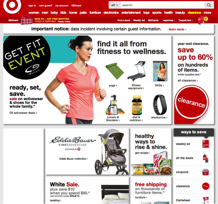
And here’s the new design.
The navigation bar has been redesigned, including new main link labels — nothing major there.
But, the rest of the page’s layout — i.e., its wireframe — is entirely different: There are now more products on the home page, for instance, replacing the simple design with a grid of products.
There’s also the infamous shadowbox design element that seems to have most offended the critics.
But was the site redesign a disaster because the design pundits didn’t like it? What if the shadowbox effect actually helps boost Target’s conversion rate by making the different sections stand out?
Sadly, we may never know, since it’s not clear if Target split tested these new elements. That’s what makes this redesign a potential disaster.
In response to the criticism, a Target spokesman said, “User testing prior to launch, and actual site traffic and sales performance since, have been very positive. We plan additional changes to our design and features, and will track guest response and make adjustments along the way.”
Since the spokesman refers to sales performance since launch — versus A/B split testing before launch, like usability testing — we’re led to believe Target didn’t do comprehensive A/B testing of any other new elements before launch.
Yes, usability testing has its place, but it’s not a substitute for A/B testing. Traffic and overall sales performance also are not reliable gauges of the impact of the new design. There are too many other effects, such as seasonality, stock levels, and competitive activity.
The aesthetics of drop shadows aside, the biggest problem with the Target redesign is the apparent risk it took, and not just with its brand.
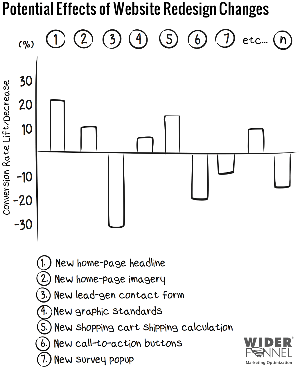
It made so many changes at once, it will be impossible for the company to really understand which changes helped its conversions and which hurt. Even if, as its spokesperson says, overall sales are up, some of the changes are probably keeping Target from even more sales.
What if, for example, the new search box design lifted the conversion rate by 12 percent (by making it easier to find things on the site) but the layout caused a conversion drop of 5 percent?
The net conversion rate lift with just these two changes would be 7 percent, but Target wouldn’t know which areas made which impact. And, that’s only two of the thousands of changes it made.

Effects of different website design changes
Learning from Target’s Mistakes
So what lessons can you learn when it’s time to redesign your ecommerce site?
Rather than making such dramatic changes all at once, and then adjusting afterward, make a series of tested changes (which can each be dramatic too). Think evolution instead of revolution. Because, let’s face it, revolutions are more dangerous than simple drop shadows, and pose a high risk of failure.
There is a less risky approach than a complete website redesign — one that maximizes your conversion-rate improvement by isolating the impact of individual changes. I call this approach “Evolutionary Site Redesign,” or ESR.
Instead of a complete change like Target did, with ESR the new design, layout, and content elements are tested continuously, changing your website design and layout toward the best-performing site it can be.
In an ESR redesign, you prioritize your most important pages, templates, and site-wide elements. Then, test new layouts, design, and content with controlled split testing. You get all the benefits of a new site design without the risks.
Since ESR uses proven conversion rate optimization principles to redesign your site, you end up with a new site look-and-feel and conversion-rate lift at the same time. With ESR, new interface methods and approaches can be tested to see if they actually improve business results.
If Target had run A/B tests on some of the changes individually, it may have found that certain changes improved conversion rates, while other hurt. Even if the shadows aren’t an improvement over the original, the new layout probably overshadows (pun intended) the decrease by showing more products clearly.
With ESR, Target could have tested the most important changes separately, and understood which changes would boost sales. That means a renewed website, without the risk.
Target could run the following isolated tests.
- New navigation design, including logo placement, search box design, background color. I’ve worked with clients that have profited from big lifts in conversion through controlled tests in this area. But not all changes are winners.
- Page layout wireframe. Adding more products to the home page could boost conversions if there are more entry points to drive action. Or, as the critics suggest, it could hurt conversions by making Target look down market.
- Site-wide design elements of box shadows, typeface treatment, and colors. Design changes can have unexpected outcomes. If you make changes that affect the entire site, even if they seem like obvious improvements, it’s always better to test than assume.

New design changes on Target’s home page.
Then, once the best design has been confirmed through careful testing, Target could continue to test, for example, (a) which product categories to display for each shopper segment, (b) which offers work best for various seasons, (c) how many products and categories to display for the best conversion rates, (d) the design and pricing treatment for products, and (e) the home page positioning headline and value proposition.
Yes, it may seem like an endless cycle, as it should be. But, by prioritizing your ecommerce conversion optimization tests — see “Use the PIE Method to Prioritize Ecommerce Tests,” one of my previous articles — you can systematically improve your conversion rate, and build better returns at each step.
Prefer Dramatic Redesign Changes?
Taking the Evolutionary Site Redesign approach doesn’t mean you can’t make bold changes — even as bold and dramatic as some of Target’s changes. It does mean implementing these changes in a controlled, measured way, making sure that their impact is tested and proven to be beneficial to your conversion rate.
Even if you’re looking at refining or redefining your brand and the entire look-and-feel of your website, ESR gives you the confidence that the changes are for the better and have a proven positive effect on your business.
Even if your redesign doesn’t win the hearts and minds of all the web designers, by taking an ESR approach you will win where it counts: with higher conversion rates and profit from your visitors.
After all, your customers are the most important audience.


