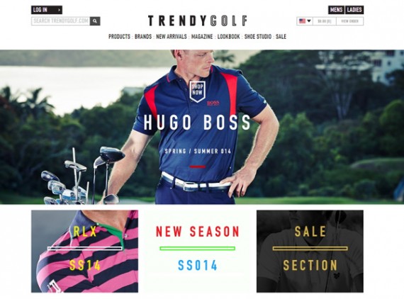
Flat design is a web and application interface design philosophy aimed at creating simple, usable interfaces that are both aesthetically attractive and functionally easy to use, regardless of where the app or page is displayed. Flat design can have an impact on site performance and user experience.
In many ways, the flat design trend, which can be seen in Apple IOS 7, Windows 8, hundreds of new mobile applications, and websites like Shopify, Magento, or Media Temple, is a response to the mobile Internet and mobile app trends.
Mobile Drives the Flat Design Trend
The Internet is on the move. Just look around. More than half of all adult Americans have and use a smartphone, according to a 2013 Pew Internet and American Life report. Separately, comScore reported that in August 2013, about 145 million Americans owned and used a smartphone like the iPhone or Samsung Galaxy S4.
Similarly, more than one in three American adults owns a tablet device, according to a separate Pew report released in June of last year.
The explosion in mobile Internet and application use introduced or reinforced a few specific website and application design requirements, including the need for fast loading pages, interfaces that both looked good and worked well on a myriad of screens, and understandable navigation.
Minimal Interface that is Easy to Understand
To accomplish these ends, flat design generally does away with extreme gradients, textures, and visual tricks that imply depth or a third dimension. These changes may be a reaction to an earlier web design trend, wherein graphic designers tried to make web pages look like real world objects.
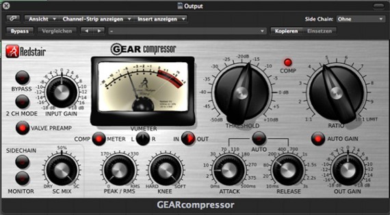
Redstair Gear Compressor’s website attempted to mimic the actual look of its devices.
The user interface for the Redstair Gear Compressor, above, is an excellent example of this earlier design trend since it makes its digital interface look nearly exactly like the real world audio device. The idea behind this sort of design was that users familiar with the real world item would feel more comfortable interacting with the digital version.
But in the mobile era, there are several challenges with this sort of hyper-realistic design. For example, the many and varied graphic files necessary for this sort of design can add a significant amount of page load time. These high style designs are also a nightmare to make responsive, so that completely different designers were necessarily for mobile devices.
Flat design, rebels, if you will, against this type of design, effectively arguing that users don’t need real world clues to properly interact in a digital environment, and that responsive and quick loading pages are better.
The flat designer seeks to use only those elements necessary to convey the page or applications message. Put another way, a user should be able to look at a flat design and almost instantly understand the concept being communicated.
Grid Layout and Responsivity
Grid layouts are a staple of interface design. In the context of the flat design aesthetic, the grid is used to organize data and convey meaning.
The grid layout also lends itself very well to responsive design, since the individual grids may be reassigned to new rows or columns. While using a grid is no guarantee of a successful user interface, it is at least a good foundation, and grid layouts are fundamental to flat design.
Absence of ‘Trickery’
As mentioned above, flat design seeks to generally avoid extreme gradients, drop shadows, bevels, and similar visual “trickery.” The aim, again, to create a nuanced design that is attractive and functional without wasting pixels or kilobytes.
Flat designers are also likely to avoid content sliders, fly-out menus, or other forms of navigation that may be difficult to manipulate from a touchscreen device.
Solid Colors
Flat design chooses to use a broad color palette that often features solid, uncommon colors. Earlier in the flat design trend, colors tended to be muted, but more recent sites and applications are also using bright and bold colors.
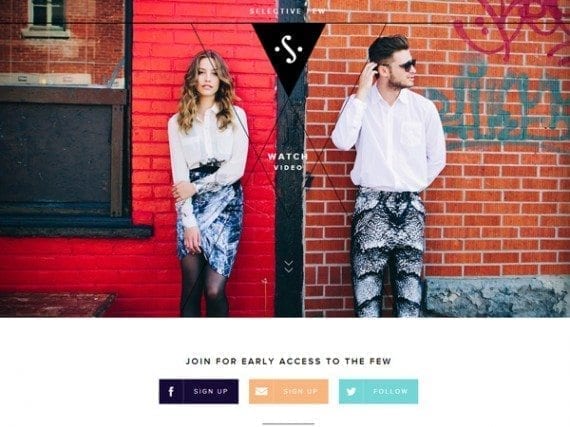
Selective Few, a curated clothing site, uses bold, varied colors.
These colors are often used to create contrast between sections or features, provide visual borders, or even convey information. For example, more than one mobile weather application now uses background color to indicate the current temperature. On a cold winter day the weather app might have a light blue background, while the background on a hot summer day may be orange.
Interesting Typography
Flat design often embraces a greater number of fonts into a single design, includes bold, retro, or otherwise interesting fonts, and varies font size and weight.
These tenets are not, however, a license to try and show off how many fonts you have at your disposal. Rather typography should help to communicate the content and features legibly, while adding to the design’s beauty.
Beyond Flat Design
Flat design is both attractive and functional. As a design philosophy, it works well on mobile devices and desktop computers alike, which explains flat design’s wide appeal and use. But it is important to remember that design trends change over time. As new technologies change the way we access information, site and application design will surely follow.

