Now that the holiday shopping season has started, make sure your mobile product pages are designed for conversion. While there is a time constraint, you may, nonetheless, want to look at templates provided by your shopping cart — find one that’s simplified and easy to tweak.
I could go for hours about what should and shouldn’t be included on the product page that’s loaded on a smartphone. But let’s focus on the priorities, which is presenting information in an inverted pyramid style.
When I was a journalist, this pyramid kept me in check. It served as a constant reminder of how to write a story.
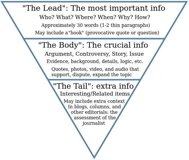
A simplified version of the journalist’s inverted pyramid. Source: Elgl.org.
Ideally, we want to follow this same style on every web page. On mobile, though, the need is even bigger. That’s because mobile users are less patient; many studies reveal that the trigger point is about 3 seconds after page load.
Trying to include everything “above the fold” on a mobile page can be difficult. That’s why it’s important to present a simplified masthead and menu icon.
Here’s an inverted pyramid for a mobile product page.
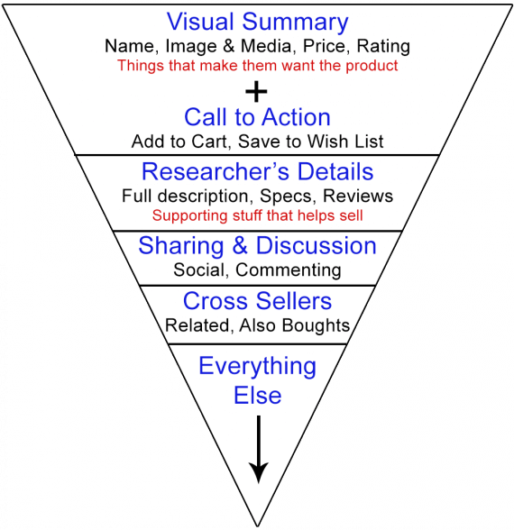
Mobile product page inverted pyramid.
Here are a few, key points.
- Social sharing tools can display above the fold on mobile, but only if they don’t shove the call to action too far down. Ask yourself what’s more important: the sale or the share.
- Customer reviews work better right after the product description, before related and “customers also bought” products. Keep everything for the product itself together.
- Strikethrough prices and savings will send the same message when presented on a single line. Stack these and you’re wasting precious real estate.
- Unless the majority of your business is via catalog sales, don’t waste space for the product code. For most sites it can be put beneath the product description.
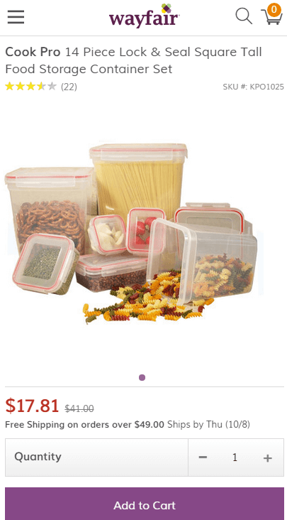
Wayfair uses a simple layout. Strikethrough pricing is shown immediately after the sale price.
When making changes, you’ll want to test the page on various devices. If you don’t have test devices, use a reputable emulator. Google Chrome has one built in and I’ve found that it returns decent results. If you’ve never used it, there’s a quick overview here.
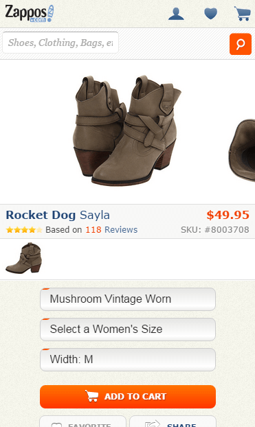
A mobile product page on Zappos, shown here on an iPhone 6.
It’s not always possible to include everything above the fold across every device due to varying resolutions. This rings especially true if the product has options. For smaller form factors, try to at least start the call-to-action display before the fold.
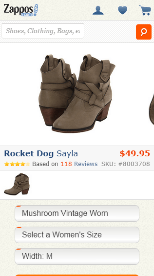
The same product page loaded on an iPhone 5. Note that the option menus start above the fold, which starts the purchase process.
If your cart or template supports static menus, you can keep the call to action always present.

Adagio.com integrates a static price and cart button on products. When shoppers scroll, the add button stays put.
We know that no single design works for every store. At Adagio’s site, a summary description is listed near the top because that’s what drives the shopper to consider the product. Reviews — the real deciding factors — immediately follow. The mobile site has a good amount of white space, yet the product pages are built to convert quickly.
Understand your target audience so you can address the most often asked questions first. You’ll also want to track changes and review sales reports in analytics. Both of these tasks may take a little time. If your current product pages look lousy on mobile, though, following the inverted pyramid supplied above gives you a starting point.


