Responsive site designs adapt to the user’s device, resizing navigation and images to provide a better mobile user experience. A well done responsive design, particularly for product pages, may lead to more mobile commerce success.
Since a good responsive ecommerce site design is a matter of taste, it makes sense to think about responsive product page design as a recipe with a handful of key ingredients, including a thin header, a high-priority call to action, product images, and finger-friendly, essential navigation.
Use a Thin Header
In website design, the header is that section of the page typically responsible for (a) brand identity, (b) global navigation, including the shopping cart or basket link, (c) search forms, and (d) key promotions. On many ecommerce sites, the header also includes product category navigation.
The header appears on every page of the site, including the all-important product detail page, and should be consistent across pages.
On a desktop or laptop computer, the header can be expansive, featuring lists of links, banners, and logo graphics. But when the header adapts to a mobile device, it needs to slim down considerably, occupying about 15 percent or less of a single screen view.
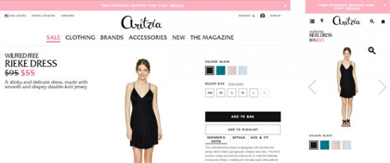
Consider two examples of headers from responsive sites as they appear on some smartphones. Notice that the example on the left has a header that consumes a significant amount of the viewable page, while the example on the right uses icons to create a much thinner header.
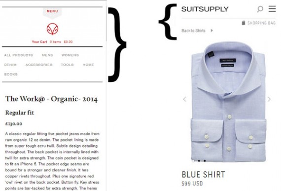
The site on the left has thick header that takes up a lot of space on small screens.
To better understand how a site header can adapt to a mobile device, look at the Aritzia site. Here again you can see how an icon can be used to produce a thin header. The list of links — such as “Sale,” “Clothing,” “Brands” — is condensed to the icon navigation icon (in this case four vertical lines). The store locator from the upper right of the desktop site becomes a map marker icon when the site adapts to mobile devices. The “Careers” link, which is repeated in the site footer, is not displayed.
Prioritize the Call to Action
Many product detail pages feature a product image on the left side of a page with the product information on the right side of the page. The product information will frequently include the product name, a description of the product, some mention of reviews, an indication of availability, some size information and finally a call to action in the form of an “Add to Cart” button.
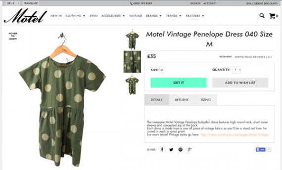
As an example, consider the product detail pages on women’s fashion site Motel. In the desktop version, the site follows the typical product page design pattern fairly closely, although it does place the call to action (“Get It”) above the product description.
However, when the site responds to a smartphone’s relatively smaller screen, the call to action (“Get It”) is moved to the top of the page.

On a smartphone’s relatively smaller screen, Motel’s call to action (“Get It”) is moved to the top of the page.
Moving the call to action above the product image is an extreme example of prioritizing it. The Firebox site, a retailer of games and gadgets, also prioritizes its “Add to Basket” button on mobile devices, but it does show it below the product image.
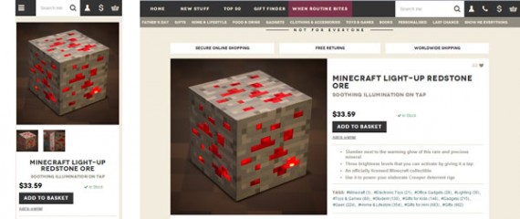
The Firebox site displays its “Add to Basket” button on mobile devices (at left) below the product image.
Feature Images
The distinction between Firebox and Motel is an important one. Prioritizing the call to action should be balanced with featuring product images or product videos.
Whether a product page is displayed on a large monitor or a relatively small mobile device, images are one of the most important contributors to conversions and sales. When responsive design is employed, don’t shrink pictures down to tiny thumbnail images, rather continue to feature them.
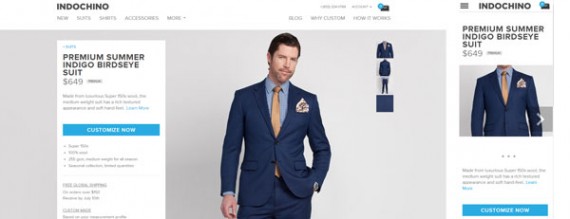
The Indochino site, which sells custom men’s clothing, features images — regardless of screen size.
Offer Finger-friendly Links and Buttons
A mouse pointer is more accurate than a fingertip. A small click or hover navigation (think lists of links in a small font) is therefore suitable on a laptop or desktop computer, but difficult to use on a mobile device. With this in mind, as responsive design adapts to smaller screens (or if it is designed mobile first, adapts to larger screens) that design should consider using touch-friendly navigation.
There are many sites that do this well, including Pure Fix Cycles and United Pixel Workers, which both have large, easy-to-touch buttons when displayed on smartphones and other mobile devices.
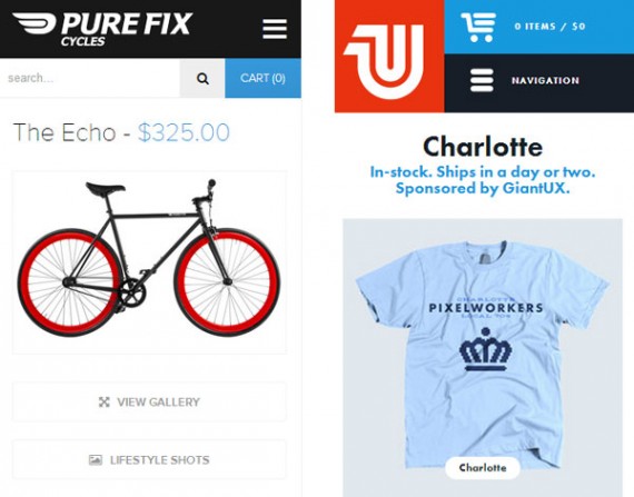
A responsive design should include touch friendly links on mobile-sized screens.
Use Only Essential Navigation
As a final ingredient, consider showing only the navigation that is essential at the moment. When site designers have lots of space on larger monitors, they can merchandise, if you will, links using words to show site visitors all of the categories available. But on space-limited screens, the responsive design needs to show only what is essential at the moment.
It is important to note that a mobile shopping experience should be every bit as rich as a shopping experience on a desktop computer. Every section of the page should be accessible. But it is not necessary to show everything all at once. Rather the visitor can focus on what is important — the product, for example — and interact with navigation as needed.
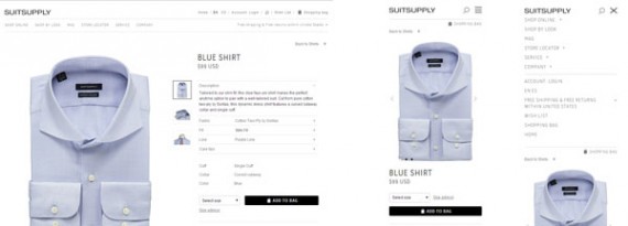
Suitsupply.com is a good example of showing only the required navigation for the moment, but still provide easy access to everything on the site.

