We continue our analysis of the top 10 converting websites by looking at the key similarities and differences between them. This follows from “Debunking Myths from the Top 10 Converting Websites,” our introductory piece on the top 10 converting sites.
Across the ten different sites, below, and using Amazon for comparison, some clear patterns emerge. What stands out most is that all 10 are direct marketers. The categories of goods sold may differ, but all are companies grounded in marketing directly to customers. Only two companies, Office Depot and Lands’ End, also have physical stores. All the others are using distance selling where you can only purchase online or by phone.
- Amazon, Multi-category, 16.5 percent
The top 10 converting sites:
- Schwan’s, Food, 41.7 percent
- ProFlowers, Flowers and gifts, 26.5 percent
- Vitacost.com, Health and nutrition, 24.0 percent
- Woman Within, Catalog /clothing, 22.4 percent
- Blair, Catalog /clothing, 20.5 percent
- Lands’ End, Catalog /clothing, 19.5 percent
- Doctors Foster and Smith, Pet supplies, 18.6 percent
- Office Depot, Office, 18.4 percent
- Roaman’s, Catalog /clothing, 18.4 percent
- QVC, Jewelry +, 18.3 percent
Some key summary statistics:
- 9 have a catalog;
- 9 do not offer free shipping;
- 8 offer a simple sign up on their home page;
- 4 out of the top 5 force a full registration before a first purchase;
- 9 out of 10 offer a 1-800 number on their home page.
Critically, 10 out of 10 use remarketing.
One other striking thing is that traditional wisdom of what you need to do to maximize your conversion rate seems to be of much lower priority to these companies. You would expect them all to rank highly with the search engines, have short and slick check out processes, capturing only the minimum of information. But this is not so.
The table below demonstrates the range of how these sites score.

Table comparing top 10 converting sites to Amazon.
Three of the top 10 converting websites have a Google PageRank of only four, indicating they have made little or no effort to optimize their sites for search. Clearly their traffic is coming directly, perhaps based on direct mailed catalogs.
The table above also shows a wide range of difference in the length of the checkout process. Conventional wisdom would suggest that ecommerce teams should minimize the number of checkout pages. This is the approach that Lands’ End has followed, with only two pages and a total of 13 fields or options before credit card entry. While Lands’ End is a great model of how to shorten your checkout process, some of the other sites are at the other end of the scale.
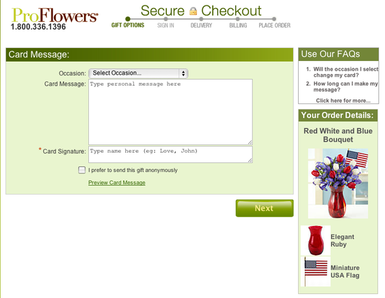
A first time purchaser at ProFlowers is presented with six different pages as part of the checkout process, and a total of 36 different options and fields to enter. It clearly hasn’t harmed ProFlowers, number two in the top 10, with an average of 26.5 percent conversion rate over the six-month study period.
In fact, we’d suggest studying ProFlowers checkout process carefully, since this is a great example of how to do checkout processes well. The large numbers of steps involved are, in part, due to the nature of its business (i.e. the ability to send flowers and gifts to others rather than yourself). The options of up-sells and cross-sells during the checkout process are well done. While you’re checking out their process, note how the items in the cart are shown on the right hand side throughout the process, but without displaying the price. This reminds purchasers about the gift, with focusing on the cost (shown below).

ProFlowers checkout page showing shopping cart contents (“Your Order Details”) on the right.


