Twitter is testing a new layout that closely resembles to Facebook Pages. This comes just weeks after a change that aligned the design of the desktop and mobile versions.
No date has been set for when the redesign will go live. In keeping with past changes, its rollout will likely be incremental, so you may or may not see it immediately. At present, the updated layout is not publicly visible. Users must be logged into their account to see it.
Here is a breakdown of the changes.
Header Image

The header image is much larger than on other social networks.
The first thing to notice is the extremely large header image. Twitter recommends that images be 1500 pixels wide by 500 pixels high, which far exceeds the size of header banners used by other social networks such as Facebook, LinkedIn, and Google+.
Background images are 1252×626 pixels in the current version, which means images fitting the new dimensions will have to be uploaded. Otherwise, they may appear distorted.
Profile Image and Bio

Profile images are situated in almost the same location as on a Facebook Page.
The placement of a larger profile image is almost exactly the same as on Facebook Pages. Biographical information is now located beneath the image and contains the same content that is available on the current layout.
List of Tweets and Other Information

Space is allocated to show the number of Tweets, photos/videos and other information.
The updated layout includes an area that lists the number of tweets, photos and videos, people the user is following, followers, and lists.
On-page Editing
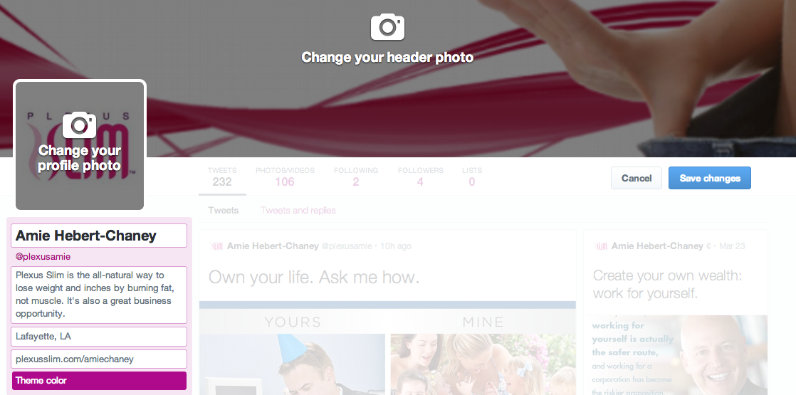
Changes to the header, profile image and bio can be made directly from the page.
By clicking the “Edit Profile” button located on the right-hand side just below the header, users can make changes to header and profile images, biographical information and theme color.
Home Page Newsfeed

Newsfeed items appear in a two-column format.
Newsfeed items are larger, and this applies especially to photos. Depending on the browser — I tested the new design in Chrome and Firefox — items may appear in a two-column format similar to the way Facebook Page timelines did before their latest redesign, or in a single column as shown below.

Newsfeed items appeared as a single column in Firefox.
Followers, Following, and Photos

Twitter Following and Followers pages utilize a card format.
Another change is the use of a card structure on the Followers, Following, and Photos/Videos pages.
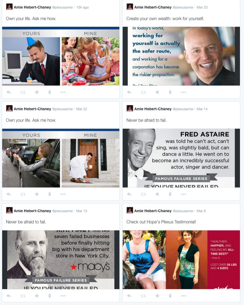
The photos and videos page also use a card structure.
Other Twitter Accounts
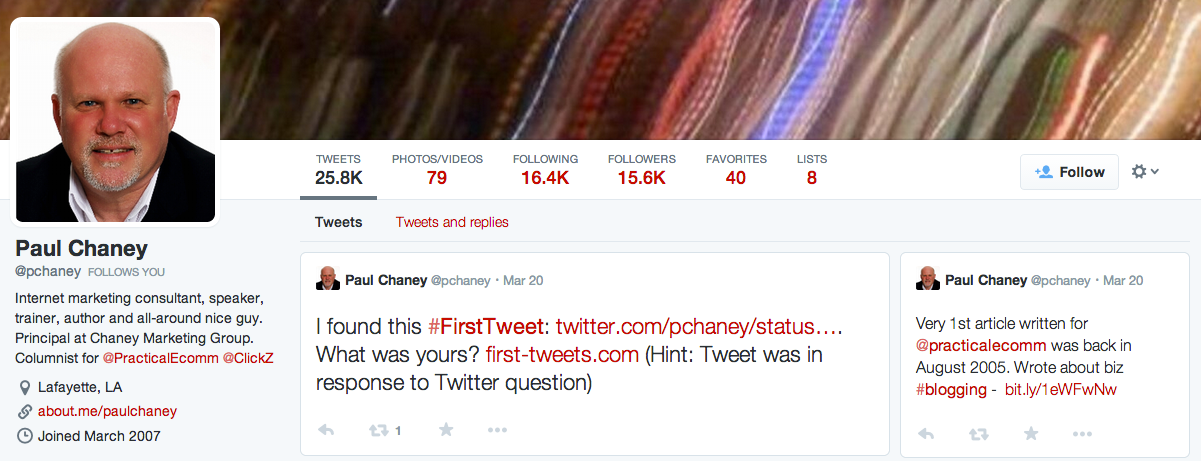
Other Twitter profiles share the same look when viewed by someone whose account is included in the test.
Interestingly, other Twitter profile pages viewed from an account with the new design share the same look, even though the others may not be included in the test.
Reason for the Change
Twitter is tight-lipped regarding reasons for the change. However, a recent earnings call with investors may provide a clue. During the call, Twitter CEO Dick Costolo said, ”We need to make Twitter a better Twitter.”
Due to its reliance on advertising revenue, the fact that most people use applications like HootSuite, SproutSocial, and TweetDeck presents a problem for the company. These third-party apps don’t show ads, so it’s in Twitter’s interest to find ways to encourage people to use its own version.


