Amazon has redesigned its website — improving aesthetics, usability, and merchandising. Changes in Amazon’s graphic design and how it displays navigation menus offer a few basic lessons about site-presentation trends that may help small and mid-sized online merchants with their own site designs.
Arguably, the Amazon website was long overdue for a redesign. The site looked dated. Specifically, the use of color-reflected design originated a few years ago. Its glossy buttons were also reflective of common style choices from the early part of the decade.

The Amazon site had grown stale and dated.
By contrast, the new Amazon site, which began showing up to Google Chrome and Apple Safari users last week, demonstrates several current trends in ecommerce site design.

The new Amazon site demonstrates several current trends in site design.
Lesson No. 1: Clean Is Better than Cluttered
The new Amazon site compartmentalizes navigation; uses light, subtle colors; and features long, unbroken lines to appear less cluttered than it was before the redesign.
Examples of this clean versus clutter appearance can be found in the page header. Previously this section of the site had a heavy blue line, glossy orange header, and significantly more text, including the navigation.

The previous Amazon header was heavy with color and text.
On the new Amazon site, the header is less intrusive, but not less informative.

The new Amazon header features clean design.
Lesson No. 2: Highlight Search
Search is, perhaps, the most important navigation feature on a retail website. In my opinion, the new Amazon site does a better job of highlighting the site search feature. Interestingly this improved emphasis was not the result of changing the search field’s position on site, but rather comes from its size, shape, and color.
In the previous Amazon site design, the search field was inside of the header’s blue stripe. It was a rectangle, and it was split into two parts.

The old Amazon search field was visually divided.
The new search field is slightly taller and narrower, which makes it appear to be larger. It is also rounded with a subtle shadow that provides some depth. Finally, without a change in functionality, it has greater visual unity.

The new site does a better job of highlighting search.
Lesson No. 3: Include a Content Slider
A content slider allows a retailer to show shoppers products, specials, or information in a visually appealing way. The new Amazon site employs two stacked content sliders. The sliders require user interaction and have tool tips associated with the labels.
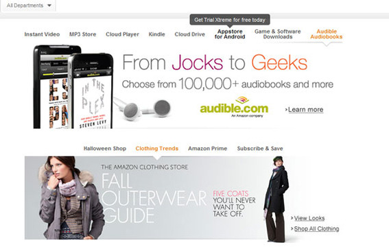
The new Amazon site has two content sliders on its home page.
Lesson No. 4: Details Make a Difference
Perhaps one of most visually impactful changes to the Amazon site is the inclusion of small, subtle design details like shadows. For example, the flyout navigation menu seems to float over the reset of the page, giving the site the appearance of greater depth.
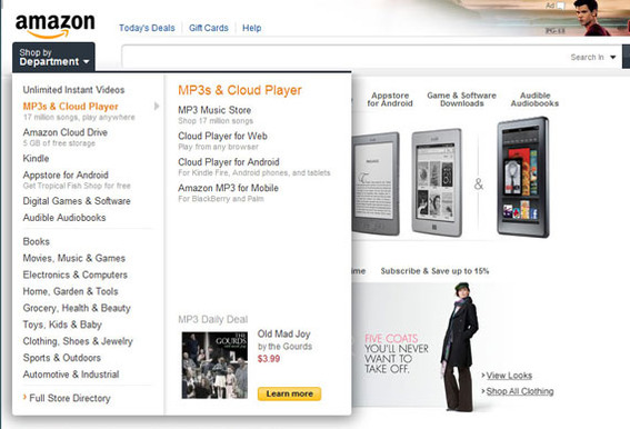
The new Amazon site includes design details that were not found in the earlier site.
Lesson No. 5: Merchandise
Onsite merchandising can be a key to increasing the number of items a shopper purchases. The new Amazon site uses its improved navigation and content sliders to show shoppers more products and more options.
Notice, as an example, the excellent and visually pleasing jean merchandising found on the “Clothing, Shoes & Jewelry” flyout.
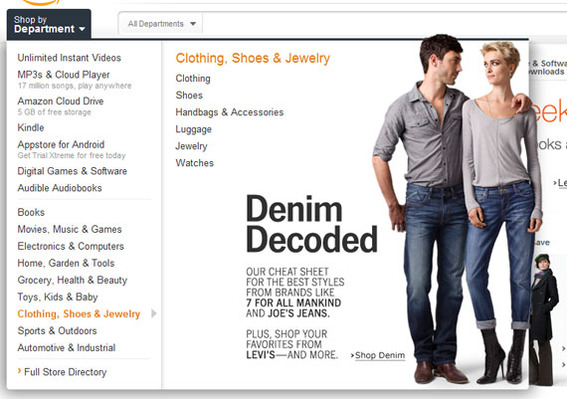
The new Amazon site does a better job of merchandising.
Summing Up
Amazon, one of the largest online retailers, has redesigned its site to be more visually appealing, to better highlight search, to include two content sliders, and to provide better merchandising opportunities. Other online retailers can take lessons from Amazon’s design choices, and improve their own sites.