
One in eight pages accessed on the Internet in the U.S. today are viewed on mobile devices, according to a report by comScore. Mobile phones account for 9 percent of Internet visits and tablets make up another 4 percent. It begs the question: What sort of experience are those mobile users being served?
Mobile users are a demanding group. They want information tailored to their small screens that they can actually read and transact with, and they want it now. Strangeloop Networks provides optimization and web performance services for mainly enterprise-level companies. Its CEO, Jonathan Bixby, said, “The latest mobile user surveys tell us that two out of three mobile shoppers expect sites to load in four seconds or less.” Tablet users expect even greater load speed at three seconds per page.
Interestingly, when Strangeloop conducted a test of 200 leading ecommerce sites, not only did mobile load times over 4G networks fall short of expectations, but desktop load times did as well. In fact, desktop load times tested were a mere one second faster than Android smartphone load times over the same networks.
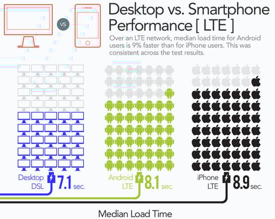
The infographics used here have been excerpted from Strangeloop’s study.
A recent study by Keynote Systems, a mobile performance firm, shows that customers are backing their expectations up with action. Sixteen percent of mobile users won’t wait for the site to load and won’t come back to the site again if it takes too long to load, according to the study.
Another study by Compuware, which provides performance and optimization services, shows that 57 percent of users will not recommend a company with a bad mobile site and 40 percent of users will visit a competitor’s site rather than using a poorly optimized mobile site. Not surprisingly, 75 percent of smartphone users surveyed by Google declared that they preferred using a “mobile-friendly” site. Aside from slower load times, companies can also run afoul of these mobile customers by not having a mobile site, or conversely by forcing customers onto the mobile site instead of the desktop site.
No Mobile Site

Of the top 200 ecommerce sites studied by Strangeloop, one third did not have a mobile site. Some of these sites use responsive web design to serve every screen size seamlessly, a positive development. But many simply aren’t serving mobile customers with mobile-friendly content.
Out of 100 users on a dedicated mobile site, one person on average buys something. That sounds like a low number, but keep in mind that for every 100 dollars spent online in 2011, 7 dollars were spent by mobile users. That was an increase of 14 times over 2010, and 2012 will likely see another major increase.
As smartphones become more powerful and their screens grow larger, customers are increasingly finding that they would rather enjoy the full site experience than a stripped down mobile version. Of those same 100 dedicated mobile site users, 35 will opt to switch to the full desktop version of the site. In fact, for every 7 dollars spent by mobile customers in 2011, 5.5 dollars were spent on a mobile device on the full site rather than the mobile version of the site.
What Can Ecommerce Sites Do?
Should merchants have a dedicated mobile site, build an app, or use responsive web design on their full site? The answer depends on your platform, resources, and business model. Some platforms may require inputs that can only be made on a desktop computer. If that’s the case, resizing and reordering the content to display optimally on a mobile screen will do little to help the customer achieve their goals. However, many modern ecommerce sites can already facilitate transactions on many mobile browsers. We’ve addressed this here recently, at “Evaluating Mobile Strategies for Ecommerce Sites.”
Personally, I think enabling transactions is a critical piece to the mobile friendly puzzle that the study did not address. The ability to transact — make a purchase, contact customer service, submit a return — is critical on a mobile device. Whether transactions are enabled via a mobile dedicated site or the full site, allowing customers to do everything they can do at their computers on their mobile devices is instrumental to earning that mobile-friendly moniker.
Another component important both to mobile customer satisfaction and revenue earned is enabling access to the full site from the mobile site when it exists. A simple link in the navigation will suffice, but make sure to link to the exact same page on the full site that the customer is viewing on the mobile site. Too many sites have a generic “Mobile Site” link that ignores the customer’s current page and dumps them on the home page of the full site instead of the relevant page. Not only is this a jarring experience, it’s disrespectful of the time that customer spent navigating to their chosen page in the first place.
Load speed clearly matters to mobile customers, but it has always mattered for ecommerce sites regardless of the device the customer uses. In the world of search, speed also plays a roll. Improving site speed is a goal that will benefit nearly all marketing channels. For a place to start learning about and optimizing load times, check out Google’s PageSpeed Tools.
One thing is certain: Mobile devices continue to grow in popularity and mobile Internet use is growing as more advanced mobile devices enable better browser experiences. Mobile commerce is here to stay, and will likely be the primary way that much of the world experiences ecommerce.


 Google Says AI Optimization Is Just SEO
 Google's AI Cart Will Remake Ecommerce
 A Preview of Agentic Marketplaces
 AI Shifts Product Discovery, not Loyalty
 New Ecommerce Tools: May 20, 2026
 How Content Marketers Misuse GenAI
 SEO for AI, Low Traffic, No Clicks