Information design is a crucial component of ecommerce conversions.
Consider your visitors and their journey on your website. Understanding their goals and the steps you want them to take will help determine the layout of your site’s information.
Many ecommerce templates address information architecture by including a top section for a tagline, pitch, and call to action, followed by featured products, social proof, and testimonials, for example. However, those items may not be suitable for your products or site.
Consider the architecture of the sites below and notice their differences, especially the sections and their order. Click the images for a full view.
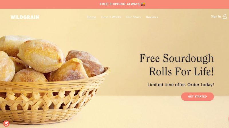
Wildgrain
Focus: Healthy eating while addressing a desire.
Key elements:
- Benefit: “Free Shipping Always”
- Navigation: Easy and simple, focused on a shopper’s journey.
- Desire: “Free Sourdough Rolls For Life”
- Call to action: “Get Started”
- Remove objections: “6 Reasons to Try WildGrain This Winter”
- Social proof: In-the-media references.
- Mission: “Our Purpose”
- Lead magnet: “Get tips, recipes & offers” (newsletter sign-up)
—
Speks
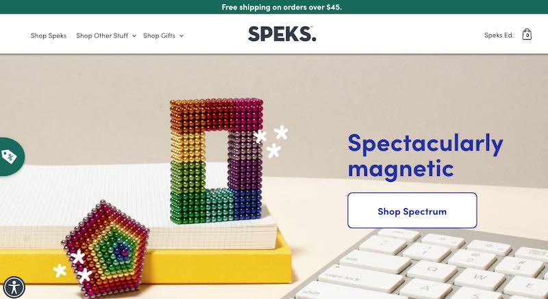
Speks creates “buildable products that will brighten any office desk and any day.” Click to view entire site.
Focus: Teaching and innovating, while addressing a desire.
Key elements:
- Benefits: “Free shipping on orders over $45″; “Spectacularly magnetic”
- Navigation: Simple and visual
- Call to action: “Shop Spectrum”
- Visual desire: Featured products for impulse purchases
- Social proof: “Who’s talking about us” (in the media)
- Mission: “Goodbye fidget spinners” (about us)
- Community building: “We want to see what you make! Share your shapes.”
- Lead magnet: “Get the scoop” (newsletter sign-up)
—
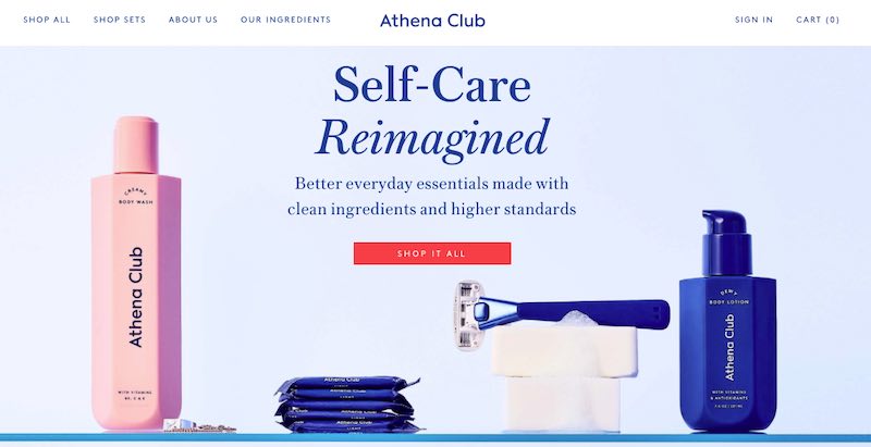
Athena Club
Focus: Personal care products.
Key elements:
- Navigation: Simple and visual
- Benefits: “Self-care Reimagined”
- Desire: “Better everyday essentials made with clean ingredients and higher standards”
- Call to action: “Shop It All”
- Mission: “Bringing you everything you need to treat your body right”
- Visual desire: Featured products for impulse purchases.
- Social proof: In-the-media mentions; customer reviews.
- Lead magnet: “Get 20% off your order” (newsletter sign-up)
—
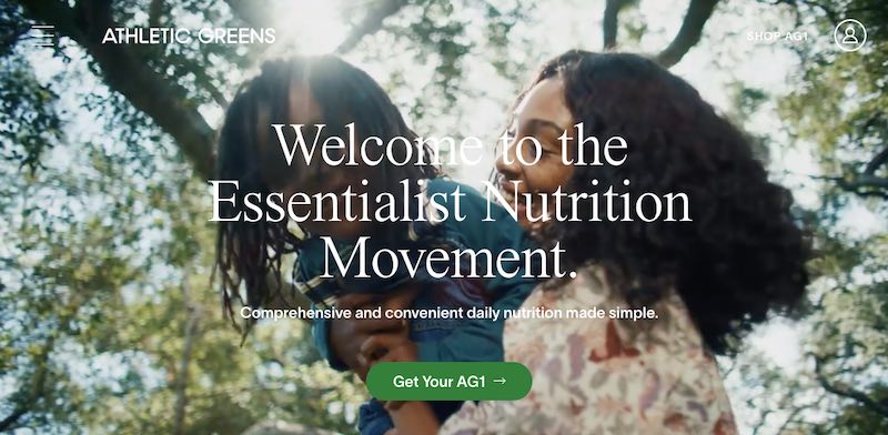
Athletic Greens
Focus: Daily nutrition made simple.
Key elements:
- Movement: Visual imagery to create action of like-minded consumers
- Benefit: “Comprehensive and convenient daily nutrition made simple”
- Call to action: “Get Your AG1”
- Address objections: “Quality ingredients… strictest standards”
- Social proof: Customer testimonials
- Community building: “Join us #LiveAG1”
- Lead magnet: “Join our newsletter”
Align with Objectives
Notice how social proof is outlined differently, in some cases more than once. Navigation also takes different forms, with some visually showcasing products while others prefer a discreet hamburger menu on the home page.
Some start with a short and simple benefit; others showcase the benefits graphically below the fold. The placement and visual representation of benefits depend on the website’s focus and products.
Some stores such as Speks and Wildgrain require more education to bridge the gap between the shopper and the purchase. Athena Club and Athletic Greens focus on removing objections by showcasing the ingredients used or avoided in their products.
Every step of the shopper’s journey has a purpose. It should align with the objective of your store. Furthermore, every page of an ecommerce site follows a story. That story has many stages, and each one has a purpose.

