
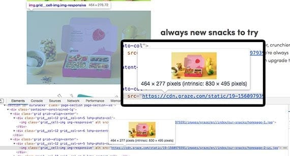
Product images on ecommerce sites are often larger than what’s required, unnecessarily slowing page load times. This image from Graze.com, for example, was about 75 percent too large.
Online retailers may have an image problem. In many cases, the images they need to sell a product are so large and so slow-to-load that they are driving shoppers away. Fortunately, a simple HTML attribute could significantly improve site performance and provide compelling images, too.
A product image is a selling tool for ecommerce merchants. To state the obvious, shoppers cannot touch or handle a product displayed on a website, so they rely on product photographs and descriptions to make a buying decision. Thus quality product photos can improve sales.
Those photos, however, could come at a cost. Shoppers are impatient. A bit more than half of mobile users, for example, will abandon a website if it takes longer than three seconds to load, according to a 2017 Akamai report.
That same report also suggested that “a 100-millisecond delay in website load time can hurt conversion rates by seven percent,” and “a two-second delay in web page load time increased bounce rates by 103 percent.”
Proper Size
The solution to (i) delivering a product image that looks great on screen and (ii) providing a fast loading website may depend on image size.
Consider an example from Graze, which sells healthy snack boxes via online subscriptions.
Graze. At the time of writing, Graze was using a few images to demonstrate its subscription service. But when displayed on a 13-inch MacBook Air, these images were significantly larger (in terms of resolution and file size) than what was required. The picture above was just 464 pixels wide on the screen but was delivered at 830 pixels.
The full image (830 x 495 pixels) was compressed and came in at about 81 KB with roughly 410,000 total pixels. But when that image was resized to 464 x 277 pixels, which is the display size, it was around 20 KB with approximately 128,000 total pixels.
This might not sound like much, but Graze had roughly 2 MB of images on its home page. If the relationship was constant between the delivered image size versus what was required, Graze could have reduced its home page image payload by 1.5 MB or 75 percent. That could significantly improve load times on mobile devices.
Graze does many things well. It is an excellent company. For example, Graze uses a content delivery network. It does a good job with image compression. Nonetheless, it could have reduced the size of the product image above by 75 percent and still delivered the same quality. It could have had beauty and performance.
Fred Perry. For a second example, consider Fred Perry, an online clothing retailer.
The Fred Perry site is using the HTML srcset attribute with its product images. Effectively, this HTML attribute offers a web browser several versions of the product photograph. It is providing the proper size image regardless of whether that image is displayed on a large screen or a small one.
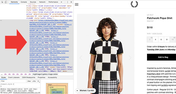
The Fred Perry site is offering the browser several product image options. These options are passed via the srcset attribute.
The srcset Attribute
The HTML srcset attribute is available to about 90 percent of internet users as it works with leading mobile and desktop browsers. The attribute’s purpose is to deliver the best possible image for a particular screen size.
<img src="product-400.png"
    srcset="product-200.png 200w,
        product-400.png 400w,
        product-600.png 600w,
        product-800.png 800w,
        product-1000.png 1000w,
        product-1200.png 1200w"
    alt="product name" >
In the example above, a browser that does not support srcset would simply use the src attribute and deliver the image specified. So while you might not get the best image possible, srcset will not break those old browsers.
The vast majority of browsers, however, would consider the screen’s width and resolution and then pick the best available image. For example, if the page were being displayed at 750 pixels wide, the browser would select the “product-800.png” image in most cases. The image would still be a bit larger than required, but it would be significantly closer in size than the 1,200-pixel version or the 200-pixel version.
For typical product-image implementations, this is all you need. What’s more, the process can be automated, although, depending on the ecommerce platform, it may require some development work.
In most cases, you would upload the largest image to your ecommerce platform. Then a script would create the smaller versions of the image and include them on the product detail page.
You could also include the sizes attribute if you wanted more control over which images are displayed at each screen size.
<img src="product-400.png"
    srcset="product-200.png 200w,
       product-400.png 400w,
       product-600.png 600w"

    sizes="(max-width: 200px) 200px,
       (max-width: 400px) 400px,
       600px"
    alt="product name" >
The sizes attribute allows you to direct the browser on which image to use at each breakpoint. Taken together, srcset and sizes are powerful tools for improving website performance.


 Hostinger Reframes Site-Free Ecommerce
 AI Visibility Scores Are Useless
 New Ecommerce Tools: July 1, 2026
 India Ecommerce Paths for Foreign Sellers
 New Ecommerce Tools: July 7, 2026
 AI Forces Affiliates to Innovate or Die
 SEO for AI, Low Traffic, No Clicks