A client recently attended a webinar where a presenter provided a list of the top search engine ranking factors. The client wanted me to confirm the list, or provide my own. I replied that I don’t waste time on preparing such generic lists. Besides, the list he was provided missed an obvious factor at play when searching from mobile devices: the proximity to the businesses nearby.
If you ask five reputable search-engine-optimization practitioners for their top 10 ranking factors, you would likely get five different opinions. Each one speaks honestly from her unique experience, but it might not be directly applicable to your situation. A decent amount of SEO work is hit and miss.
In fact, generic ranking-factor checklists have long outlived their usefulness. But instead of debating their merits, in this post I’m going to provide a solid, data-driven framework to learn which ranking factors and initiatives are applicable to your site, and what you need to do to systematically improve your organic search traffic, and sales.
A popular approach in SEO is to learn by reviewing top-ranking competitors. One disadvantage of this approach, however, is that you never have a precise view into your competitors’ strategies and tactics. Moreover, the metrics from competitive tools are not accurate, in my experience. (You can easily confirm this by comparing their numbers for your site with your analytics package.)
When you look closely at your site, you will likely find groups of pages that are more highly ranked than others. You can compare the SEO factors of those pages versus the less successful ones and use that learning to determine your best SEO strategy.
Optimal Page Length
For example, a common question I get from clients is: “What is the optimal number of words for my pages?”
The simple answer is that your content needs to be as long as necessary to help your audience. Generally, however, the more words on a page the better it will rank. In fact, we can group a site’s pages to see if the best performers gravitate towards a specific content length.

New users gravitate towards a 3K word count group.
On the Y axis, above, we have pages grouped according to their word counts — more than 0, more than 1,000, more than 3,000, and so on. On the X axis is the average number of new organic visitors.
The majority of pages on this site don’t have the optimal word count (around 3,000 words) as measured by actual performance: the average number of new organic visitors. This gives us a good reason to experiment by adding more content to the pages that don’t perform.
Another common question is about the length of the meta tags, such as titles and meta descriptions.

New users gravitate towards a meta description length of around 153 words.
On the Y axis I have grouped pages according to their meta description lengths. The X axis shows the average number of new organic visitors.
In this case, we can see that the optimal meta description to attract new visitors is 152.6 characters.
These analyses don’t necessary mean that increasing word counts and meta description lengths will increase search rankings. They simply mean that the pages that attract the most new visitors have these attributes. This is useful because it provides clear guidance on what SEO experiments to try.
Let’s review one final, slightly more sophisticated, example. After this, I will show you how to put these visualizations together.
I will use data from Google’s new, highly useful Index Coverage report that will be included in an upcoming upgrade to Search Console. The report is not yet available for everybody, but Google promises to make it available soon. The Index Coverage report finally enables us to see which pages Google has indexed, and also why other pages are not indexed.
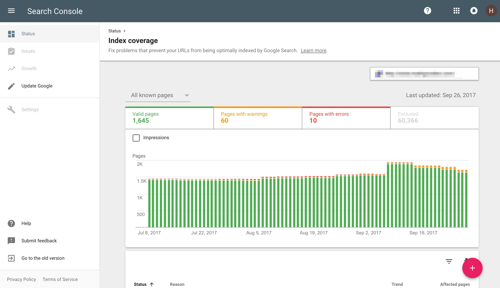
Google’s new Index Coverage report in the Search Console.
Google has a detailed help document that explains all the reasons pages get indexed — and why they don’t. But the report doesn’t tell you if the pages are not getting indexed because they lack inbound links or content.
It is interesting to see that the pages Google calls “indexed, low interest” have fewer words than the rest of the indexed pages. But when we look at incoming internal links, below, we see a more clear picture.
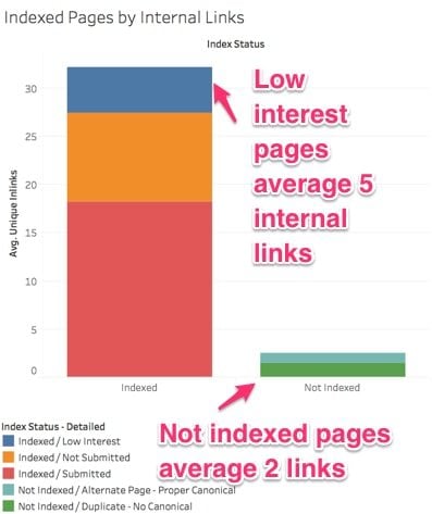
The number of internal links pointing to a page impacts its ability to index. “Not indexed” pages, on the right column, above, average just two internal links.
On the Y axis we have the average number of incoming internal links to the pages, and the X axis groups them in two: indexed (left column), or not indexed (right column). The colors break down the reasons why the pages are getting indexed or not in more detail.
According to this, the number of incoming internal links to a page is a major factor in whether Google drops the page or not from the index (for this site). This is a very powerful insight. If this site wants to have the most valuable, money-making pages indexed, those pages need to be aggressively interlinked.
Visualizing the Data
Now, I’ll explain my process of putting these visualizations together in a business intelligence tool — I use Tableau.
Step 1. Pull performance data from Google Analytics to get bottom-line metrics, such as traffic, conversions, engagement, and revenue.
I will use a handy Google Sheets add-on that makes it easy to query the Google Analytics API, and overcome any limitations in the user interface.
Create a blank Google Sheet, then go to Add-ons > Get add-ons > Google Analytics. After you complete the authorization step, you will see a pop up, as follows.
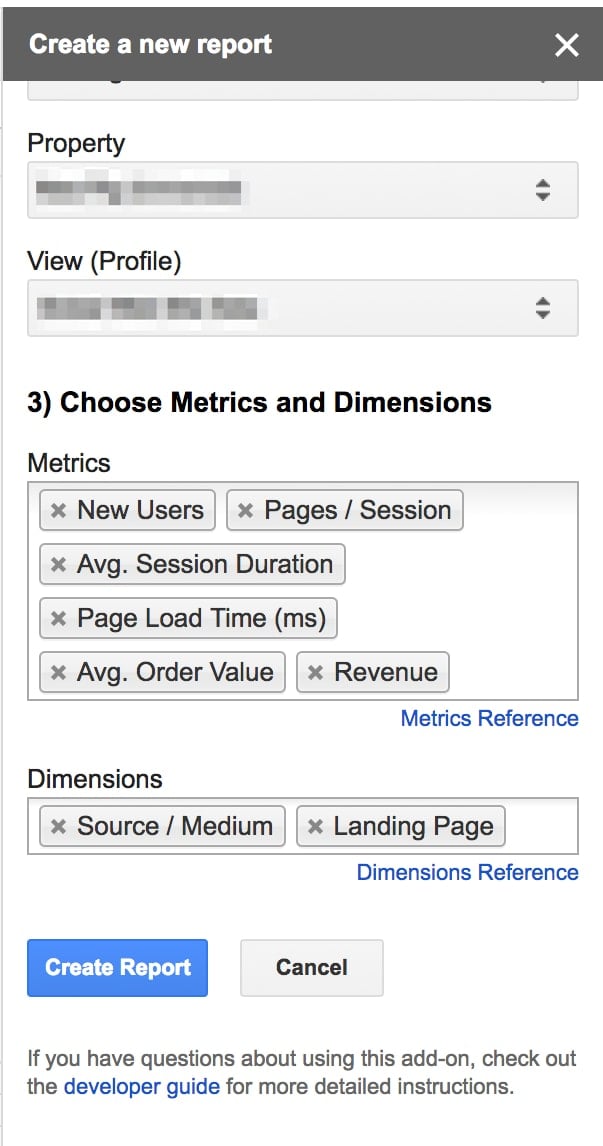
On Google Sheets, go to Add-ons > Get add-ons > Google Analytics.
Note the metrics (New Users, Pages/Session, Avg. Session Duration, Page Load Time (ms), Avg. Order Value, and Revenue) and dimensions (Source/Medium, Landing Page) that I’ve included, above. I like to add Source/Medium so I can confirm I am only looking at organic search traffic.
After you create the report, filter the traffic to only organic search, and also the date range to analyze. Use “Max Results” and “Start Index” to iterate over big data sets and pull all the data you need, overcoming the 5,000 row limit in Google Analytics reports.
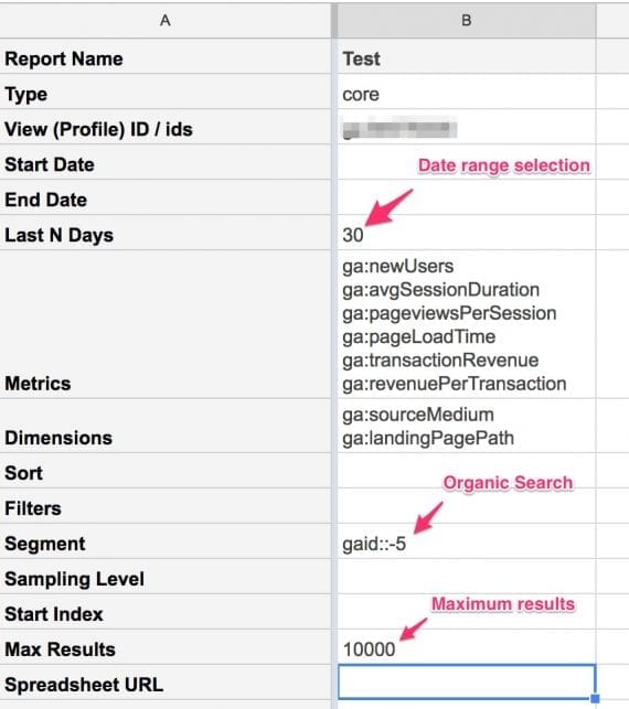
Use “Max Results” and “Start Index” to iterate over big data sets and pull all the data you need, overcoming the 5,000 row limit in Google Analytics reports.
Then go to Add-ons > Google Analytics > Run reports to get the data.
Step 2: Next, I’ll do some basic data cleanup to prepare for analysis.
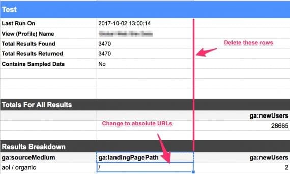
The values under ga:landingPagePath need to be absolute URLs. You can do this operation in a separate sheet, and copy the results back.
First, remove the informational rows 1-14. The values under ga:landingPagePath need to be absolute URLs. You can do this operation in a separate sheet, and copy the results back.
Step 3: Run an SEO spider, such as Screaming Frog, on the pages we pulled on Step 2 to get their SEO meta data.
Copy the updated column ga:landingPagePath with the absolute URLs to the clipboard.
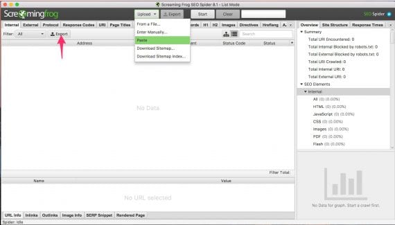
Paste the URLs you copied before and let the spider run to grab the relevant SEO meta data.
In Screaming Frog’s list mode, you can paste the URLs you copied before and let the spider run to grab the relevant SEO meta data.
Once the crawl finishes, click on the Export button. Upload the CSV file back to your Google Sheet as a separate tab.
Step 4: Next, we need to connect our datasets to our business intelligence tool. Again, I’m using Tableau, but you can alternatively use Google Data Studio or Microsoft Power BI.
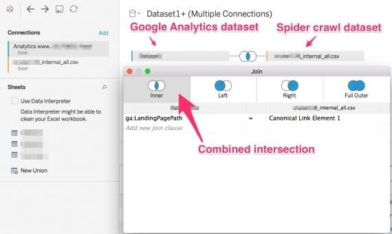
Use a business intelligence tool, like Tableau, to compare the two datasets and find the intersections.
I’m linking the two data sets by the common page URLs. In the Google Analytics dataset, the column is ga:landingPagePath. In the Screaming Frog spider crawl, it is the Canonical Link Element 1 column. If your site doesn’t have canonicals (it should), you can use the Address column instead.
Step 5: Finally, I’ll create a visualization.
For this article, the first visualization (above) is “New Users by Word Count.”
To replicate this in Tableau, drag and drop the “New Users” metric (called “Measure” in Tableau) to the Columns. Then, select the pull-down to change from the operation from the default summarization to average.
Next, right click on the metric “Word Count,” and select “Create > Bins … .” This will create a new dimension called “Word Count(bin).” Drag this to the rows.
Next, right click on the dimension “Canonical Link Element,” and select “Convert to Measure.” This will provide a count of the number of unique canonicals. Drag this to the color selector, and use a “Temperature Diverging” palette.
Finally, drag the “Status Code” dimension to the Filters, and check only “200” to filter out errors and redirects.
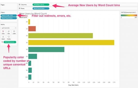
Replicating the “New Users by Word Count” visualization in Tableau. Assemble the visualization by dragging and dropping metrics and dimensions.
Follow these steps to replicate the other visualizations in this article. The last visualization, “Indexed Pages by Internal Links,” will require access to the new Index Coverage report, which Google is slowing releasing.
Recommended

Remembering Hamlet Batista
February 8, 2021