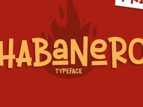
Fonts do more than convey text. They tell a story and align a brand and audience. The right font enhances user experiences and thus conversions.
There’s no shortage of compelling fonts and little reason to use those in default templates. Let’s look at a few examples in ecommerce.
Knotty Tie
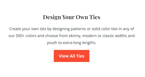
Knotty Tie combines a playful serif font for titles (Playfair Display) with a sober sans serif for readability (Open Sans), highlighting the brand’s playfulness and personality.
Knotty Tie
—
The Scribes
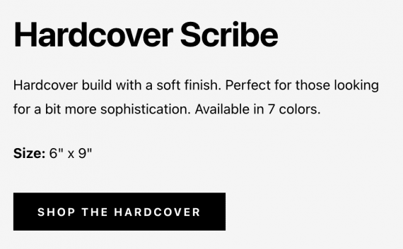
The Scribes sells printed journals. The site uses Apple System fonts to communicate innovation and minimalism. If a visitor’s computer does not have that font, the site defaults to the ever-readable Helvetica.
The Scribes
—
Leaf & Clay
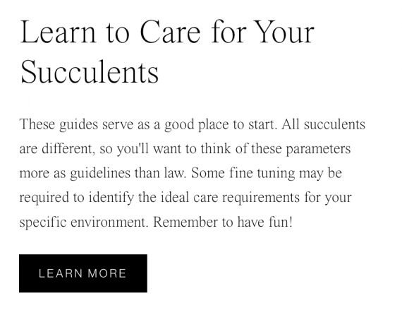
Leaf & Clay focuses on a sophisticated tall and thin serif font (Times Now Extra Light). It’s not the most readable, especially in smaller sizes, but it speaks to its audience of plant connoisseurs.
Leaf & Clay
—
Paravel
Paravel contrasts two rich fonts (Canela and Maison Neue) to highlight its uniqueness and sophistication while maintaining readability. While unexpected, this combination of a serif font for the headings and sans serif for the body works for this high-end luggage brand.
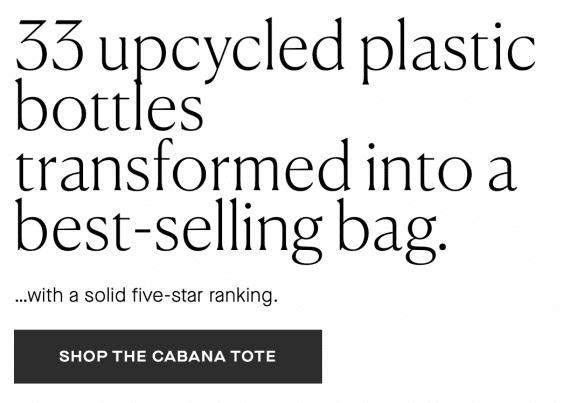
Paravel
—
Onewheel
Onewheel opted for a strong poster-like headline font (Mono 45) to align with its audience of younger motorized skateboard lovers. Paired with Favorit, a unique san serif, Onewheel makes a statement.

One Wheel
—
Everipe
Everipe sells ingredients for smoothies. The site uses Baloo, a comic font, even in buttons. Combined with Poppin, a fun and simple sans serif, the fonts convey informality.
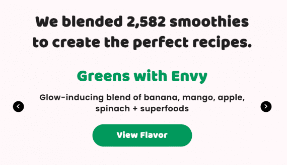
Everipe


