Designers have access to over 1,400 free-to-use fonts in Google alone — and the library is growing.
But access to new fonts is just the beginning of web design. Choosing fonts that increase communication or bring richness to a site can elevate the brand.
Communicate Your Brand
Strong, unique, simple fonts — or combining two or three — can convey a brand’s strength.
Consider the following ecommerce examples.
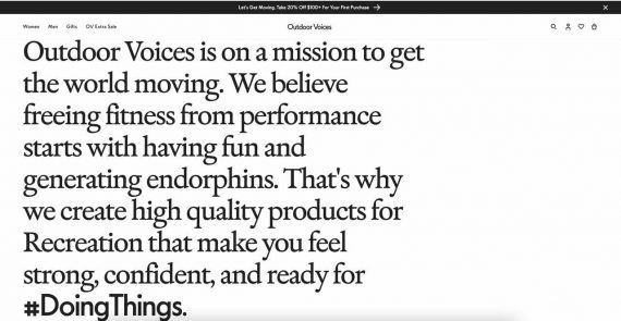
Use the mission as a visual asset. Outdoor Voices, an athletic clothing company, deploys a huge font to emphasize its mission to “get the world moving.” The visual impact places the mission as an essential part of the brand and entices potential buyers.

Outdoor Voices utilizes large, bolded font to convey its mission to “get the world moving.” Click image to enlarge.
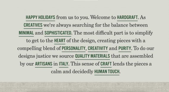
State the company’s core values. Hard Graft, a lifestyle accessory seller, does this beautifully by pairing two fonts in the same paragraph. The tactic, although unconventional, powerfully communicates the brand’s core values in all caps with a different color.
Convey sophistication with white space. Fonts don’t have to be bold and large to make an impact. By utilizing fonts at a smaller scale, Simone LeBlanc, which sells gift boxes, creates expansive white space that elevates the company’s sophistication and quality.

Simone LeBlanc uses expansive white space for a clean and sophisticated appearance. Click image to enlarge.
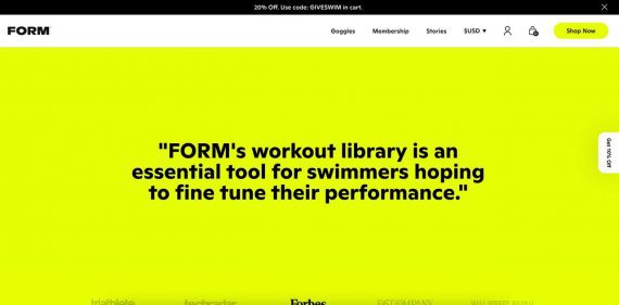
Elevate social proof. Form, a direct-to-consumer seller of swim goggles, utilizes a bold font to highlight social proof — testimonials from users. And it doesn’t stop there. The contrast between the black font and the neon yellow background, with plenty of empty space, validates the brand. It’s a visual show-stopper.
Align with Audience
The right font and layout align the brand with the audience. Choose fonts that are easy to read. Sans-serif fonts are typically more legible in smaller sizes and thus preferred for body copy. By paying attention to readability, hierarchy, and white space, you can create an attractive site that converts visitors into customers.


