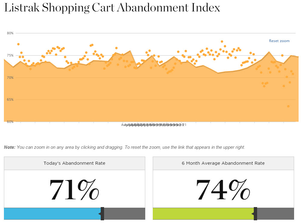
The average site’s cart abandonment rate this year was over 70 percent. That means, on average, less than 30 percent of shoppers who start to check out complete the process. While analytics can show you exit pages and actions, some things require user feedback, which doesn’t come easily.

Listrak, the email marketing firm, provides daily reports on cart abandonment rates from its client base. The abandonment rates for Listrak’s clients exceeded 70 percent throughout 2014.
While exit and feedback surveys may provide some insight as to why shoppers leave your site before completing the purchase, the majority of those users will leave quietly, never telling you exactly why.
Here are six changes you can make to the checkout experience to help soften the blow when it comes to asking for information and prompting them to pull out their credit cards. As with any site changes, you’ll want to pay close to analytics and conversion rates to find what works for your online store.
1. Don’t Require a Phone Number
Merchants often think that they need every customer’s phone number in case there is a problem with the order. However, the bulk of that data just sits there, without any need for access. Unless you’re selling B2B items, or your product line is expensive, custom made items, it’s better to give customers the option of being contacted by email or phone.
Online shoppers are becoming stricter about the information they want you to have, especially when there is concern over personal data being used for marketing purposes. If you’re concerned about losing a sale because you cannot contact a customer by phone, think about how many shoppers stop and ask themselves why they need to provide information you’ll likely never need to use.
Are you asking for two phone numbers? Some stores ask for a daytime and evening number. Consider why you need anything other than a number that will reach either a person or an answering machine.
2. Drop the Fax Number Fields
Some shopping carts, by default, insert a fax number field in the contact information. Ninety-nine percent of online stores do not need to collect this information (which the bulk of online shoppers don’t even have). It’s a wasted input that takes time for shoppers to skip over.
3. Say No to CAPTCHA
If your checkout process includes a CAPTCHA field, you’re more than likely losing orders as a results. If your system is looking for human confirmation to help combat the store becoming a testing ground for credit card thieves, there are other options, such as rejecting cards with mismatched CVVs and addresses, or locking out users after a certain number of attempts.
4. Display Only Applicable Shipping Methods
If customers need to read a list of shipping options to determine which ones apply to them, you’re creating confusion. U.S. customers should only see options for U.S. Customers from outside the U.S. should only see methods for their specific country. And none of these shoppers should ever see an option for “Gift Certificate Purchase – $0.00″ unless they’re actually purchasing a gift certificate.
If this applies to your store, look to a plug-in or customization to filter shipping methods or consider using shipping gateway plug-ins to handle all the work for you.
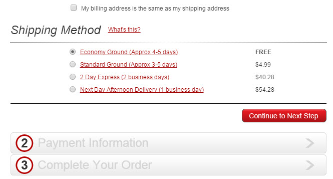
How many shipping options should they see? Don’t make customers think too much. If there is a free option, the bulk of them will not even look at other options, but when there are real choices, try to limit the available methods to five or less.
Help them decide. By including an estimate of delivery times you can help shoppers choose the right method.

Typically shoppers should see 3 to 5 shipping options, including ground and expedited options. If you offer methods from two or more carriers, consider which ones are ideal from each. Source: Guitar Center.
5. Simplify Credit Card Entries
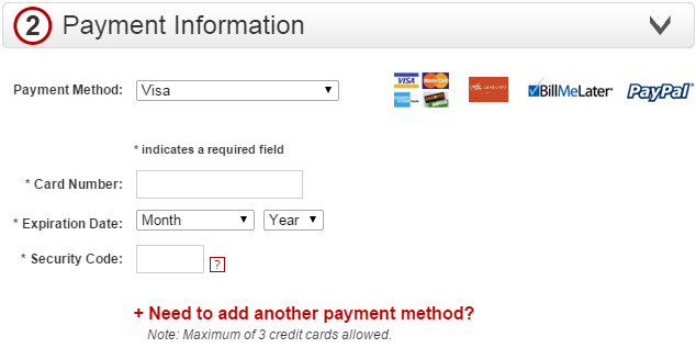
The average customer has to complete 4 to 7 fields for payment.
- Selection of card type.
- First name and last name (which may be two fields or a single field).
- Credit card number.
- Expiration date (typically two menus).
- CVV or CID.
The configuration of these fields is usually controlled by the payment gateway, but some gateways offer options. Ideally the shopper shouldn’t have to select the card type because it will be validated once the number is entered, and the name on card should be pulled from the billing address on the order.

Some gateways require the method be selected so it can populate the proper fields for cards and other methods (like PayPal). Check to see if yours does. Source: Guitar Center.
6. Eliminate Distractions, Including Navigation to More Products
If you have ever fallen victim to what I call “the YouTube trap” — when you click a link to a single video but all those recommended videos after the initial play suck you in — then you understand how important it is to minimize distractions during the checkout process. Be wary about offering upsells and add-ons that do not add real value to the order. Any prompts to “buy more” should be necessary accessories, highly discounted add-ons, or low-cost items so the order qualifies for free shipping.
While shoppers should be able to see what they’re ordering — and be able click a link to edit the shopping cart — this final process should be void of cross-promoting ads, category navigation and product spotlights.
When analyzing the checkout, remember, less is more. The less information you require, the more apt one is to place an order. And fewer distractions make for a speedier process.


