With the average attention span of online shoppers decreasing — reportedly, we now have no more than 8 seconds to inform web visitors of important details — the tried-and-true methods of navigation are changing.
For years, the most common way to present shipping details, guarantees, size charts, and other pertinent product and order information has been incorporating links and banners in site mastheads and navigation. We were careful not to stray from popular placements because it would confuse shoppers. The more we include in key navigation, though, the greater the chance shoppers will move on to other sites.
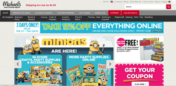
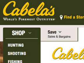
Michael’s navigation auto displays links to several sections and categories.
However, there are three main problems with using core navigation to spotlight storewide policies and features (like guarantees and returns information, and basket contents) and product descriptors (such as size charts and color options).
- They call attention away from more important details and links, like main categories and sales banners. In most cases, the more cluttered the navigation, the higher the bounce rate.
- They don’t always apply to all products, or are too generalized. For example, a store that sells both clothing and accessories shouldn’t use the navigation to link to a size chart page.
- They may link to pages that have high exit rates.
It’s important to list key features right on the product page, where shoppers can be instantly informed. By separating site banners and navigation, and product details, into two entirely different blocks, shoppers can use their 8 seconds to decide to either (a) shop the site via browse and search, or (b) learn more about a product itself.
Visitors landing on the site from another site’s reference list, or from email, typically scan the top of the page; those landing on specific products from search engines generally look at the item itself.
In short, both site navigation and product page elements must follow the attention span rule: Grab them fast, and don’t let go.
When it comes to products, address every question within a product’s page. It’s easy when you pretend there is no top navigation to guide them.
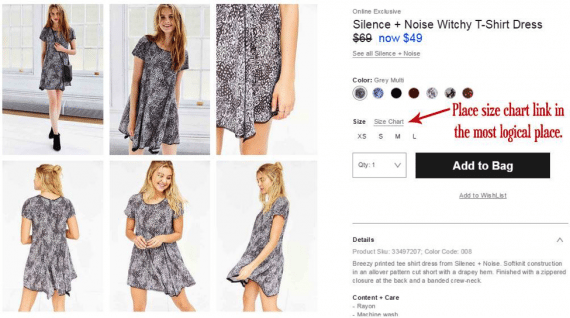
Linking to the appropriate size chart where the shopper selects the size is the most logical placement. Source: Urban Outfitters.
—
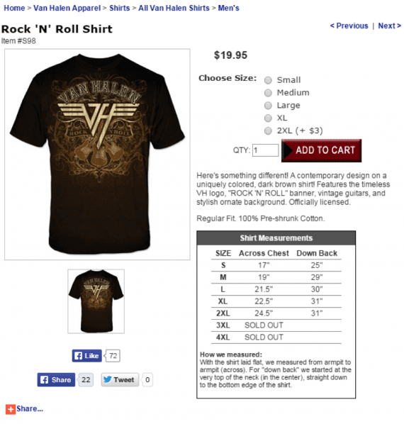
Van Halen Store’s product pages are simplified, and include the full size chart right on the product page.
—
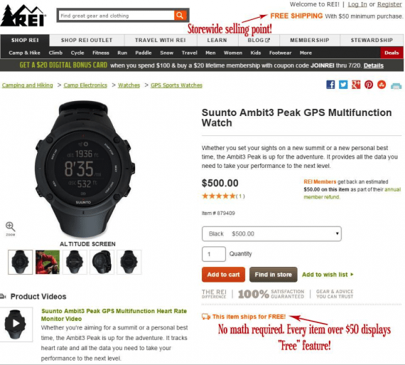
Remind shoppers of items that will ship for free due to their price. Source: REI.com.
Running a category-wide sale? Or a buy-one-get-one-free offer on a specific group of products? Be sure to hype the deal on each product page as well. This not only helps shoppers confirm which products apply, but those landing directly on product pages from search engines and shopping directories will also be aware of special offers not hyped in site-wide banners.

Target.com hypes any deals right on each product’s page. This includes buy-one-get-one sales, coupon discounts, and themed sales. Also included is a shipping message under “add to cart.”
—
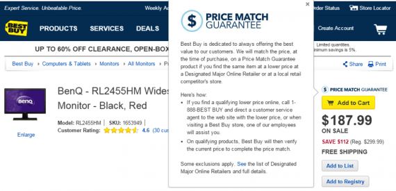
Best Buy reminds shoppers that it matches prices of other retailers.
The idea is not to move key information from the store’s header and footer, but rather to call more attention to anything that’s key to sell each product. Offer reward points? Tell the shopper exactly how much he’ll earn if he buys the item. Offer free gift wrap on certain types of products? Say so where it counts: within bullet points or near the add-to-cart button.
Where to Put Site-wide Links?
Sales and special offers — including coupons — should still be hyped in top navigation or in a right-hand column. Other elements, like size charts, returns and exchanges, shopping help, and privacy, go in the footer. Follow the rule that if it’s something shoppers may look for, put it in the footer. Features they must see go in the top. Anything that applies gets replicated on product pages.
Before moving items from the top to bottom, though, be sure to look at your analytics to see just how popular the links are. You’re looking for a low percentage of clicks, as well as linked pages that have higher than normal exit rates.
A heat map can also show which elements get clicked on most. But you’ll still want to analyze how those destination pages perform when deciding to keep them in the most prominent space.