
Ecommerce site navigation should help shoppers find products quickly and easily. Good navigation improves the online shopping experience and helps merchants increase sales and profits.
Website design includes a combination of user experience patterns, conventions, preferences, and branding. On the one hand, design should express the store’s personality and values. On the other hand, it should provide familiar and intuitive navigation that shoppers recognize.
Even relatively small differences in global navigation — i.e., the navigation that appears on most every page of a site — may significantly impact users and their ability to find products.
To improve ecommerce navigation, consider these seven suggestions.
Use Meaningful Labels
In most circumstances, the top level of ecommerce navigation should include a set of general product category labels. Often these are single words that describe a broad range of products.
Shoppers should be able to scan navigation labels and instantly understand what those labels represent within the store context.
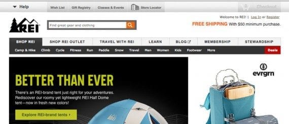
REI has easy-to-comprehend navigation labels, such as “Camp & Hike” and “Climb.”
As an example, look at the navigation for REI. The product labels first describe activities REI shoppers might participate in, like camping and hiking, climbing, or cycling. Further down the navigation bar, the labels change when it makes better sense to describe a condition or the person who might use a product, resulting in labels like “Men,” “Women,” and “Kids.”
List and Re-list Subcategories
Product categories are often arranged in a hierarchy that moves from the general to the specific. It is possible, however, that some products might naturally appear in more than one hierarchy.
On Build.com, the top level of product navigation includes a label or category for bathrooms and a label for lighting. However, the subcategory, “Bathroom Lighting,” appears under both “Bathroom” and “Lighting” since a shopper could reasonably assume it would be in either parent category.
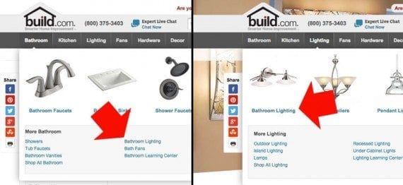
Build.com places some subcategories in more than one hierarchy when it makes sense.
Make Top-level Navigation Clickable, Tappable
Many website designers discourage hover-based navigation, as well as dropdown or flyout menus, for a variety of reasons. But on ecommerce sites with many products and product categories, these sorts of mega menus are still common.
There is, however, a subtle difference that can make these more effective: Make the top level of the navigation a link.
In 2013, the Baymard Institute conducted a survey of ecommerce sites, ranking sites for user experience on the home page and category pages. One of the survey’s findings was that shoppers expected the top level of a dropdown or flyout menu and any headings in that menu to be active links.
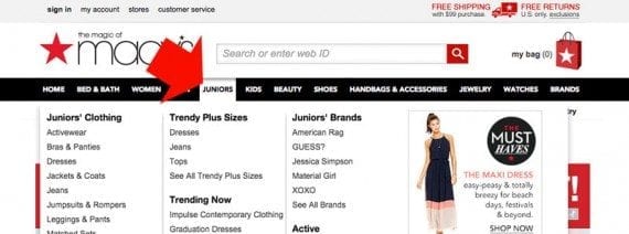
Top-level navigation labels are active links on the Macy’s website.
On the Macy’s website, as an example, the top-level navigation labels are links to category landing pages. When a shopper clicks “Juniors,” for example, she gets the expected result, a juniors’ landing page.
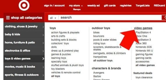
Headers in the Target flyout menu are links too.
Similarly, on the Target website, headers in the flyout navigation are links, too. So a shopper looking for video games in general can click the “Video Games” header and get a video games’ category page as expected.
As obvious as this might seem, relatively few sites actually make top-level labels and headers actionable links. REI has both, making the user experience simple and easy.

REI makes top level labels and dropdown menu heads active links.
Follow Design Conventions
Although it might be fun to generate a unique and unusual form of website navigation, for ecommerce it is often best to follow common design and navigation conventions.
With this in mind, navigation should either be at the top of the page or, for sites featuring left-to-right reading languages, on the left side of the page.
Placing global navigation at or near the top of the page is a common and familiar pattern that may help shoppers.
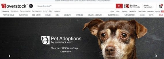
Overstock.com, as an example, uses a long navigation bar at the top of the page — where many shoppers would expect to find it.
The Home Depot website uses side navigation. Again, this is a common convention that shoppers will easily recognize.
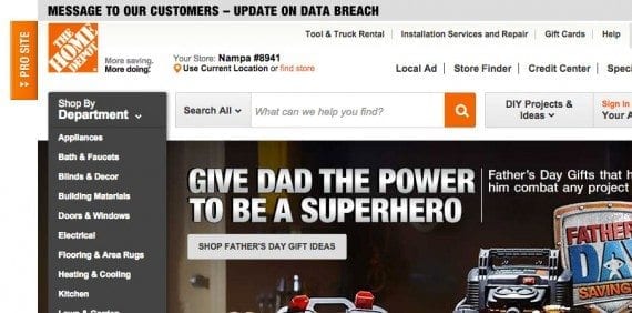
Placing ecommerce global navigation at the side of the page also follows a common pattern that shoppers will recognize.
Similarly, hidden menus, which are sometimes called hamburger menus, are also widely recognized on mobile, laptop, and desktop devices.
Google’s store uses hidden menus on all screen sizes, and for both profile access and product navigation on relatively smaller screens.
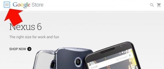
The Google Store features a hidden menu on all screen sizes.
Include Search
Search is one of the most important tools for ecommerce site navigation. It should be included at or near the top of every page on a site.
On the L.L.Bean website, there is large and obvious search form on every page. At any instant, a shopper can simply search.
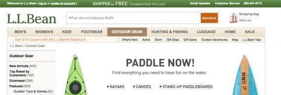
It is important to add an easy to see and find search form.
Mention Sales, Discounts, and Specials
Some shoppers will respond to special offers and sales. It can be a good idea to mention these in an ecommerce site’s global navigation.
On the Cabela’s website, for example, there is a “Save” label available from anywhere on the site. The label opens a dropdown menu that shows offers, and repeats the primary special from the home page.

Discounts and special offers are easy to find on the Cabela’s site.
Offer Content
Content marketing that seeks to build lasting relationships with shoppers has become an important part of operating an ecommerce business. The idea is that if shoppers find a store’s site or social media channels generally useful, those shoppers will be more apt to buy from that store, even if the prices are slightly higher.
With so much upside, consider including a link to content directly in global navigation.
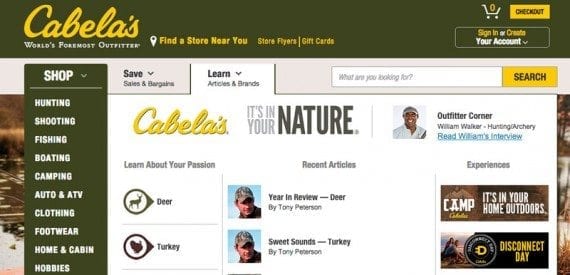
Cabela’s places a “Learn” link to its content marketing front and center in its global navigation.
The Cabela’s website features content in its global navigation in the “Learn” link.
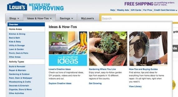
Lowe’s offers site visitors useful content directly in the global navigation.
Similarly, the Lowe’s website features “Ideas & How-Tos” directly in its global navigation.


 Hostinger Reframes Site-Free Ecommerce
 AI Visibility Scores Are Useless
 New Ecommerce Tools: July 1, 2026
 India Ecommerce Paths for Foreign Sellers
 New Ecommerce Tools: July 7, 2026
 AI Forces Affiliates to Innovate or Die
 SEO for AI, Low Traffic, No Clicks