Editor’s Note: This article was originally published by Web Marketing Today. Practical Ecommerce acquired Web Marketing Today in 2012. In 2016, we merged the two sites, leaving Practical Ecommerce as the successor.
Contact pages on websites are where businesses typically drop in the phone number, email address, and perhaps a contact form. Often treated as an afterthought, contact pages deserve more attention since they serve as a:
- Consumer resource for contacting key personnel;
- Lead generation touch point;
- Trust generating focal point.
When used for lead generation, contact us forms serve two purposes:
- A simple way to provide contact information;
- A way to qualify leads.
Below are fifteen examples of contact pages designed to inspire you to improve your pages and increase engagement.
Editor’s Note: Some of the contact page images have been abbreviated, due to length. Click the image to access the full page.
Specialized Contact Pages
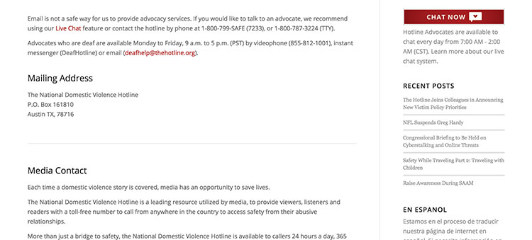
Domestic Violence Hotline. The National Domestic Violence Hotline’s contact us page serves a specific consumer audience where safety is a legitimate concern.
The contact us page states, “Email is not a safe way for us to provide advocacy services.” Instead, the contact page includes phone numbers to advocates who work with hearing and deaf individuals; live chat is also available. In the sidebar is a place where Spanish-speaking individuals can switch the site’s language.
Talent Agency. For actors or people in industries that utilize submissions, a submission form is an appropriate substitute for a “contact us” form. The Boutique Talent Agency in Spring, Texas, includes a page that provides advice, submission guidelines based on media and experience, and an FAQ addressing many of the questions the agency fields when called.
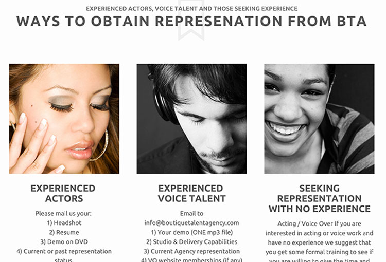
BTA uses different contact methods based on skills and experience.
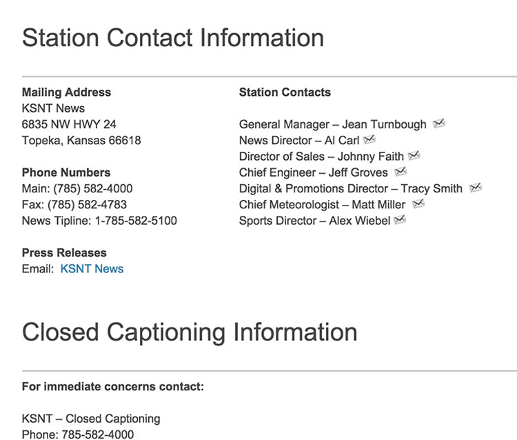
Media — Newspapers, Radio, Television. Providing information that consumers seek is one of the primary purposes of the contact us page. For news organizations, information on the station itself, its key personnel by department or responsibility, and contact information required by regulatory agencies are a best practice.
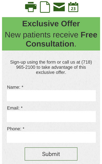
Mobile Sites and Google Maps. Contact pages are now often viewed on mobile devices. Businesses need to make sure their contact page is thumb-friendly and that their Google My Business information is accurate and complete.
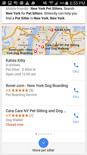
Pet sitters shown on Google My Business at the top of search result pages.
Local Business Examples
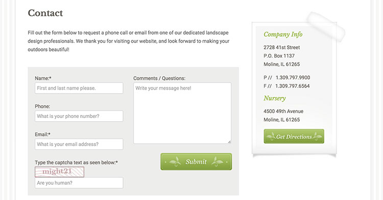
Moline Illinois Landscape Design. Heritage Landscape Design uses a clean, simple design with its contact form. The text above the form is professional and friendly. Contact information is located in the right-hand column.
Brooklyn Moving Company. Many current web design templates make contact us pages almost unnecessary. Dumbo Moving + Storage uses a header and footer as its “contact page” on every page of the website.
The header contains the company’s name and phone number, eight social media accounts, and the Better Business Bureau Rating. The footer has a map and contact information including phone, fax, address, email, and website.
Minneapolis Restaurants. Minneapolis restaurant, The Pourhouse, uses its contact page to provide hours of operation, location, main personnel, and to promote upcoming events. At the end of the contact list is an item, Street Team, which includes an email address for brand advocates.
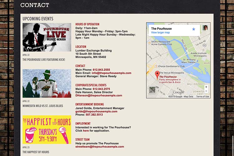
Contact us page used to promote the restaurant, events, and to enlist brand advocacy.
By contrast, another Minneapolis restaurant, The Kenwood, uses the contact us page to promote its personality and brand with imagery and clever writing.
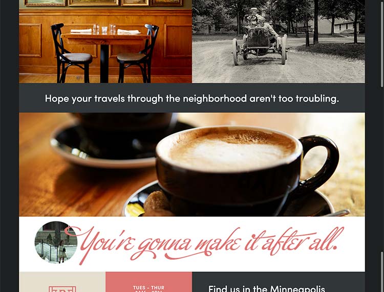
Contact page reinforces the restaurant’s brand and personality.
The beginning line of copy is, “For cartographers we’re easy to find. Other might employ navigation.” The Kenwood ends the page with the famous Minneapolis catchphrase, “You’re gonna make it after all.”
Multiple Location Contact Us Pages
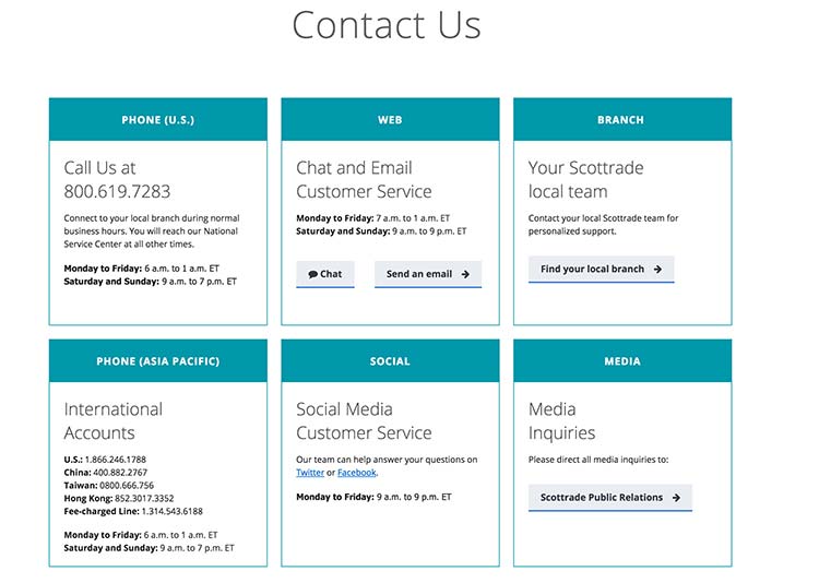
National Brokerage Firm. This page focuses on the contact information for the Scottrade headquarters and provides a method for visitors to find their local branch. It also includes major categories for web, Asia Pacific phone information, social media customer service, and media inquiries.
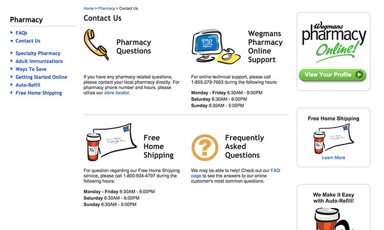
Pharmacy Retail Chain. Wegmans Pharmacy, located throughout the East Coast, features pictures on its contact page. The images provide the consumer with a page that is easily scannable and answers questions regarding the pharmacy, home shipping options, online support, and auto refills.
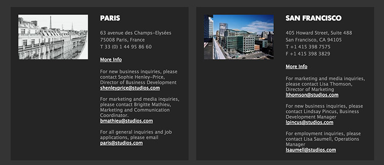
International Architecture Firms. Studios Architecture has offices in four US and two international cities. On its website, the company includes contact information for each city along with role specific email addresses for media, marketing, business, and employment inquiries. Additional location and people profiles are provided when users click the “More Info” link.
The architectural firm Grimshaw has one office in the US and four worldwide. A world map shows the company’s office locations that, when clicked, direct visitors to a Google Map.
Lead Generation Contact Form Pop-Ups
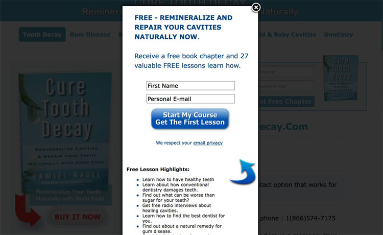
The author of “Cure Tooth Decay” uses a contact us form to handle a multitude of tasks, including ways to buy the book, media contact information, and customer testimonials. Once the visitor has been on the contact page for approximately thirty seconds, a pop-up offer appears that allows subscribers to get a free chapter of the book in exchange for their first name and email address.
Long Contact Forms
Long contact forms are common on contact us pages, for two reasons:
- To qualify the lead before returning the email or call;
- To provide the best service and answers to the consumer.
As you can see in the form below, the site’s visitors are asked to fill out a long form, three columns wide. Conversion rates tend to be higher with a shorter form. Testing forms is a recommended best practice.
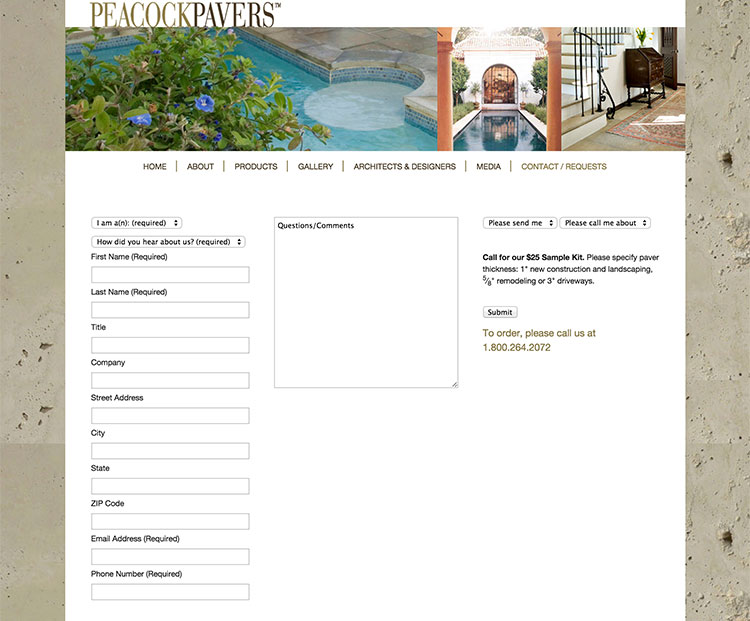
Peacock Pavers uses a long contact form, three columns wide.

