A great retail site design is aesthetically pleasant; it reflects current trends; and it includes the best and often latest in functionality. When these areas are ignored the resulting design can be downright sinful — even harmful to the bottom line.
To some extent, site design is subjective. One visitor likes tangerine orange. Another visitor hates tangerine orange. But this does not mean that anything goes. How a site looks and behaves affects how visitors trust the site, how they find and learn about products, and ultimately what those visitors decide about making a purchase.
Site design is also not static either. Trends in color, font, layout, and features change all of the time, and these changes impact customer expectations. In 2008, almost none of a retail site’s visitors expected the site to render well on a phone. But in 2013, a significant amount of retail site traffic will be from mobile devices and those mobile visitors are going to expect the merchant to be ready for them.
In 2013, there are, perhaps, five unforgivable retail site design sins. If your site is guilty, it may be time for an update.
1. You Didn’t Consider Mobile
Forrester Research has predicted that mobile commerce sales will reach $25 billion in 2013. Although smartphones like the Samsung Galaxy III and tablets like the iPad do a great job of rendering desktop-only websites, users deserve a mobile-specific shopping experience.
In 2013, this means that it is a sin not to have a responsive site design that reacts to the user’s device or a site that is built specifically to render on small screens.
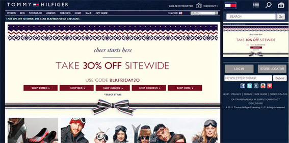
Tommy Hilfiger’s American site responds to the size of the device.
2. You Have a Poor Checkout Experience
Imagine the customer’s disappointment. After 20 minutes of debating whether or not her sister would look better in the blue blouse or the brown one, the shopper encounters forced registration, a 50-field checkout process over five web pages, and is only offered one payment option.
What’s more, each time the form validates it empties the various and scattered fields, forcing the shopper to reenter her billing address, shipping address, name, and payment information.
The checkout process should be secure, simple, and fast. Anything else is sinful.
3. You Have Small and Few Images
Photographs and videos are the best ways that online retailers can present products to site visitors. Remember the old saying, “a picture is worth a thousand words.” So in an era when there are plenty of ways to optimize photography, employ content delivery networks, or even serve different images based on the device, there is no excuse for tiny images or, worse yet, no product images.
As a rule, provide several large images and a zoom option on every product detail page. In retailer website design, not having lots of great photography is a sin.
4. You Forgot to Keep it Simple
If not having good product and lifestyle photography is a sin of one extreme having a complex, graphics-heavy retail site with confusing navigation, weird icons, or “unique” layouts is the sin of the opposite extreme.
The purpose of a retail site is to present product information in a way that helps visitors make an educated buying decision. Choose a design that is both attractive and simple.
5. Your Fonts are Tiny and Old
There is, perhaps, a popular myth that most, if not all, online shoppers are young hipsters rocking iPads and sipping soy lattes. But increasingly online shoppers include less computer savvy users, some of which might benefit from larger, legible fonts.
In the past, the web was limited to a small set of “safe” fonts that were used sparingly at 10 or 12 points. But now, designers may use any of ten thousand fonts and fearless make them large. Don’t commit the sin of having tiny text.


