Years ago online popups were the way to gain someone’s attention. Today many internet users employ popup-blocking tools in their browsers. Many users close popups and overlays before reading them.
A popup is a new, smaller window that typically requires interaction to make it go away — such as clicking an X. Popups generally appear as a result of clicking on a link or button. They’re also used on page loads to serve up promotions.
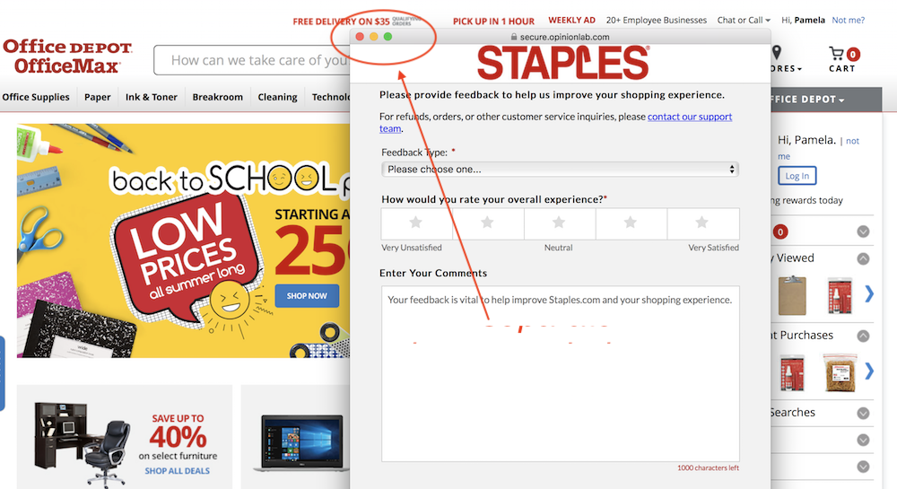
Many browsers will automatically block popup windows unless the user specifically wants to open them.
Because popups are often used to serve alerts and ads, most modern browsers include a popup block setting, and some have it activated by default.
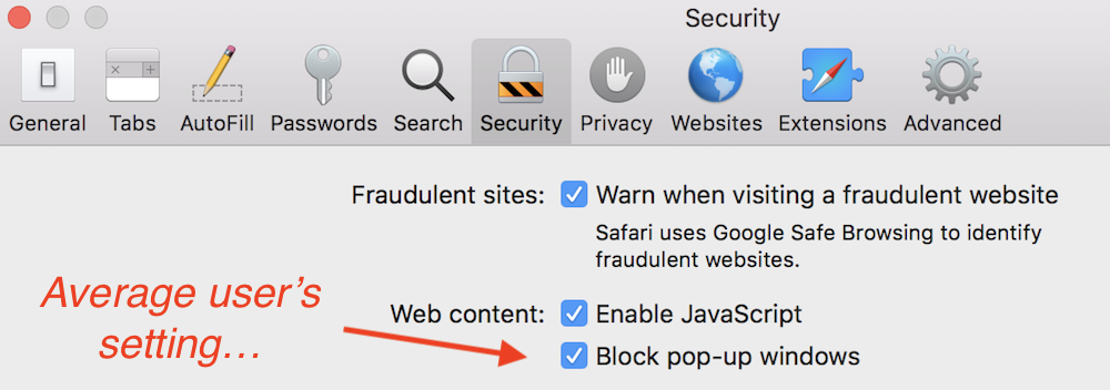
The average user can’t see popup windows.
A popover (also known as an overlay, a modal, or interstitial) is part of the actual web page. Good popovers close automatically when the user clicks elsewhere on the page. Ideally, they are configured to appear based on a visitor’s actions. For example, you can display an email signup form when the visitor has scrolled down half the page and has been on the page for 20 seconds.
Popovers are not generally blocked, giving you a better chance of the content being seen.
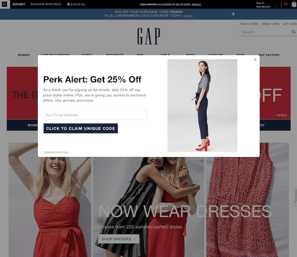
The most common popover asks for an email address in exchange for a coupon.
Using popovers and overlays can boost conversions, but there are things to consider when implementing them.
5 Things to Consider for Popovers
Proper timing. In the example above, Gap’s home page loads the popover upon page load. It is the first thing a visitor sees, as it covers the site’s navigation. Big, popular brands can get away with this because of their social proof. But interrupting the process can have a detrimental effect on smaller stores. Instead, configure these to display based on a shoppers action or anticipated intent, after a set amount of time.
Placement. Page-load popovers should never obstruct the site’s logo and core navigation. This is why intent configured overlays work better when they slide in from the bottom of the page.
Content determines effectiveness. There may be special messages you want to get across. Overlays, though, should be relevant to the shopping session. For example, if the shopper is looking at coffee makers, don’t waste his time with a popover promoting a garlic press. This is why most sites reserve popovers for email signups, coupons, and key messages about shopper benefits.
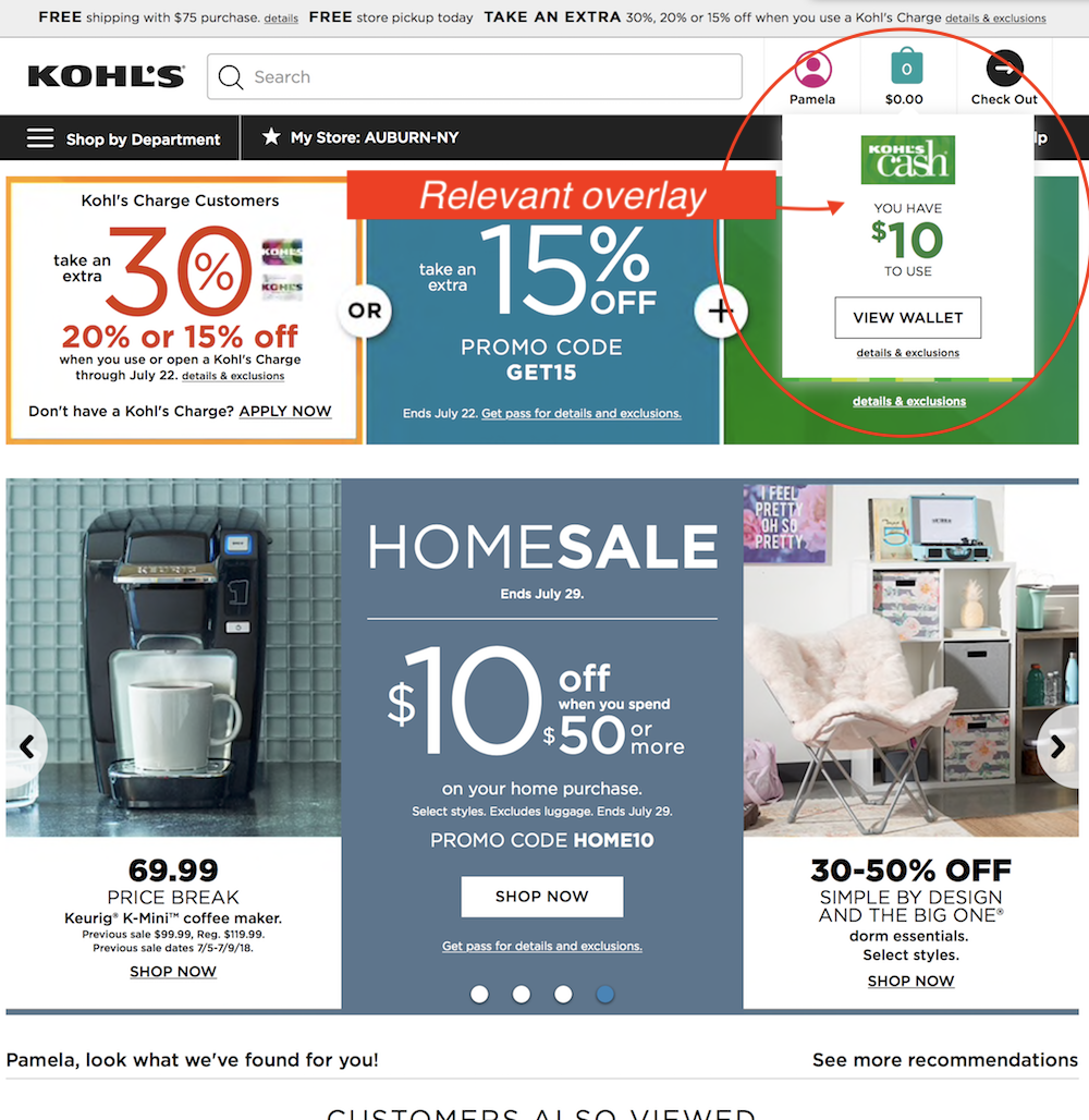
Kohl’s informs customers of available Kohl’s Cash.
Ease of closing can save the session. While some shoppers will leave a page whenever a popover appears, some leave out of frustration. Best practice calls for popovers to close whenever you click outside of the block (on the content beneath it) as well as when the shopper clicks an “X” or “CLOSE” button. All overlays should include a large, obvious close button regardless.
Timeout period. No one wants to be harassed about registering for a mailing list or creating an account. Be sure to configure popovers to display either just once, or once per number of visitors or period. Even better, use a tool that relies on user-specific data to either display or suppress forms and announcements.
A Nuisance?
None of the above is meant to convey that popovers are necessary. If you can get away with not using them, you’ll boost visitor happiness. Analyze visitors’ actions taken on popovers and on the page when they display. That might tell you if they’re a nuisance.


