Offering a compelling ecommerce experience to B2B buyers requires a process of continuous improvement. It can be helpful to examine other B2B ecommerce sites, to learn. Grainger and Amazon Business are often cited as leading examples. Both companies have invested heavily in getting commerce right. But there is also value in learning from smaller, innovative B2B companies.
In this post, I’ll address six impressive, independent B2B sites.
Curbell Plastics
Curbell Plastics, a fabrication company, helps buyers narrow their choices by showing the shape of the product they are looking for. Using shapes in the reductive navigation is an interesting way to assist users to find what they are looking for.

Curbell Plastics shoppers can sort by shapes and materials.
—
The Curbell Plastics site works well on mobile — the phone number and hamburger menu are helpful, too.
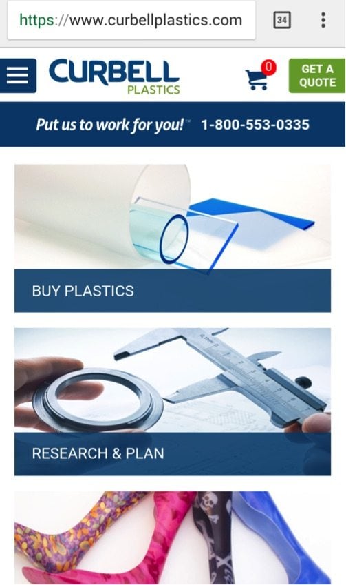
Curbell Plastics is optimized well for mobile with a clean layout.
—
The “Shop by Shape” feature is also presented at the top of the mobile screen, simplifying the shopping process for buyers.
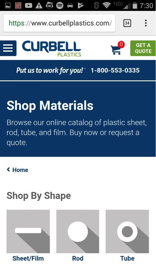
“Shop by Shape” is at the top of the Curbell Plastics mobile site, helping buyers to quickly narrow down what they’re looking for.
—
Also, Curbell offers suggestions to save money, such as avoiding pallet charges. This helps buyers build confidence in the company.
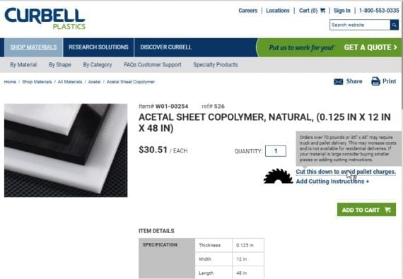
Curbell Plastics offers shoppers options to avoid extra charges, helping to build confidence in their brand.
3DXTech
3DXTech, a 3D printing company, uses an exit popup to solicit a visitor’s email address. The initial reaction from business owners regarding popups is often negative. But done well, popups are highly effective, converting a visitor into a marketing contact.
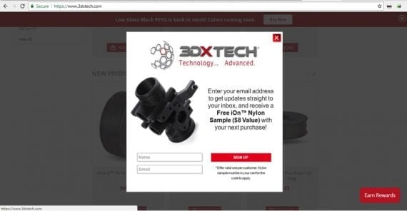
3DXTech has a popup that offers a free sample in exchange for the shopper’s email on their next order.
3DXTech displays a top banner highlighting a product in stock. With the right message, a persistent top banner can be a strong tool — especially if it’s tailored to a search ad or marketing campaign.
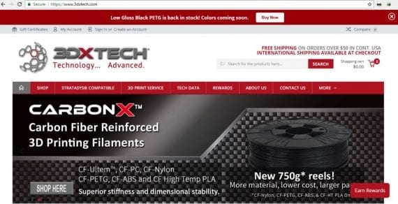
3DXTech has a banner at the top of their site highlighting a product that is back in stock.
—
3DXTech also has a rewards program for social shares, reviews, and other user mentions.
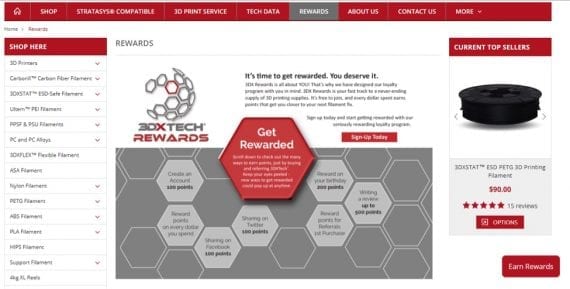
3DXTech offers a rewards program where you can earn savings by sharing on social media, on your birthday, and by other means.
3DXTech is innovative, but its site overemphasizes red. The company should use red only on its conversion points, or should consider another color to visually highlight conversion points.
Warehouse-Lighting.com
Warehouse-Lighting.com offers a preferred contractor program, which includes a dedicated rep and sales leads to contractors that sign up, in addition to special discount pricing.
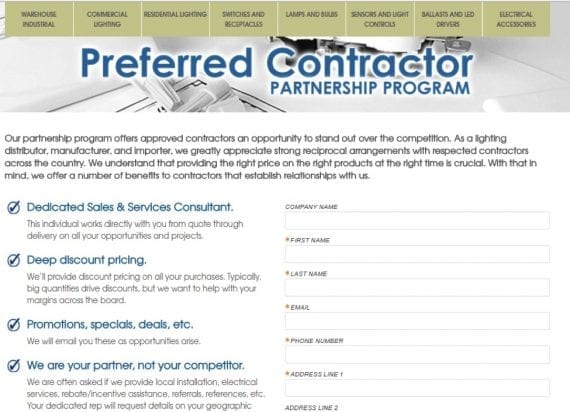
Warehouse-Lighting.com’s preferred contractor program includes materials discounts and sales leads, among other benefits.
Warehouse-Lighting.com’s top navigation clearly describes the company’s products — “industrial and commercial lighting at wholesale prices” — and provides quick access to the phone number and live chat.

Warehouse-Lighting.com has a clear top navigation with the phone number and company purpose clearly visible.
—
Warehouse-Lighting.com displays product reviews using Shopper Approved, a reviews platform.
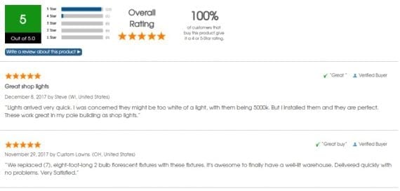
Warehouse-Lighting.com shows product reviews using Shopper Approved.
Sterlitech
Sterlitech, a producer of membranes and filtration products, uses a popup to help users find the correct products, which are extensive.

Sterlitech uses a popup to help guide shoppers towards the right options.
Sterlitech’s blog offers helpful content. The company is committed to building a community. The blog posts include detailed comments, with replies by engineers at Sterlitech.
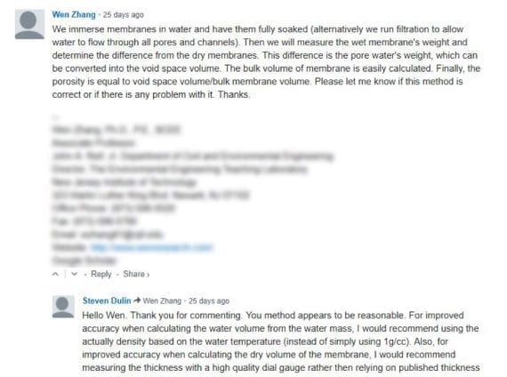
Sterlitech engineers offer detailed responses to user questions on the company’s blog.
—
Sterlitech’s mobile site is nicely effective. The company’s phone number is prominent throughout, and the user interface is easily clickable for thumbs.
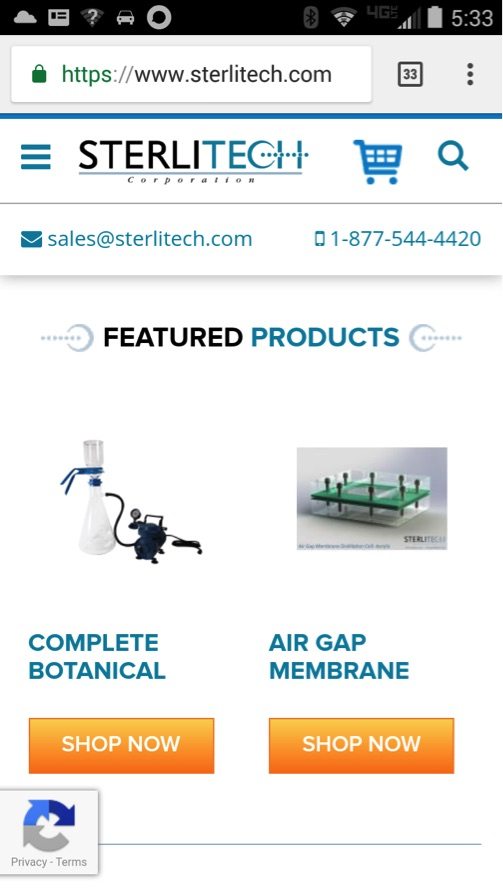
Sterlitech has a nice mobile user interface with elements that are easy to press with thumbs.
Scilogex
Scilogex, which sells lab products, uses color to draw users to conversion points.
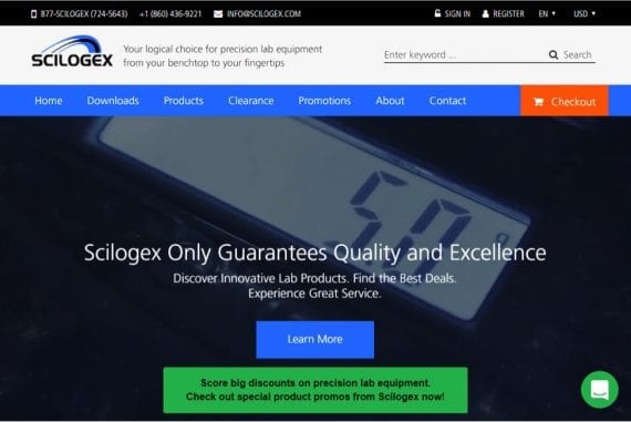
Scilogex has an appealing website that uses color to draw shoppers to the conversion point.
Orange leads buyers towards conversions and a secondary color, such as green, is used for additional actions.
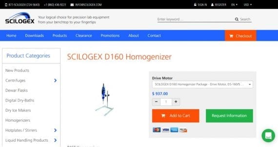
Scilogex uses orange to draw buyers to the conversion point and other colors, such as green, for secondary actions.
Smalley
The website for Smalley, a manufacturer of industrial steel rings, doesn’t lead to a paid checkout, but, instead, to a request for quote. The site includes resources, such as videos and how-to guides, that help buyers select the correct products. Buyers can also search for different types of retaining rings and springs before they request a quote.
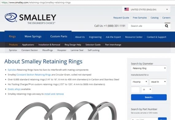
Smalley has resources, such as how-to guides, that are tailored to target customers.
Smalley’s capable mobile site includes the phone number in the header and the product search at the top of the home page. The buttons could be a bit bigger for those of us fat-fingered users.
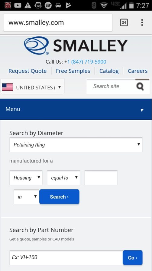
Smalley has a clean mobile page, but the buttons could be a bit bigger.


