
Most conversion articles focus on a store’s product pages. After all, those pages are most visited by search engine spiders and internal search results. Customers who browse, however, use category pages, and those customers need buying nudges, too.
Every store needs conversion-ready content on category pages. This means category pages should be built with both search engine optimization and shopability in mind.
10 Improvements to Category Pages
Here are 10 ways to help make your store’s category pages promote purchases.
-
Descriptive header. Include a header that explains the type of products the shopper will find on the page. Keep it short and keyword rich, as this also helps with SEO. Try to keep the header to four lines or less. Integrating graphics will make it more powerful.
-
Category-wide sales. Offer category-wide sales rather than limiting it to products. By offering a discount across all products in a category you simplify the process. Shoppers won’t have to think to look for specific products on the page, which increases the chances of multi-product purchases.
When offering these types of sales, a simple, yet colorful banner ad sends a clear message. A typical banner would include the text: “SAVE 20% ON ALL ACCESSORIES.” Be sure to disclose when the offer ends and any restrictions. Link the banner to a page or pop-up if you need to relay more in-depth information.
-
Offer sorting options. Allow shoppers to sort products within categories by name, price and entry date (newest-to-oldest). If customers often shop the store by SKU or product code, offer that option as well.
-
Adjust pagination. If you paginate products (displaying a set number of items per page), include the option to adjust how many products load on each page. Typically, categories are paginated at 12-20 items per page. By giving shoppers the ability to display, say, 40 per page, you put them in control of the speed of the page (because the more products on a page, the longer it takes to load).
-
Include page numbers. Besides “Next” and “Previous” buttons, multi-page categories should include linked page numbers. All page numbers should be displayed like this:
1 2 3 4 5 6
They should not be displayed like this:
1 2 3 … 7 8 9.
This makes it easier for those who return to the page later (less clicks to get to pages 4, 5 or 6).
-
Display more than one featured item. Unless you’re selling the one, all-important, got-to-have product (like an iPad), you should be featuring more than one product on landing pages. By offering options the page will appeal to a much broader audience.
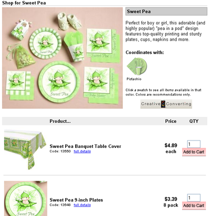
Example of displaying products one per row when displaying products by theme.
-
Utilize subcategories. Use subcategories to help shoppers narrow selections. If you assign dozens or more products to a category, cross-categorizing those products into subcategories will help shoppers quickly reach specific types of products.
-
Provide additional information. Display “Details” or “More Info” buttons. Whether or not shoppers can add items to their carts from the category page is dependent upon the items you sell. Products requiring the customer to peruse details (by forcing the purchase from the product page), as well as products that can be purchased from the category screen should include a directive for them to view more. Don’t rely on what’s obvious to you, because plenty of new users won’t notice they can click on thumbnail graphics or product names.
-
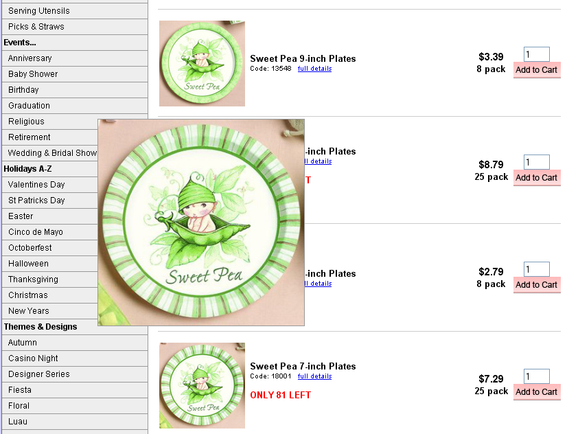
Watch the layout. Use the best layout on a per-category basis. One of the biggest myths of the category page is that you must always display products in columns. The most common layout is three products per row, but this isn’t the ideal layout for everything.
Categories featuring products that follow the same theme (like SpongeBob party supplies), or single products that come in various colors (such as balloons or paper plates) should use a quick-list format. With this layout, each item is in its own row and the customer enters the quantity desired on the same row. The layout can include an add button on each line, or a single add to cart function at the bottom of the page.
-
Allow for zooming or enlarging thumbnails. If the primary selling feature of your products are visual (as with puzzles), you should allow customers to zoom on the image right from the category page. This saves a click to the product page and promotes multiple add to cart clicks from that page.
Example of letting shoppers see a larger image without having to click through to a product page.
Conclusion
By having conversion-ready content on your category pages, you’re increasing the chances to convert browsers into buyers, even if they never reach the product page they were initially searching for.


