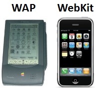
Perhaps you’ve noticed the lack of mobile sites in your mobile search results. Most likely you’re using a smartphone. The two are closely related, and bode poorly for ecommerce companies focusing search-engine-optimization resources on their smartphone sites. In a recent question-and-answer session, Google’s John Mueller, webmaster trends analyst, highlighted the core challenge: Smartphone content is not “mobile” content by Google’s definition.
Google Focuses on ‘Traditional’ Mobile
According to Mueller, as quoted in Search Engine Roundtable, “You need to differentiate between smartphone and traditional mobile (WAP/WML/iMode) pages (and this is something that confuses quite a lot of people). Traditional mobile pages need to be in a special format for those devices, and they will be crawled and indexed separately (with Googlebot mobile).”
Google mobile search returns content for traditional browsers, not new models.
Google’s mobile index targets content aimed at traditional-mode browsers — those built on older WAP, HDML or i-mode technologies, see “Mobile Browsers” on Wikipedia — not today’s modern smartphone browsers built on WebKit, the newer, open-source browser platform. Think of it this way: WAP is to the Apple Newton as WebKit is to the iPhone. That’s not entirely true since feature phones today may still use WAP browsers, but most ecommerce companies I’ve worked with are more interested selling to the demographics of users sporting expensive and cutting-edge smartphones. These smartphone customers are the ones we can envision more easily researching products in depth on their large screens, and opening their digital wallets to transact online.
Google: No Difference between Mobile and Desktop
The fact is that Googlebot-Mobile is not even remotely interested in HTML and XML content targeted at smartphone users. Googlebot-Mobile’s mission is to crawl and index content like the WML — wireless markup language — targeted at WAP browsers. In fact, Google doesn’t differentiate between a site designed for desktop browsers and a site designed for smartphone users. They’re both built with HTML and XML, and modern WebKit browsers can display the majority of content on the majority of websites. So essentially, Google feels no need to differentiate between desktop and smartphone sites in its search results.
I whole-heartedly disagree with this line of thinking. Ecommerce sites may want to create specific content targeted at smartphones based on more than display changes. Differences in customer intent on smartphone versus desktop, differences in the level of trust customers may have in mobile transactions versus desktop transactions, and — most of all — browser-capability differences, all point to the need in some cases to have different sites targeted at smartphone and desktop browsers. In its quest to deliver the right result to the right user at the right time, why wouldn’t Google want to prefer smartphone sites to desktop sites when a search originates from a smartphone?
For now, at least, the answer is that it just doesn’t work that way. Your smartphone HTML site isn’t a mobile site by Google’s definition, and it therefore will not show up mobile search results as a mobile site. End of discussion.
Preventing Duplicate Content
So where does that leave sites that target smartphones on one set of URLs and desktop browsers on another set of URLs? Holding a bag of duplicate content, and marketing to smartphone customers on a smartphone site that those customers won’t reach from the search results alone.
For example, let’s say that a hypothetical ecommerce site at www.example.com has a separate HTML website for smartphone users on WebKit browsers at m.example.com. The m subdomain may look like a mobile site to humans, but Google will not treat it as a mobile site because it is developed in HTML. Likely, the same content is available at both the www and the m subdomains, because this site is selling the same core set of products. Since Googlebot is crawling both of these sites and Googlebot-Mobile is crawling neither, Googlebot sees the two sites as duplicate content. Google’s algorithm will choose the strongest pages to return in the search results, and it’s a pretty safe bet that the www versions of the pages will have many more links than the m subdomain, so desktop and smartphone searchers alike will land on the desktop version of the site at www.example.com.
Mueller’s advice for resolving duplicate content and getting visitors to the right content is: “…You can use the rel=canonical [link attribute] to point to your desktop version. This helps us to focus on the desktop version for web-search. When users visit that desktop version with a smartphone, you can redirect them to the mobile version.” [Note: A re=canonical link attribute tells search engines which site carries a higher “canonical” priority.]
Mueller’s advice should not be misconstrued as an invitation to cloak, which is the practice of showing search engines one thing and human visitors another. Both the smartphone site and the desktop site should be readily accessible to crawlers and customers alike, and the content on the two versions should be similar if they truly are meant to be versions of the same site. Remember that Googlebot regularly spoofs different user agents and compares the content displayed to each to detect spam.
Cascading Style Sheets the Best Option
If the smartphone version of the site is a simple reformatting of the content to display better on smartphone browsers, then the cleanest solution of all is to serve both types of browsers the same URL with different CSS files to control the format accordingly. This option handily eliminates duplicate content and searcher landing page issues, as well as eliminating most cloaking issues and the need to maintain two versions of a site.


