Site owners have many competing needs when developing mobile sites. Different devices, different capabilities, different screen sizes and resolutions, all have an impact on designing and developing mobile sites today.
According to Mongoose Metrics, a tracking and analysis firm, only 9 percent of sites are ready for mobile in 2012. The primary consideration with mobile tends to be enabling better usability and — for ecommece sites — conversion. Another study by Compuware, a software and services provider, shows that 57 percent of users will not recommend a company with a bad mobile site and 40 percent of users will visit a competitor’s site rather than using a poorly optimized mobile site. The case for usability and conversion as primary concerns in the drive to take ecommerce sites mobile is easy to make. Fortunately, responsive web design — the leading solution to the mobile usability challenge — is also beneficial to search engine optimization.
What Is Responsive Web Design?
Responsive web design is a concept that blends CSS, CSS3 and JavaScript to create fluid site designs that can expand, contract, rearrange or remove content based upon the user’s screen size. Instead of developing different sites for devices with different screen sizes and capabilities, one site with one set of pages reacts flexibly to display optimally on everything from a 27-inch desktop monitor to a three and a half-inch iPhone display. The usability benefits are obvious: Customers can interact with a site regardless of the device they’re using instead of having to choose between viewing the whole page illegibly or one small part of it that’s disorienting. Where usability improves, decrease bounce rates and increased conversions are usually not far behind.
True, there are cases where the function and content of the mobile site needs to be different than the desktop site. Responsive design can handle those instances also via CSS by removing or reducing the visibility of content that’s less relevant to mobile users. In some cases only a mobile app will really meet the needs of mobile users. But this article is about neither mobile apps nor the technical details of implementing responsive web design. For an excellent technical overview and references to other resources, see Smashing Magazine’s “Responsive Web Design: What It Is and How to Use It.”
Responsive Web Design Benefits SEO
Fortunately, search engine optimization offers another great reason to consider responsive web design: links. The alternative to developing a single responsive site that meets all device needs is to develop multiple sites to meet individual device needs. One site for desktop browsers, one for smartphone browsers, one for tablets, and each has to be maintained separately after the expense of designing and developing them separately. From a search engine perspective, each needs links and/or user agent-specific redirects to get customers to the right version of the site. One site means one set of links to build, and no annoying redirects to add to server load, site speed and maintenance hassles.
Think of it this way, Groupon has developed Touch.groupon.com for smartphones, Ipad.groupon.com for the iPad, and www.groupon.com for desktop computers. The search engines don’t have much interest in figuring out which sites should receive searches on which devices, though they easily could with their ability to crawl sites as different browser types. The point is that the onus is on the site to redirect the customers to the site that meet their device’s needs. For more on this, see “How to Benefit from Googlebot Mobile’s New Smarts,” my recent article on that topic.
Most ecommerce sites I’ve visited do a terrible job of redirecting customers to a mobile version of a site — if they even have a mobile site in the first place. Even my poster child for mobile success, Amazon.com, uses different sites for different devices and redirects, instead of responsive design. In their case, however, it’s hard to argue for a change when they’re running on all cylinders with their current solution.
Do Links Matter for Mobile Sites?
So back to links. If a site has to physically redirect mobile users from its desktop site to its mobile site, and if smartphone and tablet sites rarely if ever rank in the search results, what do links matter for mobile sites? Excellent question. It’s not about getting more links to the mobile version so it can rank. It’s the fact that some mobile users may create links to or share pages from the mobile site, which essentially steals link equity from the desktop site.
Say a mobile version of a product page has links to it from two blogs, two Tweets, two Facebook Likes and two Google +1s. But the desktop version of that same page has links to it from 20 blogs, 20 Tweets, 20 Facebook Likes and 20 Google +1s. The mobile version of that page is almost certainly not going to rank, and it’s stealing those links and shares from the stronger desktop version of the site. If the site had been built using responsive design, the single product page would have 22 of each type of link and share instead of 20 and two to separate pages. In summary, the benefit is consolidation is link equity to a single page, enabling that single page to send stronger signals and rank better than the two separate pages could have alone.
Example of Responsive Web Design in Ecommerce
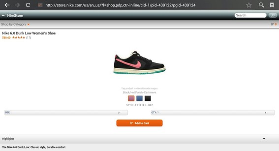
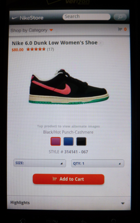
The best example of responsive web design I could find was Nike’s Store. From the home page down into the product pages, the URLs were the same for the mobile and desktop versions, but the display changed to suit the device. See the image below of Nike’s 6.0 Dunk Low Women’s Shoe across a laptop PC display, an Android tablet screen and an Android smartphone screen. The URL is exactly the same for each of these images, despite the difference in design and layout. That’s what makes it responsive web design and not merely a mobile web site.

Nike’s responsive site design adjusts page design and layout to best display on various screen sizes.

For large screens, Nike renders their full-featured website.

For smaller screens, Nike has a cleaner, simpler web interface.

For mobile browsers, Nike shows only the basic options needed for a purchase.
Interestingly, Sony.com was the only other site I could find that practiced responsive design, but it has so far only implemented it on the home page. As soon as you click off the home page, the formatting reverts to desktop display. It’s interesting that a company that makes mobile devices doesn’t itself have a more mobile-friendly site.
Other sites like Walgreen’s, Shoes.com, Coldwater Creek, and others have mobile versions, but the URLs for the mobile pages are different than the URLs for the desktop pages. These sites, while mobile, are not examples of responsive web design. They are still splitting their link equity between different pages of the same content, missing the opportunity to send a stronger signal by consolidating their links to a single page with responsive web design.


