
Last week, I cited estimates for the number of Internet-capable mobile devices sold in 2009, and how this has already outpaced the number of computers sold, both portable and desktop. Here I’ll show you some useful tools for determining how effectively your site, in its present form, operates on a mobile device.
The best way to observe your online store’s performance on a mobile device would be to use the device itself. But there are also some free online tools you can use to simulate a mobile browser’s effect on your site.
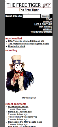
I tried each of these tools using TheFreeTiger.com, an online student publication I helped found at the University of Missouri. We, like many journalists-turned-online-publishers, are not well versed in CSS, so we use the Drupal content management system to develop our site. The results were telling—we have a lot of work to do for mobile optimization.

The Free Tiger home page.
mobiReady Page Test
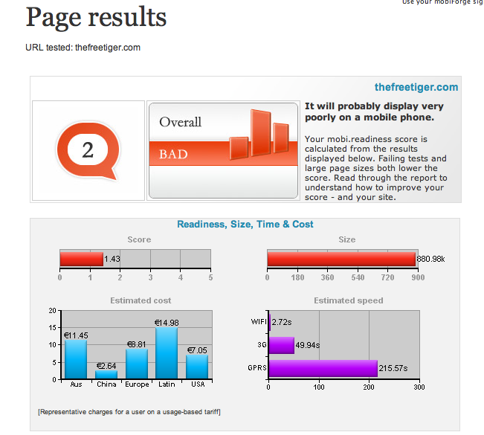
This is a good place to start to see how a specific page stacks up to commonly-accepted standards in mobile optimization. The mobiReady Page Test evaluates whatever URL you enter according to the W3C Mobile Web Best Practices, which helps ensure users get the optimum experience browsing a site on a mobile device.
TheFreeTiger.com’s home page scored a 2 out of 5 on the test, with the general prognosis being that the page will display very poorly, if at all, on a mobile phone. Below were a list of criteria receiving passes, fails and warnings for various design and development aspects that affect mobile browsing. Our biggest problems were oversized graphics tied to specific measurements that exceed the dimensions of a mobile phone screen.
mobiReady top of page.
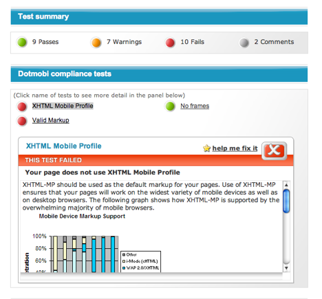
The best part about this tool is that it differentiates between development criteria and points to specific examples on the page that break the rules. This is great for finding what images are too large and what parts of the page rely too heavily on external resources or tables.
mobiReady bottom of page.
Opera’s Small Screen View
In addition to its popular mobile browser Opera Mini, the standard browser has a small screen view that can be useful for simulating a mobile screen. If you toggle between large and small-screen view on mobile optimized sites, you can see how the site uses a different set of instructions for rendering on a mobile or large screen. I tried this with Opera’s home page.
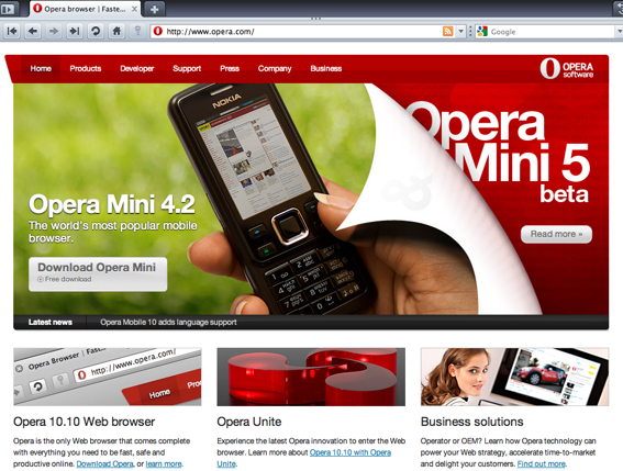
Opera home page.
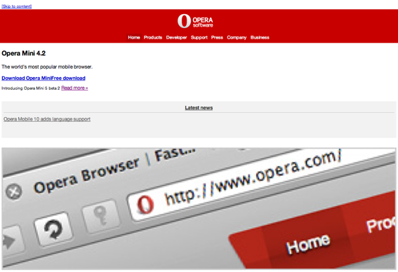
Opera home page smaller.
I then tried it again with TheFreeTiger.com. Not terrible, but certainly not an enjoyable browsing experience. We would need to better arrange the content so our more important features are displayed in a higher position than the recruiting page with the Uncle Sam Tiger icon we use to beg for more staffers.
The Free Tiger on Opera.
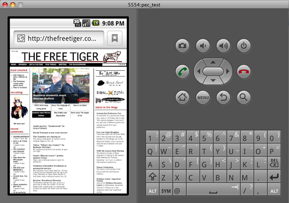
iPhone Tester
This online tool, designed by an Australian developer for Atmail the night before the iPhone’s release, is a useful way to get a rudimentary idea of how your page would display on the iPhone. Type in the URL of your site, and you can see an approximation of the iPhone’s rendering. A button on the side of the virtual device allows users to switch to the horizontal view.

The Free Tiger on iPhone.
The images on our home page rendered properly, but they are obviously too wide for the iPhone and would require far too much manual navigation. The headers and footers are too big; a user would have to scroll sideways several times before they could see the main title and logo for our site. I was unable even to find headline I could read in its entirety without making a zoom or scrolling adjustment.
Android SDK
Setting up this emulator is a little tricky, but it allows users to create a virtual Android device on their computers, so it’s effective for testing mobile functionality. Go here to download the Android SDK, and then follow this simple tutorial by Ben Hedrington for Mac, or this for PC.
I chose to download the latest version of Android, Android 2.1. The home page of TheFreeTiger.com rendered pretty well except for some unwanted text in the header, but videos and audio on all other pages failed to load properly. When you spend a lot of time working on these, it’s important to know anyone who visits the site on an Android device will not be able to see them.
The Free Tiger on Android.
Solutions
By running their sites through this series of mobile emulators, merchants may have some idea of how their content will look to the mobile user. Fixing some of the issues that cause bad rendering or loading time can often be a matter of creating a simplified version of every page.
Matt Swezey, President of Tulsa, Okla.-based web design firm MDS Media Group, said he has spent the last few months creating a mobile version of his social city guide StreetMavens.com. He said the site “automatically detects mobile browsers and displays a light-weight version of the current page.”
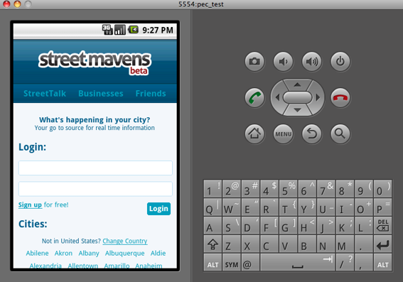
Mobile version of StreetMavens.com.
“I highly recommend serving different content to mobile devices such as smaller, optimized images, text instead of images where possible and cutting out any heavy JavaScript that will not run well in a mobile browser,” Swezey said in an email.
He did acknowledge that doing this might be difficult for an ecommerce merchant with an expansive catalog. Merchants might have to use different product images for their standard and mobile pages, among other variances.
Ultimately, merchants’ ability to optimize their sites for mobile depends on their shopping carts. Some carts do offer these capabilities for their users. Nick Hendler, President and Chief Developer for Kryptonic, Inc., which manufactures ClickCartPro, said in an email that his cart uses XHTML Strict code, a W3C standard for mobile developers. He also said users had the ability to adjust their templates.
“Currently our users can adjust the CSS and displays in their display templates, or skins as we call them, to provide alternate layout for mobile devices,” Hendler said.
Because the number of mobile devices is growing rapidly, and mobile traffic may at some point eclipse computer traffic, mobile optimization may become a more of priority in a merchant’s choice of shopping cart.


 Hostinger Reframes Site-Free Ecommerce
 AI Visibility Scores Are Useless
 New Ecommerce Tools: July 1, 2026
 India Ecommerce Paths for Foreign Sellers
 New Ecommerce Tools: July 7, 2026
 AI Forces Affiliates to Innovate or Die
 SEO for AI, Low Traffic, No Clicks