Last month, I wrote about color psychology and its effect on emotions, in “Color Psychology and Online Marketing” and “Color Psychology Showcase.” In this article, I am going to discuss color theory, including the terms that describe color. Understanding color theory is useful whether you do most of your own design or if you simply want to communicate more effectively with your graphic designer.
The Color Wheel
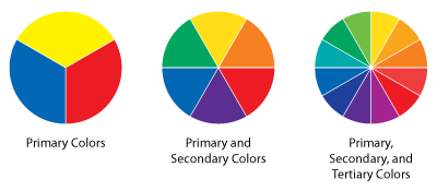
The color wheel is perhaps the simplest way to illustrate primary, secondary, and tertiary colors. We start with the primary colors: red, yellow, and blue. From there, we take the “steps” between each of the primary colors to get secondary colors; green, orange, and purple. Finally, we take the “steps” between the primary and secondary colors to end up with tertiary colors; blue-green, yellow-green, yellow-orange, red-orange, red-purple, and blue-purple.
The primary, secondary, and tertiary color wheels.
Additive and Subtractive Color Mixing
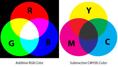
Additive color mixing uses light to mix the colors red, green, and blue. You may have heard the term RGB — red, green, blue — color in reference to color for “screen” work. Displays like monitors and televisions use light to perform additive color mixing. For this reason, anything designed for the web should use an RGB color model.
Subtractive color mixing uses ink or dyes to mix the colors cyan, magenta, and yellow. This is why anything designed for print should use a CYMK color model. (The K in CMYK stands for “black.”)
The CMYK color model matches the inks used for printing.
Warm, Cool, and Neutral Colors
Colors are also often referred to as “warm,” “cool,” or “neutral.” Warm colors include red, orange, and yellow as well as derivatives of these colors. Cool colors include blue, green, and purple as well as their derivatives. Finally, neutral colors like grey and brown are duller colors that can’t be described as either warm or cool.
Talking About Color
The three terms that are used most frequently when discussing color are “hue,” “saturation,” and “value.” You may already be familiar with what each of these terms describes, even if you didn’t know the word for it.
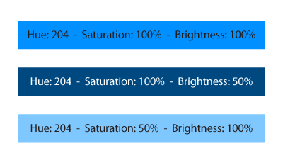
Hue. When we describe a color as being “more blue” or “more red,” we are discussing hue. Adjusting the hue of an image is essentially adjusting the color of the image. It is important to note that two colors can have the exact same hue and still have different values or levels of saturation.
Saturation. Saturation is another commonly used term in graphic design. It refers to the strength or purity of the color. You can think about this as how much grey is present in the color. A color at 100 percent grey is “desaturated” while a color at 0 percent grey is completely “saturated.”
Value. Value refers to how light or dark a color is. This is sometimes referred to as “brightness.”
Notice how the hue remains the same between these three colors.
HSV, HSB, and HSL
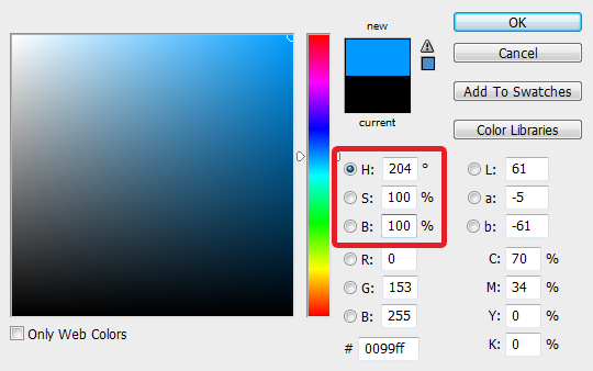
If you’ve used an image editor, you’ve likely encountered the acronyms HSV, HSB, or HSL. Each of these is a coordinate RGB color model — essentially a color picker. HSV stands for “Hue, Saturation, and Value.” HSB is the same as HSV but uses “Brightness” instead of “Value.”
HSL stands for “Hue, Saturation, and Lightness.” Lightness is calculated differently from Value or Brightness but essentially accomplishes the same thing. There is much confusion regarding the technical differences between Value and Lightness. Just remember that both adjust the value of the color.
HSB stands for Hue, Saturation, Brightness
A Few More Terms
Chroma. Chroma is another color theory term, though I rarely use it. Chroma is very similar to saturation and is the color purity as it relates to grey. While saturation is the purity of a color relative to its own brightness, chroma is the purity of a color relative to another color that appears white under similar viewing conditions.
Chroma is often mistaken with saturation. Again, I rarely refer to chroma when dealing with color and instead opt for saturation as it is simpler to understand.
Tones, Shades, and Tints. “Tones,” “shades,” and “tints” are each created by adding grey, black, and white to a hue, respectively. That is to say, tones are created by adding grey to a hue, shades are created by adding black to a hue, and tints are created by adding white to a hue. Tones, shades, and tints are all just more specific ways to talk about value.
Conclusion
As you can see, there are many ways to talk about color. Advanced color theory can become very confusing and even delve into the mathematics behind color. My recommendation to any beginner looking to get a better grasp of color theory is to understand the basics, including hue, saturation, and value. These three terms will not only allow you to describe color in greater detail, but will help you understand the color pickers employed by image editing applications.


