Editor’s Note: This is “Part 3” of a 3-part series on ecommerce design. “Part 1: Key Components” and “Part 2: Banners and Boxes” we published previously.
In “Part 2: Banners and Boxes,” I explored the pros and cons of rotating banners and the proper way to utilize them on ecommerce sites. The overall purpose of this series, as I noted in the first two installments, is to focus on the steps to take once you’ve hired a company to design your ecommerce site.
The key to a successful relationship is to plan ahead and have a basic idea of what you want before approaching any designer. The more you know and understand, the less you’ll leave up to the interpretation of those building your website and the better the experience will be for all parties involved.
Headers
Your site’s header is one of the most important components for the simple reasons that it’s the first thing your visitors will see and it appears on every page.
Although the look of these headers will vary greatly from site to site, they should all contain the following elements.
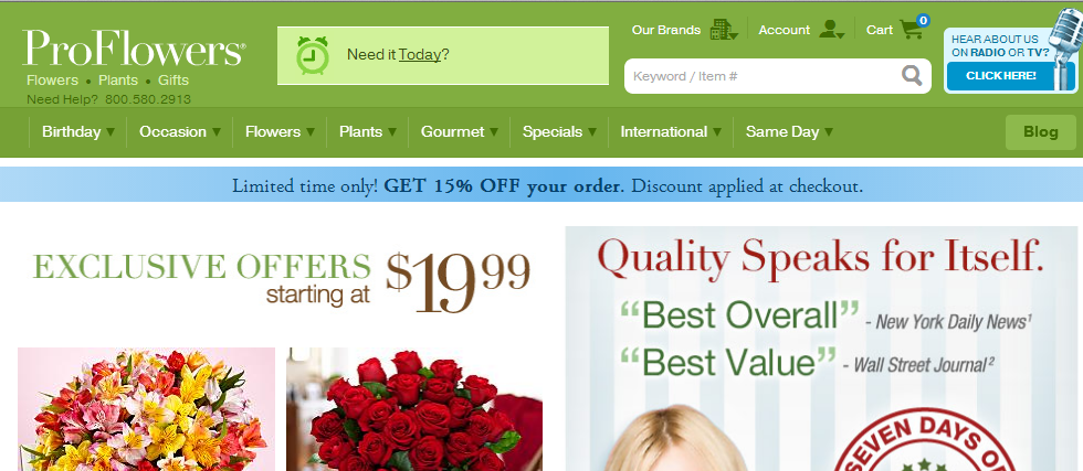
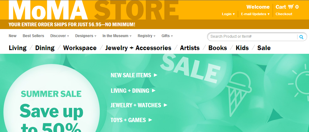
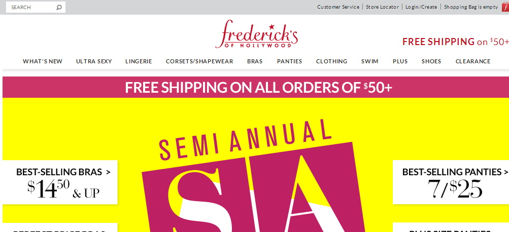
- Logo. Your store’s logo should be displayed prominently. Most sites display their logos on the upper left corner, as shown in the ProFlowers and MOMA images, below. But Bluefly and Fredericks of Hollywood place their logos in the center, which are shown below, too.
- Site search. Site search boxes should be prominent since it’s a tool that can help shoppers find products and thus increase your conversions. Avoid placing any type of signup boxes close to your search field as it can cause confusion among visitors.
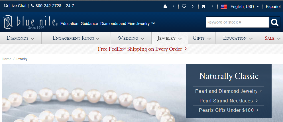
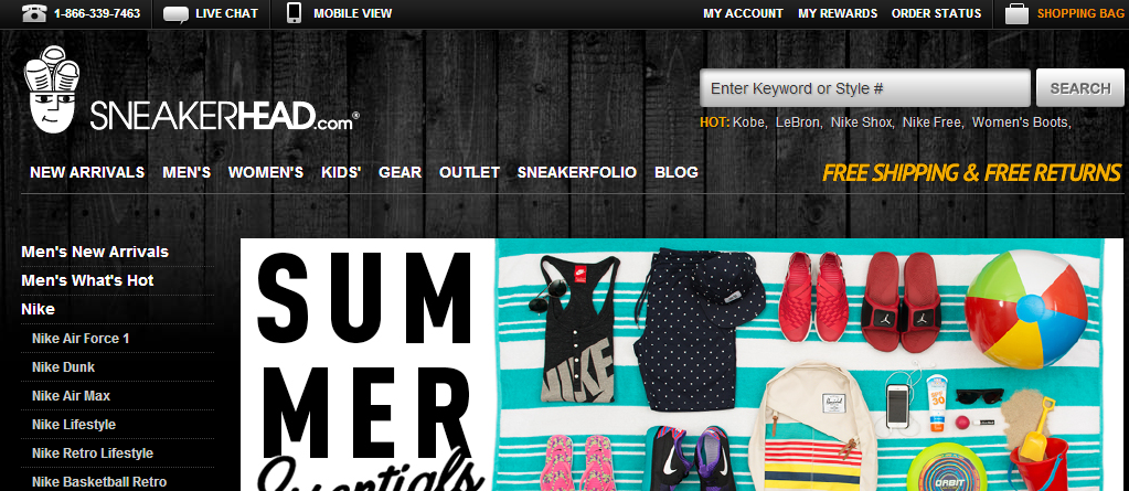
- Phone numbers. While larger ecommerce operations tend to not place a phone number in their sites’ headers, retailers that are not national brands should include the phone number, since as it’s a way to reassure users that you’re a legitimate operation. Having a number that customers can call will not only help to resolve issues faster, it could also help build a dialog with your shoppers. If you’re selling high-ticket items, a prominent phone number is a must. If you only answer the phones during a set time, clearly state that, as well. You get bonus points for a toll free number. Even now, when most consumers have cell phones, as of January 2014 cell phone penetration in the U.S. was at about two thirds, leaving a one-third of potential customers who do not have them.
- Secondary navigation. Many sites add administrative navigation links — i.e., about us, shipping, return policy, FAQ — to their headers.
- User account links. Provide a link to a sign-up or sign-in box, so that users can easily create or access their accounts.
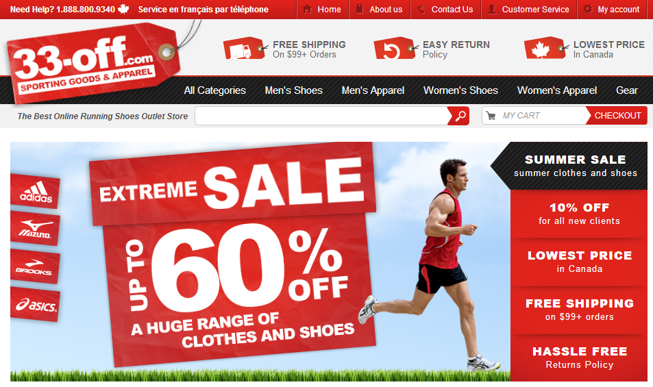
- Benefits. Highlight the benefits of shopping at your ecommerce site, such as free shipping, low price guarantees, easy return policies, and so on. A high percentage of shopping carts are abandoned due to high shipping costs, or shipping cost that were disclosed too late. Moreover, restrictive return policies and vague cost concerns also cause abandonment. So take any steps that can reduce shopper anxieties.
- Customer service. Clearly label your customer service contact options, whether it’s a phone number, online chat, or an email address. Many shopping carts are abandoned because customers can’t obtain support.
- Shopping cart. Whereas online stores used to feature a simple shopping cart button that would take you to a page where you can view the items you added, modern online stores tend to include a widget that tallies the customer’s items and cost in real time.
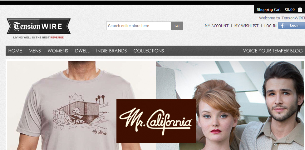
Tension Wire displays a real-time shopping cart tally in the upper right.
- Social media icons. There’s a running debate as to whether social media links belong in the header or in the footer. The naysayers state that placing the icons in the header are distracting, while others say that placing them in the header increases the chances of gaining new followers. I fall in the latter category. But, if you place social media icons in the header, they should be smaller in size than they would be in the footer.
Incidentally, many designers and conversion experts believe the top left portion of a website is critical. A senior customer experience representative with Yahoo stores, for example, recently shared this with me: “The top left corner of your store is prime real estate (since the eye is automatically drawn there). One idea is to put your store’s benefits up there and proactively address what shoppers care about: fast and free shipping, easy returns and anything else that you can do for shoppers.”
Footers
According to Zeald, a prominent New Zealand-based web design firm, “The purpose of the footer is to signal to the user that they are at the bottom of the web page and to provide links or shortcuts to other areas of your web site. The footer is the area that many users expect to find the ‘fine print’ — legal information such as ‘terms and conditions,’ ‘privacy policies.’”
Thus, your footer should contain the following items, at a minimum.
- Navigation links
- Site map
- Legal and copyright information
- Contact information
- Social media icons
- Newsletter signup. As more sites begin to adapt a one-column format, the footer works well for displaying newsletter signup forms.
- Methods of payment accepted. Let visitors know what forms of payment your store accepts.
- Trust badges. Reassure shoppers that you’ve made an investment in security, to increase their confidence in making a purchase.

