Live Out There is an online community and store for active people. Featuring top brands in apparel and gear, the site is designed to attract folks serious about outdoor activities.
The products Live Out There sells aren’t for the budget-shopper, but rather those looking for tried and tested, durable wear. Synthetic sleeping bags, for example, start at $119.
The background and top of each page showcases mountains and an image of an outdoorsman, explaining that the site is both a community and store. This sends a clear message to anyone who lands on any page. Since the site is community-driven, it’s appropriate for the shopping navigation to start below the message and tabs for toggling between the two areas of the website.
There is, however, as with all ecommerce sites, great room for improvement.
Navigation
The navigation itself is logical. Included is a search box, breadcrumbs, login/register links, browse by category, a link to the shopping cart and a compare feature.
The site’s logo conveys the proper message and it’s easy to move from the store to the fully featured community pages. The only issue is, since the logo includes a moving bicycle, Flash is required to see the anchor graphic for the entire site.
The left column, which includes category navigation, contains too much white space. The parent and subcategories should be tightened so users can also see the Live Help graphic. In addition, an off-white background would cause less distraction from the main content of each page.
Grade: B-
Home Page
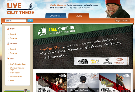
LiveOutThere.com home page.
The home page grabs visitors first by focusing attention on free shipping on orders over $100, as well as spotlighting top brands.
Six graphics spotlight select products, and community information is embedded at the bottom of the page.
While the core information is there, the initial graphic takes up quite a bit of real estate; the average visitor can only see the first line of spotlighted items. By tightening up this page the company can serve more interests.
Grade: B-
Category Pages
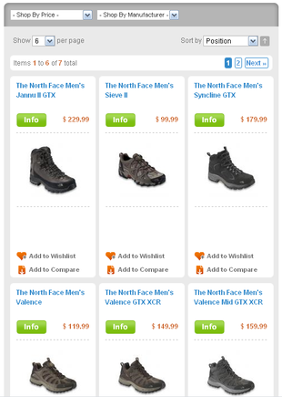
Category page on LiveOutThere.com.
Each category page is prefaced by the free shipping offer. This is good, since visitors may initially land on any page of the site.
Customers can shop by price or manufacturer and sort by price, name and manufacturer. They can also select how many products they’d like to view per page. The default, however, is six items per page. This should be increased to 12, so there’s less clicking required to see additional items.
The product layout on these pages wastes a great deal of space. So much so that shoppers can only see the first row of products. Ideally, shoppers should see at least part of the second row.
Another issue is the order of product elements. The site displays products in the order of: name, info button, price, graphic, “Add to Wishlist” and “Add to Compare.” People shop primarily by visuals, though. The correct order would be: graphic, name, price, info button, “Add to Wishlist” and “Add to Compare.”
The compare feature is a bit cumbersome, because most sites use checkboxes for selection of comparable products. On Live Out There, you click a link, which then reloads the page–with the product selected now listed on the right-hand side. After selecting products, users click a Compare Items button, which opens in a popup window. This process takes several steps and significantly more time than the traditional checkbox method.
There are no Add to Cart buttons on the category page. This is fine, since the product line would require people read the entire description in order to make an educated decision.
Grade: B-
Product Page
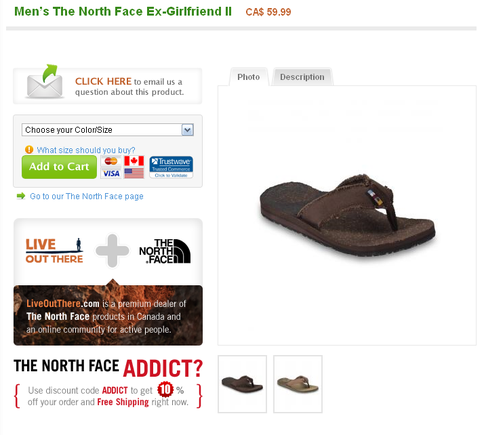
Product page on LiveOutThere.com.
This is where the shopping elements become confusing. The entire left menu is gone and it’s now that I realize the breadcrumb–which sits in the top navigation–is not apparent to the shopper from this page.
The layout tries to be clean, but with such a lack of color there’s no real segmentation of page elements.
The site uses tabbed elements on the product page, which I previously recommended for sites needing to provide a great deal of information. Unfortunately, using tabs for toggling the product image and description can confuse the shopper. First, the tabs don’t really stand out. Second, and most important, shoppers expect to see both a product photo and description load by default. Since the first button seen on the upper left is a link to email customer service questions concerning the product, the company should analyze how many messages they receive, understanding that for each one, many other potential customers won’t have bothered.
The size/color selection and Add to Cart button is buried in the left column. It needs to be more apparent and stand on its own.
Product pages boast customer reviews–something this store likely relies heavily upon–but lacks other key information. There’s no Live Help link on the page, and many product descriptions don’t provide material details.
When clicking to view another product view, a popup window is launched. This can be easily missed. Swapping with the main image would be more useful.
Grade: C_
Search
The search results page provides useful and detailed information on keyword searching, but a thumbnail image would make the selection process even easier. Also, by category shopping, there are 21 sandals for sale in this store. A search on the term “sandal” only returned three products. This indicates that the keyword “sandal” isn’t being used in product descriptions or search fields for most of the items. That not only affects internal searching, but search engine finds as well.
Grade: C
Checkout
When a product is added to the cart, the shopper is taken to the Shopping Cart page, which includes a thumbnail image and basic information. However, this page is missing specific instructions, such as what’s expected of the shopper at this point. Also, the grand total is more often than not way below the scroll line due to unnecessary white space.
When Proceed to Checkout is clicked, I’m offered the option to check out as a guest, register for an account, or register with my own Facebook account. Then, the checkout process–which should be the most streamlined process of an online store–is interrupted with a survey request. This is just bad for business. Worse, when I click “No”, I’m immediately taken to the Billing Information form (no more options to register).
This site only accepts Visa and MasterCard. This is a problem because many online shoppers rely on alternative methods like PayPal, and, studies show that American Express and Discover Card holders prefer to use those cards while shopping online.
There is also no apparent option to return to my shopping cart to modify quantities.
Grade: C
Overview
The base design of this online store is catchy and appropriate for what it sells. Unfortunately, there are likely a lot of assumptions being made by shoppers due to lack of information and/or clarity. While I think the problems aren’t shooing away a majority of dedicated community members, they can definitely be turn-offs for newcomers.
I suggest improving on the following five areas.
- Visitors are prompted twice to complete a survey–once when first entering a category page and again during checkout. Both occurrences happen at the worst stages (the survey asks about the shopping experience).
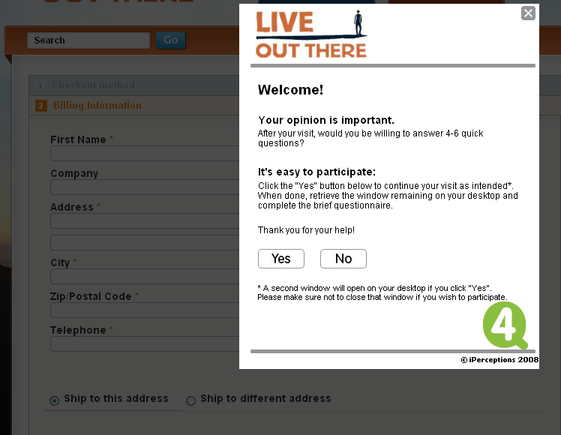
Survey pop-up on LiveOutThere.com checkout page.
- It’s not clear to shoppers that the site only accepts two payment methods.
- Shipping seems pricey and it isn’t clear up front how it will be charged to consumers outside of Canada. I was charged $15 for a test drive with an item that costs less than $40.
- The search tool doesn’t appear to return all possible results. This makes it difficult for people to find something they need, and can frustrate them, especially if it’s a product they expect the store to carry.
- It is difficult to make a decision and add a product from the most important page: the product page.
One culprit seems to be that efforts to build both the community pages and the online store are not allocated properly. It could be that a small team of people is dedicated to the business’ growth. However, unlike most online stores, Live Out There has twice as much work to do to reach its full potential.
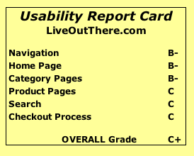
USABILITY REPORT CARD
LiveOutThere.com
Navigation B-
Home Page B-
Category Pages B-
Product Page C
Search C
Checkout C
Overall Grade C+