
With some experience in HTML and CSS, you can learn to design your own responsive email templates in just about a weekend. With your fresh new skills, take control over how your email marketing messages look on nearly any device.
Email marketing messages should look good regardless of whether your customers read them on an MacBook Pro or a Samsung Galaxy S6. Your product recommendations and perfect, pithy copy has to read well in Gmail or Outlook.
The solution is to use an email-client-friendly responsive design. There are certainly plenty of good, responsive email templates available. You can find 28 suggestions right here on Practical Ecommerce. But at some point, you may want to do your own thing: Design a template perfect for your brand and your business.
Learn from Existing Templates
One of the best ways to learn to design responsive email templates is to analyze existing ones.
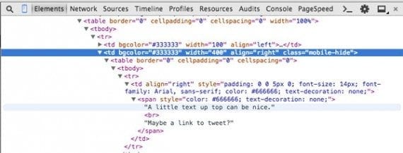
Take, for example, the Slate product announcement responsive email template from Litmus Software. If you download the template and open it in a browser on a desktop computer you might notice some placeholder text on the right-hand side of the header. It says, “A little text up top can be nice.”
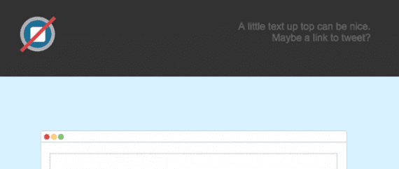
Viewed on a relatively larger screen, the Slate template includes a text section in the header.
But when you view the template on a smaller mobile device, like an iPhone 6, that text is gone.
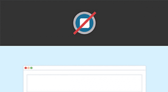
On a mobile device, the text on the right side of the header is not shown.
This sort of responsive behavior is easy in a modern web browser, but how is Litmus pulling this off in an email client? To find out, try using Google Chrome’s web developer tools. Open the Slate template in Chrome, right or alt click anywhere and select “Inspect Element.”
Chrome’s developer tools should open, taking up about half of your screen.
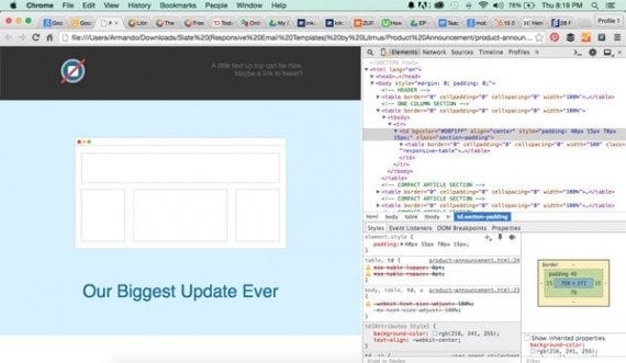
Chrome’s developer tools can help you dissect responsive email templates.
On the developer tools portion of the screen, look for the mobile device icon near the top left.
Chrome’s mobile emulation icon is in the upper left of the developer tools panel.
This icon will open an emulator, showing you how the page, or email template in this case, looks on various devices.
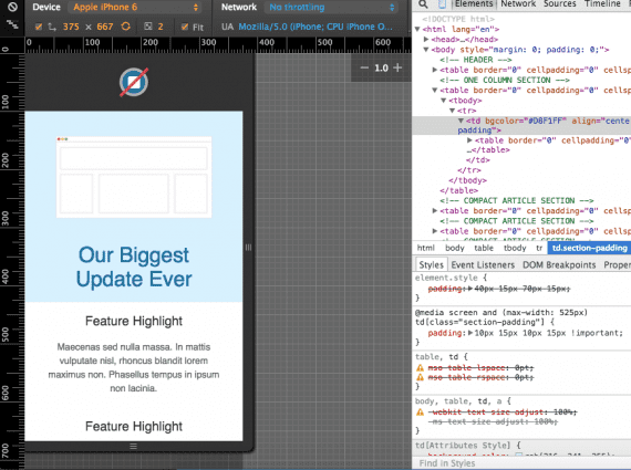
The emulator in Google Chrome’s developer tools shows you how the template would look on various devices.
Now, right or alt click on the header and select “Inspect Element” again to help locate the header code in the developer tools. In this case, you’ll find that the text is, ultimately, inside of a td element with a class of “mobile-hide.”
Using Chrome it is possible to figure out what makes the text vanish.
If you look at the style declarations at the top of the template, you find that “mobile-hide” is in a media-query that is only active when the screen width falls below 525 pixels. Problem solved. You know how Litmus did it.
After you have spent some time dissecting a few responsive email templates, you will start to have an idea of how they work. Hopefully, you can build one or two of your own.
Learn from Real Emails
Using the same principles described above, you can also learn from the real emails that land in your inbox.
Litmus has a free tool called Scope, which is intended to make it easier to share emails. Scope includes a code inspection feature that allows you to see just how that email from Walmart, Amazon, or Netflix was developed.
Use a Framework
Responsive email frameworks help you design your mobile-and-desktop friendly emails more quickly. They offer a foundation from which you can add your own work. They are easier to use than starting completely from scratch, and, in some cases, they give you greater flexibility than using a template.
Here are few responsive email frameworks to try.
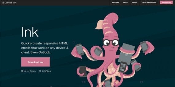
Zurb’s Ink is one of several popular responsive email frameworks.
Ink. Zurb, a product design consultancy, created the Ink Responsive Email Framework. This is important because Zurb has been developing web tools since 1998 and is the company behind Foundation, one of the most advanced responsive frameworks for web development. Ink uses a 12-column grid for displays 580 pixels wide or wider. Below 580 pixels, each column becomes full width and stacks vertically.
Antwort. Released in October 2014, this framework has you build directly on one of several fluid templates. Like Ink, it works across many devices.
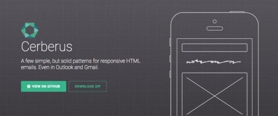
Cerberus was built because without a framework HTML email design can be a dog.
Cerberus. According to the project’s core author, Ted Goas, “Between desktop, mobile, and Outlook, HTML email is a three-headed dog from Hell.” Goas solution for slaying that dog is a series of email design patterns with or without media queries.
Email Framework. This generically-named solution provides code examples for developing your own templates, and handles many situations.
Follow Tutorials
There are hundreds of good tutorials for responsive or fluid email design. Consider following a few of these from start to finish. You will end up with a few more templates and you should have better understanding of why and how they are constructed.
Here are a few email design tutorials that you should try.
- How to: Code a Responsive Email from Scratch, by Alex Ilhan. This tutorial walks you through the process of building the Crowder responsive email template. You’ll learn how Ilhan manages page flow across devices. You’ll also get an HTML email skeleton to use.
- Creating a Simple Responsive HTML Email, by Nicole Merlin. In this 2013 tutorial, Merlin uses fluid design to manage the layout. Merlin writes the email much like you would a web page, with CSS at the top, then uses Premailer to move CSS inline.
- Creating a Future-Proof Responsive Email Without Media Queries, by Nicole Merlin. In this more recent tutorial, Merlin refines techniques and addresses six major problems with responsive email design.
- Building Responsive Email Templates with Ink, by Nicholas Cerminara. If the “future-proof” framework suggestion above sounded interesting, read this tutorial on Scotch.io. It is one of the best tutorials you’ll find.
Take an Online Class
There are many online courses devoted to responsive email design and development. Most of these will have you creating fluid and flexible emails in just a couple of hours.
- Zurb University: Introduction to Responsive Email. For $299 you learn from Zurb engineers live. This is not an on demand class, but rather a live event. At the time of writing the next class was set for September 29, 2015.
- udemy: Creating a Responsive HTML Email. Designer and developer Chris Converse teaches this two hour course. The course is priced at $150; you can get for $10 with a coupon from Converse’s own site. You can find the same course on Lynda.com, too.
- Treehouse: HTML Email Design. Treehouse members have access to this course lead by MailChimp User Experience Designer Fabio Carneiro.


 New Ecommerce Tools: June 10, 2026
 How Reddit Drives GenAI Visibility
 For Brands, AI Is the New Shelf Space
 FAQs for Google's 'Preferred Sources'
 New Ecommerce Tools: June 3, 2026
 Cautious Shoppers Reward Clear Value
 SEO for AI, Low Traffic, No Clicks