Ecommerce merchandising is the art and science of displaying products or offers on a website with the goal of increasing sales. Understanding how some of America’s top revenue-generating sellers merchandise online may help small and mid-sized businesses improve sales, too.
The idea is to look at how sites like Walmart, Home Depot, Amazon, and Apple merchandise and draw lessons from what these retail giants are doing.
To this end, for this article I considered 10 of America’s top retail companies based on their 2014 U.S. retail sales across all channels, as reported by National Retail Federation.
- Walmart – $343.6 billion
- Costco – $79.6 billion
- The Home Depot – $74.2 billion
- Walgreens – $72.6 billion
- Target – $72.6 billion
- CVS Caremark – $67.9 billion
- Lowe’s – $54.8 billion
- Amazon – $49.3 billion
- Best Buy – $35.9 billion
- Apple Store and iTunes – $28.3 billion
Each of these 10 companies experienced revenue growth in 2014. Target grew the least, with a 1.9 percent increase in U.S. retail sales from 2013 to 2014. Amazon grew the most, boosting U.S. retail sales 22.6 percent for the same period.
With the exception of Amazon, most all of these retailers sell both online and through brick-and-mortar stores. So it is not necessarily a list of the best merchandised ecommerce sites, but rather a list of retailers large enough that they should know how to merchandise well across channels.
Home Page Merchandising
The first area for consideration is the home page. This landing page may not always be where shoppers enter a site, but it is certainly a hub for navigation.
Lesson 1: Display an offer up front. Merchandise a single offer right up front on your home page. Each of the large retailers’ sites made a significant offer or merchandised a product with a big hero image at the top of the home page.
Apple’s site featured several of its products as possible holiday gifts.
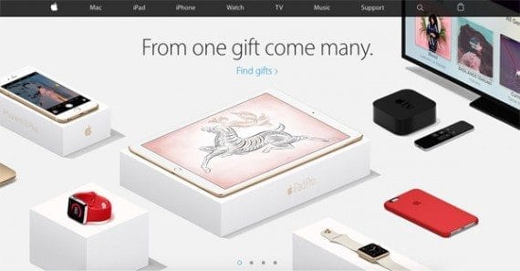
A large image suggesting that Apple’s products make good gifts dominates the company’s home page.
Best Buy featured the new Star Wars Battlefront game.
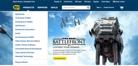
The Best Buy website had a large image promoting the Star Wars Battlefront game.
Lesson 2: Feature individual products, personalize. Lower down on the home page, all 10 retail sites featured individual products or product categories. On at least a few of these sites, the products shown were personalized based on the visitor’s shopping and viewing history.
For example, Amazon showed products specifically related to the shopper’s recent activity, which in my case included the unlikely combination of wrestling shoes and Smurfs.
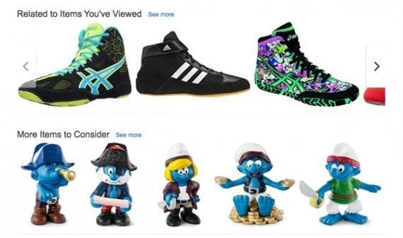
Amazon offered personalized products on its home page.
Lesson 3: Show a free shipping banner. Ecommerce merchandising is about showing products and offers. In an example of the latter, consider showing a free shipping banner on your home page. When displayed on a 1,280 x 800 MacBook Pro, 6 of the 10 sites reviewed had a free shipping banner showing when the page loaded.
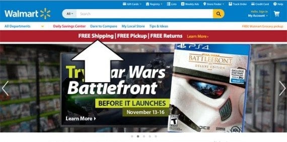
Walmart’s site was one of many to feature a free shipping offer.
Category Page Merchandising
Category pages help shoppers browse products. Like the aisles in a brick and mortar store, category pages display related products together, helping shoppers to choose and compare.
The majority of the sites reviewed have hundreds or even thousands of products. Nearly every one of the sites had multi-level categories like clothing, men’s clothing, shirts, and t-shirts.
Lesson 4: Follow popular conventions. Specific products on the category pages were displayed in accordance with long standing ecommerce conventions. There was a product image, a product name, a price, and a means of either getting more information or adding the product to the cart.
Customers expect category pages to look a certain way and provide some basic information. So, do not disappoint these shoppers. Lowe’s category pages, for example, were not exactly sexy, but they work.
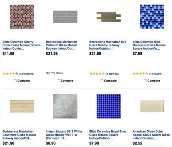
A category page from the Lowe’s website follows ecommerce category page conventions and gives shoppers an expected layout and look.
Lesson 5: Use filters and layers. With the exception of Apple, which has significantly fewer products than the other sites examined for this article, all of these large retailers use some form of layering and filtering on category pages to help merchandise their many products.
Walmart, for example, allows shoppers looking at women’s graphic tees to filter by price, size, color, brand, and even shipping options.
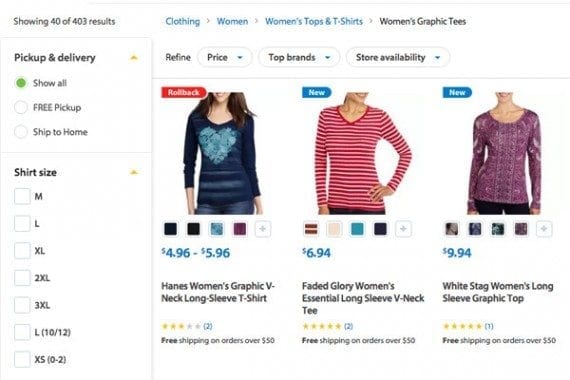
Walmart lets shoppers filter products on its category pages.
Amazon, as another example, also offers all of these features, plus its shoppers can see products that may be shipped internationally.

Amazon lets shoppers filter category pages to select just those products available for international shipping.
Product Detail Page Merchandising
On an ecommerce site, the product detail page is often where the shopper chooses to add an item to the shopping cart. It is the spot where the retailer needs to make a mini conversion, if you will, convincing the shopper that this is the right product at the right price.
Interestingly, most of the sites examined treated products differently on product detail pages. There was not a specific recipe, if you will, for what should be on a product detail page. Rather, these retailers seemingly tried to present each product in the best possible light.
Lesson 6: Show the product from many angles. One advantage brick-and-mortar stores have over ecommerce is that shoppers can hold the product.
Perhaps to compensate for this, many of the sites considered in this article included multiple product images — showing the item from many angles. It seems it is smart ecommerce merchandising to show off your products.
Consider, for example, the Costco website. This product detail page for a Jura Impressa C9 One Touch Coffee Center included many images, and even had links on some images to a more detailed image.
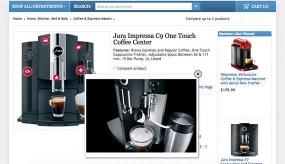
Costco not only shows a picture of this coffee center, but has links in the image to additional images and information.
The Jura images were not limited to just the standard product image area, but rather additional product pictures were shown lower on the page as part of the written product description.
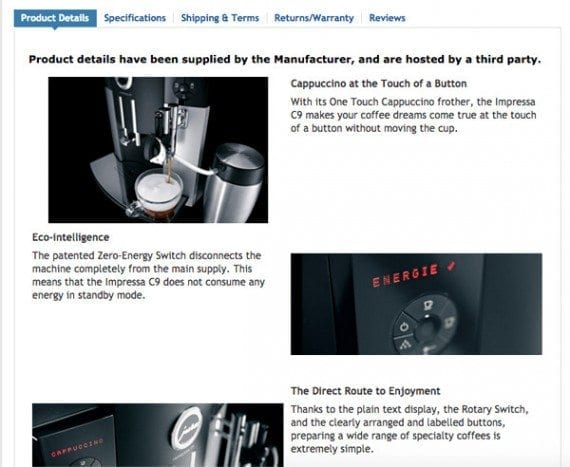
The coffee center images appear in several sections of the page.
Another good example of how images are used is on Home Depot’s site, which includes a 360-degree view on some of its product detail pages, allowing shoppers to look at items like a high efficiency washer.
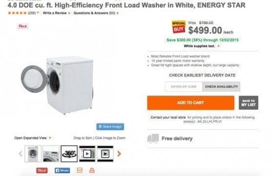
The Home Depot site included a 360-degree view of this washer.
Lesson 7: Use product videos. Several of the sites merchandised products with video. If you were shopping for Black Ops 3 on Best Buy’s site, for example, you could watch a trailer for the popular video game.
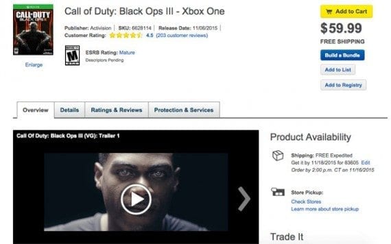
Best Buy uses video on product detail pages.