
A study in 2017 revealed a massive “conversion gap” on mobile. comScore found that mobile devices generated 69 percent of internet traffic but only 20 percent of ecommerce conversions. As 2018 comes to a close, has that gap changed?
Data from Adobe Analytics for Black Friday 2018 shows that for 80 of the 100 largest U.S. e-retailers, 33.5 percent of sales came from mobile devices. Thus the conversion gap for the largest ecommerce merchants has narrowed, but there is still a disparity when you consider that mobile traffic is reportedly at 61.1 percent of total ecommerce traffic and the mobile conversion rates for small and medium-sized commerce sites are likely lower.
Mobile devices generate more than 50 percent of internet traffic, but the website experience for users is often poor.
Conversion Gap
So why does this conversion gap exist?
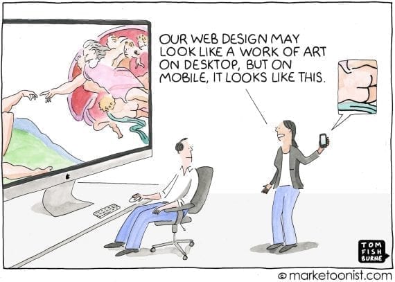
It is caused by taking an experience designed for a desktop, keyboard, and mouse; rotating it 90 degrees; and squeezing the content onto a much smaller screen. When the content has not been optimized for this new mobile orientation, it produces a poor experience.
The result is that consumers abandon their mobile shopping journey and switch to a different device and channel, starting the process over. This creates friction for consumers and missed conversions for merchants.
Responsive design, an approach that adjusts layouts and images to the user’s screen size, was intended to deliver better mobile experiences. However, my quick tour of responsive retail sites reveals many glitches, where basic concepts of commerce continue to fall flat on a small screen. Responsive design, after all, is a compromise. We can measure the impact of this compromise in the conversion gap.
Rather than resizing the same content onto smaller screens, businesses must rethink how to execute commerce on mobile devices altogether.
Take the ecommerce category tree, for example. Simply replicating the full desktop list of categories onto a small screen is almost certainly not going to adapt well. In the same vein, facets, filters, and checkboxes are not only hard to use with fingers, but take up a large portion of the screen, often resulting in products being hidden behind menus of text.
In short, responsive design relies on concepts from a different era, when most consumers navigated a website with a mouse. What follows are three ways to prompt more mobile conversions.
3 Ways to Narrow the Mobile Commerce Gap
Visual navigation. In retail, it’s critical to display products effectively. Humans are visual. It takes three seconds to process a headline, but as little as 13 milliseconds to process a photo. Images are processed in a different part of the human brain and trigger stronger emotional responses. It’s the same part of the brain that allows us to recognize faces much faster than we can recall names.
Businesses can take advantage of this with native mobile design and visual category trees, where the navigation is based on tapping and swiping images.
In the screenshots below, the image-based navigation on the right is much more inviting than the forms-based approach on the left. (Which categories to show to which visitor, however, is a more complex question. That can now be solved using artificial intelligence.)
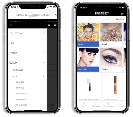
The image-based navigation on the right is much more inviting than the forms-based approach on the left.
One-tap buy. The most critical part of mobile conversion is when a user must enter data. Registering or logging into an account and checking out are difficult. These instances are almost certainly where consumers who would have converted give up and go back to desktop.
Checkout has perhaps the biggest impact. Ninety-four percent of mobile visitors that get to this stage do not complete their purchase. Why? It’s too difficult to type credit card details while on the move.
The answer is the one-tap buy, such as Apple Pay, Google Pay, and Samsung Pay. One-tap buy transforms the shopping experience by eliminating the need to enter billing, shipping, and credit card details and, instead, using the info already stored in the phone’s mobile wallet. Biometric payment confirmation via a thumbprint or Apple’s Face ID is much more convenient than trying to enter payment details by hand.
Progressive web. Until recently, one-tap buy was limited to mobile apps. However, with progressive web apps, businesses can now provide an app-like experience in a browser. This includes one-tap buy, bringing easy and fast checkout to all mobile and tablet users.
It’s worth noting that PWAs are not apps in the way consumers typically think of them. There is nothing to download. Rather, a browser automatically applies app-like functionality as the user starts navigating through a site. It’s fast and easy and supports tapping, swiping, and zooming — just like a native app.
Rethinking Mobile
The mobile shopping experience is still poor for typical consumers. Merchants should rethink how to optimize that experience, especially in the areas of product discovery and checkout. The answer is not responsive design. The answer, instead, is making commerce intuitive on mobile, which is the primary device used by shoppers.


 USPS Losses Threaten Ecommerce Shipping
 AI Drives Smarter Ecommerce Pricing
 SEO Tactics for GenAI Visibility
 New Ecommerce Tools: March 25, 2026
 Search Console's Average Position, Explained
 New Ecommerce Tools: March 18, 2026
 SEO for AI, Low Traffic, No Clicks