Even a cursory review of other retailers’ marketing efforts can spawn ideas to drive your next campaign.
Modern marketing is dynamic, multi-faceted, and competitive. On the one hand, marketers seek to build lasting customer relationships with social media, useful content, and brand recognition, while at the same time trying to get immediate sales in response to offers in an environment wherein a potential customer might get dozens of offers a week.
In this context, here are five, recently sent email marketing campaigns from HauteLook, Gap, Williams-Sonoma, Cost Plus World Marketing, and GNC. The examples show what five leading online marketers are sending to their prospects.
Example 1: HauteLook
HauteLook is a membership site offering deeply discounted premium items for short duration sales. The company’s main product lines include fashion clothing for men, women, and children, home decorating products, make-up and beauty products, and similar accessories.
In an email sent on January 31, HauteLook took a newsletter-like approach to offering products. With the exception of a single item, a Steve Madden Puffer Vest, the email did not list product prices, rather it showed recipients the variety of product categories HauteLook offers.
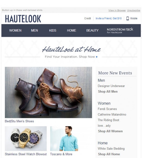
The email from HauteLook showed no prices.
The email’s subject line, below, was ridiculously long. But it did seem to match the email’s core message that HauteLook as a lot of products to offer.
Bed|Stu Men’s Shoes | Stainless Steel Watch Blowout | Toscano & More | X-Ray Men | Men’s Weekend Casual: Favorite Finds | And more on sale now!
Key Takeaways:
- You don’t have to show prices to promote products;
- Website-like layout;
- Good product photography.
Example 2: Gap
Gap is a multinational, multichannel clothing and accessories retailer, selling online and via brick-and-mortar stores. The company reported $15.6 billion in revenue for its 2012 fiscal year ended in February 2013, and had more than $11.5 billion in revenue from February 3, 2013 to November 2, 2013.
With so much revenue, one would expect Gap to present thoughtful, well-designed email marketing messages, which in many ways this January 31 message delivers. The design is clean and the message is clear.
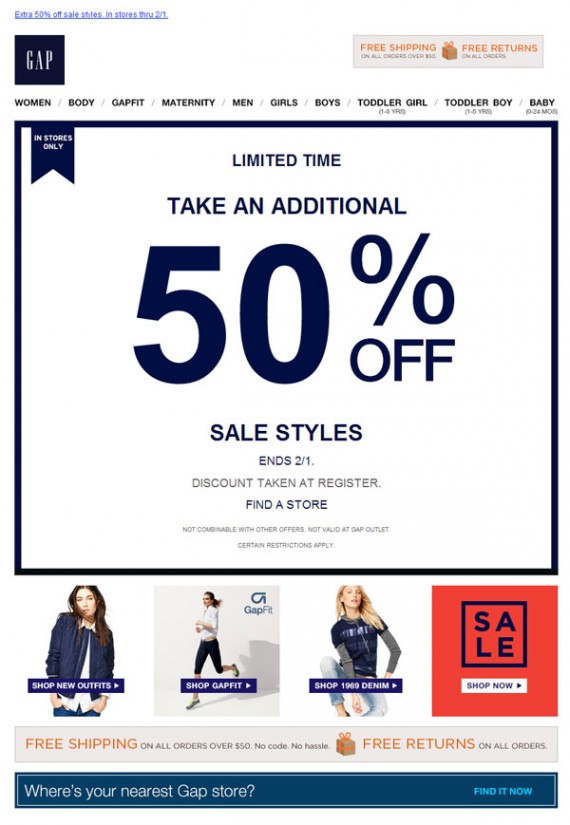
Gap’s email emphasized a clean design and a clear message.
The subject line, “Last Chance to Save,” however, lacked clarity. And it is worth noting that the relatively wide layout (808 pixels) made it hard to view on a smartphone.
Key Takeaways:
- A singular focus with a singular offer;
- Website-like navigation;
- Brand-relevant graphics and photography.
Example 3: Williams-Sonoma
Mutlichannel, specialty retailer Williams-Sonoma is a favorite of foodies, offering great cooking and baking related products and a significant amount of useful site content. The company’s good reputation no doubt boosts its email open rates and email marketing results.
In this message, which was sent on January 31, 2014, Williams-Sonoma featured a 20 percent discount on baking pans and accessories. The email included many sharp high-quality images aimed at showing recipients what they might do in their own kitchens if only they were aimed with the items Williams-Sonoma sells.
The subject line, “Get it While its Hot – The Bakeware Sale is Almost Over,” is description of the content, but is, perhaps, a bit long. Many email professionals aim for 35 characters for fewer.
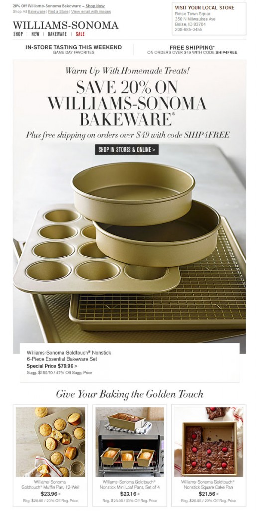
The Williams-Sonoma email featured high-quality images.
The email itself was also extremely long at about 4,962 pixels from top to bottom. Very long pages are part of a relatively new web design trend, wherein designers are catering to mobile, swipe-friendly devices, since many users would rather swipe than go to a new page.
Key Takeaways:
- Great product photography;
- A very long vertical page.
Example 4: Cost Plus World Market
Cost Plus World Market sells wine, beer, specialty foods, cookware, plates and glasses, home decorations, and even furniture, both online and in more than 260 brick-and-mortar retail stores.
In its January 31 email message, World Market was promoting discounts on wine and beer ahead of Sunday’s Super Bowl.
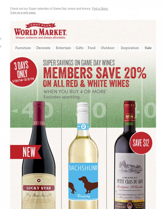
Cost Plus World Market’s email carried a Super Bowl theme.
The message’s subject line was very descriptive, telling recipients exactly what the offers were even before the message is opened.
20% off ALL wines + 35% off build-your-own 12-pack of beer
Regarding design, the message included a football theme, without actually mentioning the Super Bowl by name. Like other examples here, the graphics and photography were high quality. Also, the layout was not too wide, and looked relatively good even on mobile email clients.
Key Takeaways:
- Great photography and images;
- Friendly for mobile email clients.
Example 5: GNC
General Nutrition Center (GNC) is a Pittsburgh, Penn.-based multi-channel retailer selling health, fitness, and beauty related products.
GNC’s January 30, 2013 email message seemed to be aimed at the weather headlines of the day. Places like Florida were getting inches on inches of snow, and GNC’s marketers may have been hopeful that folks stuck at home (because of the cold temperatures) would shop online.
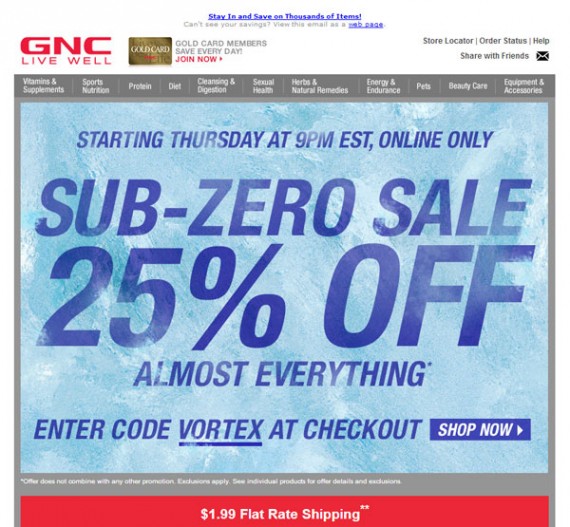
GNC’s email looked very similar to its website.
The subject line spoke directly to the email’s content, which is as it should be. A MailChimp study found that descriptive and concise email subject lines often had the best open rates.
20% Off Sub-Zero Sale, Tonight Only
The email’s navigation looks and acts very much like the navigation on the GNC website, this continuity means that email recipients can start searching the GNC ecommerce site if the particular email offer does not appeal to them.
Key Takeaways:
- Website like navigation;
- Timely theme.


