
New techniques, technologies, and user behaviors drive ecommerce website and application design every year. In 2018, expect ecommerce sites to employ the CSS Grid Layout, use mobile-friendly full-screen modal windows, offer a lot more video, and include microinteractions and guided selling.
1. CSS Grid Layout
CSS Grid Layout is a two-dimensional layout model and part of the CSS standard from the World Wide Web Consortium.
It gives designers significantly more control over how a web page is laid out and helps make much better use of space across devices and screen sizes. Put another way, CSS Grid Layout makes optimizing user interfaces relatively easy when compared to other methods.
“As websites evolved from simple documents into complex, interactive applications, techniques for document layout, e.g. floats, were not necessarily well suited for application layout,” wrote World Wide Web Consortium editors in the CSS Grid Layout recommendation.
“By using a combination of tables, JavaScript, or careful measurements on floated elements, authors discovered workarounds to achieve desired layouts. Layouts that adapted to the available space were often brittle and resulted in counterintuitive behavior as space became constrained. As an alternative, authors of many web applications opted for a fixed layout that cannot take advantage of changes in the available rendering space on a screen.”
CSS Grid Layout addresses those problems and makes web design a lot better all around.
In 2018, look for ecommerce website designers and theme makers to include CSS Grid Layout, especially on product category pages or on search results pages.
The only possible barrier may be that some early versions of web browsers do not completely support CSS Grid. But the most recent versions of all leading browsers — including Chrome, Firefox, Safari, Opera, and Edge — do support it.
2. Full-screen Search, Forms
In web design, a modal, modal box, or modal window is an element, typically controlled with a script, that is overlaid on top of other elements (content) to permit user interaction.
Modals have been an effective user interface for several years and are common on many ecommerce websites. What may change for 2018 is the use of full-screen modals for search and forms.
The trend comes from mobile-first web design. On a mobile device, many modals take up most or all of the available space on the screen.

Overstock’s newsletter subscription form uses a full-screen modal box.
Overstock, as an example, is using a full-screen modal for its newsletter registration form, which pops up for new site visitors. On a mobile device, the form is centered and full-screen and even on a much larger screen the translucent gray stretches end to end.
The Ralph Lauren website includes a search modal that covers nearly all of the content on the page when displayed on desktop or laptop computers, and is, in fact, full-screen on a mobile device.
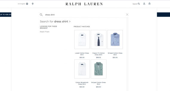
The Ralph Lauren site uses a search modal that is full-screen on mobile devices and covers most content on larger screens.
Look for designers who are building for mobile first to use full-screen modals for search and other forms and carry those full-screen implementations into larger layouts, too.
3. Much More Video
Video is an excellent medium for conveying complex information, telling stories, and evoking emotion. The amount of videos distributed on the web and watched by Internet users rises every day. So it should not be a surprise that online retailers are also using more video elements in web design.
Sites such as Beardbrand, which has been using videos and content marketing for several years, lead the way by adding video inline on product detail pages.
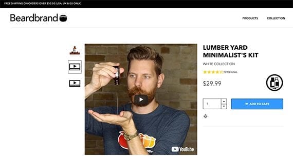
Online videos are both popular and effective. In 2018, look for ecommerce site designs to include video on product pages, landing pages, and even as backgrounds. Source: Beardbrand.
You may also see video used as backgrounds, on-site merchandising, or hero images.
4. More Microinteractions
Microinteractions have been around at least since Facebook added the “Like” button to its posts. What started as a way to rate social media contributions has grown into one of the most popular website and application trends for 2018.
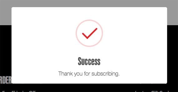
An animated success message tells a user he has successfully joined the mailing list.
For online sellers, a microinteraction’s best trick may be its ability to help create habits or, at the very least, reward users for completing specific tasks, such as adding a product to the shopping cart, reviewing a product, or subscribing to an email newsletter.
As Nick Babich, editor-in-chief of Planet UX, points out, “Microinteractions have the power to encourage users to actually interact. They are strong instruments that help to form habit loops.”
Shoppers on an ecommerce website, for example, might write a review for recently purchased products. When they submit the review, a small animation (microinteraction) rewards them for the submission, encouraging them to write another review.
There are four main parts to a microinteraction, according to Dan Saffer, author of the book Microinteractions.
- A trigger that initiates or begins the microinteraction.
- Rules that define or determine what happens in the interaction.
- Feedback communicates what is happening or what just happened.
- Loops and modes which govern, if you will, the content.
In 2018, expect ecommerce site and application designers to season their designs with microinteractions.
5. Guided Selling
Guided selling is the act of asking shoppers questions about features and usage to help them discover specific products.
In ecommerce, guided selling has been around for several years. Victoria’s Secret, for example, has a sports bra selector. The North Face will help you find jackets. And Bodybuilding.com has a three-step supplement finder to help you meet your fitness goals.

Bodybuilding.com’s simple supplement finder leads shoppers to a good solution.
Like some other design trends on this list, guided selling could become much more common in 2018.


 Hostinger Reframes Site-Free Ecommerce
 AI Visibility Scores Are Useless
 New Ecommerce Tools: July 1, 2026
 India Ecommerce Paths for Foreign Sellers
 New Ecommerce Tools: July 7, 2026
 A Subtle Google Ads Bidding Change
 SEO for AI, Low Traffic, No Clicks