Founded in 1995, eBay is one of the original ecommerce pioneers. So it would stand to reason that as eBay has gone from startup to earning more than $17.9 billion in revenue in 2014, it may have picked up a trick or two about how to lay out a product detail page and what sort of content to include.
In fact, looking at just six of the things eBay does well on its product pages may provide some insights for small and mid-sized ecommerce operations to improve their own sites.
1. Good Product Information
The product detail pages on eBay have two product-information sections, including some basic product information that eBay collects when a user creates a product listing and a large portion of seller-contributed content.
The example shown below is from a listing for a lithograph. Notice that the first section, which is laid out a little like a table, includes product specifications, such as the print’s dimensions, how many prints were in the series, and whether or not the artist signed it.
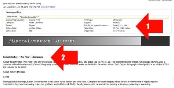
eBay product pages include two sections for written product information.
The second product information section comes from the seller, Martin Lawrence Galleries in the example. This portion of the product information is really the sales copy. It provides context, fuels desire for the product, and helps to set up, if you will, the product’s value. Remember that this example was meant to sell art; here is a sample from the description.
“The artwork is hand-signed and numbered by the artist. The paper size 11.75 x 11.25. The uncompromising printer, Art Estampe of Paris, used a centuries old traditional method of stone lithography to ensure that these beautiful works are faithful to the artist’s vision. Each Deyber lithograph is hand-pulled in an edition of 395 and initialed by the artist.
“Throughout his paintings, Robert Deyber moves in and out of visual themes and storylines. Compelled to create imagery where he uses a combination of highly stylized composition, light and contrasting colors, his goal is to apply all three skillfully, thereby drawing the viewer into his painting without overpowering or confusing.”
Aside from the written descriptions, eBay is also quite good at offering product photos. Even the most basic auction listings will frequently include many product images.
The image below shows the eBay listing for a 1962 Beech AirQueen twin-engine airplane. This listing included six separate images of the product’s (the airplane’s) interior and exterior.

Even basic auction listings on eBay will frequently have several good product images.
All eBay product pages also include a very functional zoom feature, allowing shoppers to see product images in considerable detail.

eBay has a simple and functional image zoom, the sort of feature that just about every ecommerce site should have.
The takeaway here may be to devote a bit more space to good product descriptions and use lots of photos.
2. A Clear Call to Action
Product detail pages are meant to close the sale. There should be little or no ambiguity here. The aim or call to action should be plain, as it is on nearly every one of eBay’s product pages.
Here is an example from the eBay product detail page for a collectable comic book. In this case, the product is up for auction, so the clear call to action is “Place bid.” The “Place bid” button is brightly colored, centrally located, and positioned for site visitors to find.
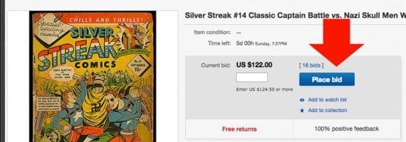
A clear call to action may lead to more sales.
Notice also that the current bid price is located just to the left of the call to action. Reading from left to right, the page shows a good product image, the price, and the call to action, giving the shopper, in some cases, enough information to act.
When items are offered for sale rather than via an auction, eBay shows two buttons in the call-to-action area of the page. The first, “Buy it Now,” goes directly to checkout, while the second button lets the shopper add an item to her cart and keep shopping. While it might be argued that one button would be better than two here, eBay is still making the call or calls to action rather direct.

Some eBay product pages may have two call to action buttons, but even these are well placed on the page.
On your product detail pages, make add to cart or buy buttons obvious.
3. Superb Shipping and Delivery Data
The 2015 UPS Pulse of the Online Shopper report, released in June, found that as many as 44 percent of online shoppers had abandoned a shopping cart after loading it simply to find out how much shipping might cost.
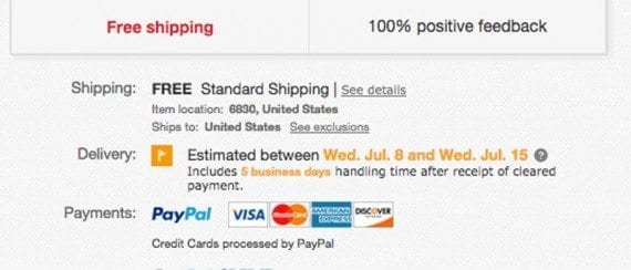
On the eBay site, this is not a problem. Product detail pages typically include superb information about shipping charges and estimated delivery dates. Users logged into eBay will see these figures personalized for their location.
In this example for a product with free shipping, eBay clearly lets the buyer know when the product is likely to arrive.
eBay includes superb shipping and delivery information on its product detail pages.
Lower on the page, eBay includes more detailed information about shipping and the option for the buyer to get estimates for other delivery locations.
Adding this level of shipping detail to product pages may reduce cart abandonment rates and, possibly, boost sales.
4. Clear Payment Options
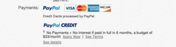
Similar to how it shows shipping and delivery data, eBay also shows clear payment options on its product detail pages.
Notice in this example, shoppers may purchase the product outright using a payment card or even get six months of interest-free credit.
The product pages on eBay include clear payment option information.
While some could argue that payment card acceptance is expected, there is no reason not to reassure a shopper right on the product page.
The lesson here may be to give shoppers all of the necessary information without requiring them to move into the checkout process.
5. Upfront Return Policy
Perhaps because eBay is a marketplace with a variety of sellers and differing policies, the site includes return policy information on every product page, just below delivery information and payment options.
While it may be the case that your site has a single return policy or guarantee, it might still be a good idea to do what eBay does and remind shoppers that they can safely return a product.
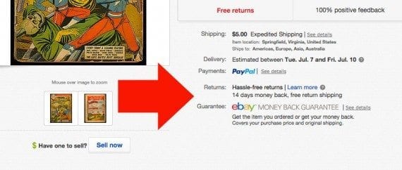
The return policy and available guarantee are shown just below the payment options.
6. Detailed Seller Information
Before a shopper will buy from an online store, that shopper needs to know that he can trust the seller to complete the transaction, to have been accurate in the product description, and to be willing to work out any problems that may arise.
To help establish this sort of necessary trust, eBay includes good seller information directly on product detail pages. This example shows a 100-percent positive feedback score for Adam’s Rare Comics, which has had more than 15,000 transactions.

The seller information shown on eBay product pages may help boost trust.
Interested shoppers could even click through and read specific feedback from their peers.
For your site, try to include reviews and ratings that help boost trust in a similar way.