

The bible of user-interface design is “Don’t Make Me Think” by Steve Krug. He believes questions such as “Where do I click?” or “What does this mean?” create hesitation in shoppers.
Each question distracts from finding a product or completing a purchase and turns the session into figuring out the site.
The questions add up, and every moment spent decoding the interface lessens the urge to buy. Krug says it’s a reservoir of goodwill that drains with each uncertainty. When it runs out, shoppers leave.
A common question involves quantities and prices, including shipping costs. Yet lesser-known cues, visual or written, also remove shopper doubts.
Here are examples.
No Counting
Do the math
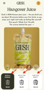
Gush labels its pack sizes by occasion, “With a Friend,” “With the Crew,” and “For the Party,” in addition to showing the number of pouches. The occasion does the math: instead of figuring out how many pouches they need, shoppers pick the kind of night they’re planning.
Gush
—
Clear quantities
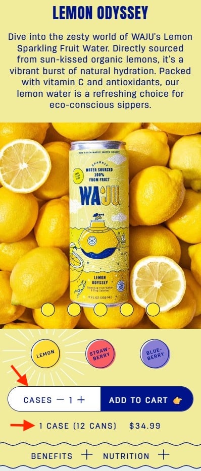
Waju’s product page clearly shows that the quantity refers to cases, not separate cans, with a line explaining how many cans are in a case. The quantity field’s white background stands out, so you can’t miss the wording.
Waju
—
Intuitive product names
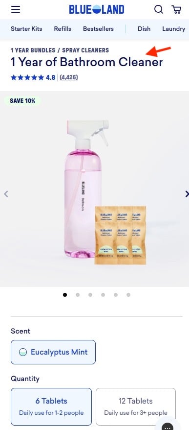
Blueland doesn’t just translate tablets into daily usage for the number of people in the household. The product name — “1 Year of Bathroom Cleaner” — describes the outcome, not the contents.
Blueland
—
Illustrate portions
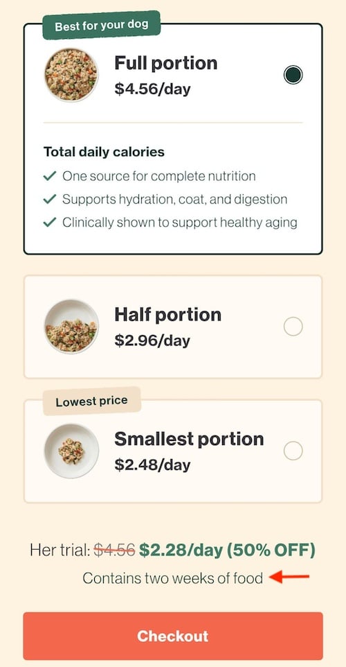
The Farmer’s Dog answers the amount-to-order question in three visual portions. Each shows a bowl to illustrate the quantity of dog food. The price is per day rather than per box, matching how most dog owners equate the cost. A sentence below the options — “Contains two weeks of food” — clarifies the selection. Shoppers never have to convert grams, boxes, or totals.
The Farmer’s Dog
Next Steps
- Find the unit your shopper thinks in. Open your product page and look at the quantity selector. Is it in your unit (grams, packs, tablets) or in theirs (days, people, occasions, uses)? Add one line under each option to clarify.
- Price the unit, not just the box. If shoppers think in days, meals, or uses, show the price per day, meal, or use next to the total. Make sure the number matches the option they selected, so a subscription price doesn’t sit next to a one-time purchase.
- Spell out what’s inside a bundle. If you sell in cases, packs, or kits, write the count next to the selector: “1 case (12 cans).” Don’t force shoppers to open a dropdown or read a description.
- Move “How long will this last?” out of the FAQs. Put it next to the quantity options.
- Watch a shopper choose. Ask three people outside your team to pick a quantity out loud. Every pause, “hmm,” or calculation is one of Krug’s question marks. It reveals where to add a hint.



 New Ecommerce Tools: September 16, 2026
 Test Your Products for AI Discovery
 Branded Sites Are Vital for Merchants
 Drive Awareness with Video Sequence Ads
 Does Retail Media Add Value?
 New Ecommerce Tools: September 23, 2026