Bootstrap is an HTML, CSS, and JavaScript framework that makes it easy to rapidly develop websites. It can be used with nearly every ecommerce platform.
Bootstrap is an open-source framework for creating responsive, mobile first websites. It can help even novice developers. But many new Bootstrap users have trouble with fixed navbars — navigation headers — making navbars collapse on smaller screens and failing to center a website’s name or logo.
Bootstrap is one of the most popular HTML, CSS, and JavaScript frameworks for developing responsive web pages. Thousands of websites use Bootstrap. It can also be used in combination with most ecommerce platforms, so that Shopify themes or WooCommerce themes, as examples, may be built with Bootstrap.
By default, Bootstrap navbars put a site’s logo or brand name on the left; scroll up with the page, and will not collapse. In this article, I will describe how to overcome these limitations, so that the logo is centered, the navbar can achieve a fixed position, and the menu can collapse for smaller screens.
Loading Dependencies
This project requires the Bootstrap CSS file, the Bootstrap JavaScript file, and jQuery (above version 1.1.9 and below version 3).
There are many ways to include Bootstrap in your project, but one of the simplest is to call the required files from a content delivery network. If you choose this approach, put the Bootstrap CSS file in the head section of your HTML file.
<head>
...
<link
 href="https://maxcdn.bootstrapcdn.com/bootstrap/3.3.6/css/bootstrap.min.css"
 rel="stylesheet"
 integrity="sha384-1q8mTJOASx8j1Au+a5WDVnPi2lkFfwwEAa8hDDdjZlpLegxhjVME1fgjWPGmkzs7"
 crossorigin="anonymous"
>
</head>
The Bootstrap JavaScript file and jQuery can be referenced at the bottom of your HTML document, just before the closing body tag. Since Bootstrap depends on jQuery, you will need to include jQuery first.
<script
 src="https://code.jquery.com/jquery-2.2.2.min.js"
 integrity="sha256-36cp2Co+/62rEAAYHLmRCPIych47CvdM+uTBJwSzWjI="
 crossorigin="anonymous"
></script>
<script
 src="https://maxcdn.bootstrapcdn.com/bootstrap/3.3.6/js/bootstrap.min.js"
 integrity="sha384-0mSbJDEHialfmuBBQP6A4Qrprq5OVfW37PRR3j5ELqxss1yVqOtnepnHVP9aJ7xS"
 crossorigin="anonymous"
></script>

</body>
Responsive Bootstrap Navbar
The first feature will focus on collapsing or, if you like, expanding the Bootstrap navbar. The idea is simple: When the page is displayed on a mobile screen, we want individual navigation items to be consolidated under a single button, which is sometimes called a hamburger menu.

On screens that are smaller than 768 pixels wide, the navigation items collapse behind a hamburger menu.
Touching or clicking on the hamburger menu displays the navigation items.
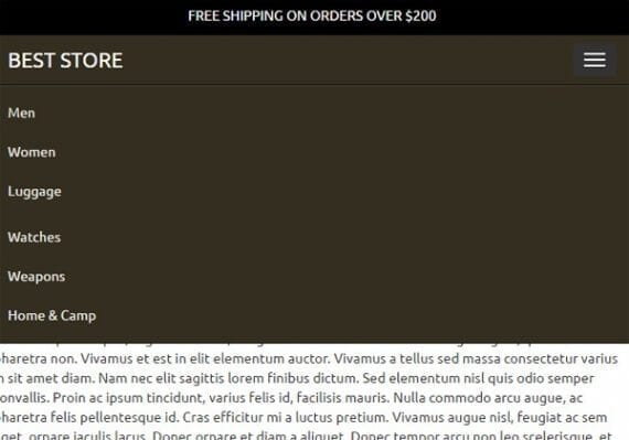
The navigation items are still available, but they are not always displayed. This makes it relatively easier for mobile users.
When the same page is displayed on a larger screen (more than 768 pixels wide) the navbar will expand to show individual items separately.

On screens more than 768 pixels wide, the navigation items are expanded to fill the space and save a click.
This feature is shown pretty clearly in the Bootstrap documentation, but at the time of writing it was not called out or specifically identified as a collapsing navbar. Rather it is simply included as part of a description of many different navbar capabilities.
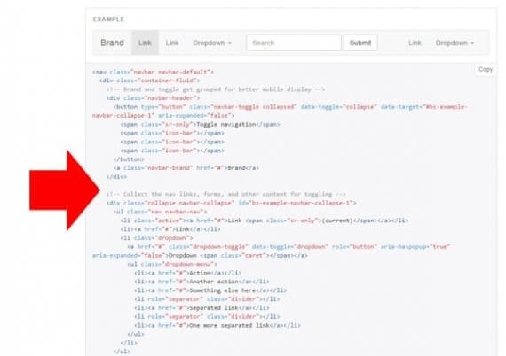
An example collapsing navbar is shown on in the Bootstrap documentation, but that the time of writing it was not called out as such.
This collapsing navbar has two parts wrapped in a nav element and a Bootstrap container. In Bootstrap, each of these wrappers has meaning on style properties.
<nav class="navbar navbar-inverse navbar-fixed-top”>
 <div class="container">
     ...
 </div><!-- end container -->
</nav>
We are applying three Bootstrap CSS classes to the nav element: navbar, navbar-inverse, and navbar-fixed-top.
The first of these tells Bootstrap that this is a navbar and applies a series of styles to make the element look like a navigation element. The second class, navbar-inverse, tells Bootstrap that we want a dark-colored navbar with light-colored text. The third class, navbar-fixed-top, will make the navbar stay at the top of the screen even when the page scrolls down (more about this later).
The first part of the collapsible navbar defines the hamburger menu (the three horizontal lines) and includes the site’s brand, which in this case is simple text.
<div class="navbar-header">
 <button
  type="button"
  class="navbar-toggle collapsed"
  data-toggle="collapse"
  data-target="#expand-nav"
  aria-expanded="false"
 >
  <span class="sr-only">toggle navigation</span>
  <span class="icon-bar"></span>
  <span class="icon-bar"></span>
  <span class="icon-bar"></span>
 </button>
 <a class="navbar-brand" href="#">Best Store</a>
</div>
Much of this code can be copied as is and used in just about any project. The key to notice is the button’s data-target property. This property tells the Bootstrap JavaScript the id of the div containing the navbar items that we want to collapse.
Here is the second part of the collapsible navbar.
<div class="collapse navbar-collapse" id="expand-nav"> <ul class="nav navbar-nav navbar-left"> <li><a href="#">Men</a></li> <li><a href="#">Women</a></li> <li><a href="#">Luggage</a></li> </ul> <ul class="nav navbar-nav navbar-right"> <li><a href="#">Watches</a></li> <li><a href="#">Weapons</a></li> <li><a href="#">Home & Camp</a></li> </ul> </div>
This section describes the actual list items. Notice that the div’s id property matches the button’s data-target property discussed above. Other than the Bootstrap CSS classes placed on the div and ul elements, this is a pair of simple lists.
Notice that each of the unordered lists (ul) have a navbar-left and navbar-right class. These classes will bring us to the second thing we wanted to accomplish in this article: centering the brand text or logo.
Center the Brand in a Bootstrap Navbar
In the example of the expanded navbar shown above, the brand, Best Store, is shown in the middle with links on either side. But if you ran the code shown in the last section of the article, the brand would actually be on the left.

By default, Bootstrap will place the navbar brand on the left side. It takes a bit of extra CSS to reposition the brand to the center of the navbar.
To center the brand on a Bootstrap navbar, I am going to use a media query and just a bit of CSS. This CSS can be included in your HTML document inside of a style element or included in a linked, external style sheet. In this example, it is shown as an internal style sheet wrapped in style tags.
<style>
@media (min-width: 768px) {
 .navbar-brand {
  position: absolute;
  width: 100%;
  left: 0;
  top: 0;
  text-align: center;
  margin: auto;
 }
}
</style>
Bootstrap uses media queries to apply specific styles when the page is displayed on screens meeting some requirement. In this case, the CSS above is only applied on screens that are at least 768 pixels wide (min-width).
So when the navigation is collapsed, the brand will be displayed on the left with the hamburger menu on the right, but when the navigation is expanded the brand is centered.
Put a Message above a Fixed Bootstrap Navbar
The third feature that we’ll build into our Bootstrap navbar has already been shown in the examples above. You may have noticed that above the Bootstrap navbar there is a little section with a free shipping offer — “Free Shipping On Orders Over $200.”
This pre-navigation header is a popular design pattern at present, but it will normally not work with a fixed-position, Bootstrap navbar, since the navbar wants, if you will, to be at top of the page.
To achieve it, you’ll first need to add the header above your Bootstrap navbar.
<div class="nav-top">
  <div class="container">
   <div class="row">
     <div class="col-xs-12">
       <a href="#">Free Shipping on Orders Over $200</a>
     </div>
   </div>
 </div>
</div>
The container, row, and col-xs-12 classes are part of Bootstrap’s grid system. These give the header particular style characteristics.
The nav-top class is a custom class I used to reference this header. Here are the styles used to position and decorate the header.
.nav-top {
  width: 100%;
  height: 40px;
  background: #000;
  color: white;
  text-transform: uppercase;
  text-align: center;
  position: fixed;
  overflow: hidden;
}
.nav-top a { color: white; }
.nav-top a:hover { text-decoration: underline; }
.nav-top div.row { padding: 10px 0; }
Notice that the header is given a fixed position, which keeps it at the top of the page. It is set to fill the entire screen horizontally, and it will occupy 40 pixels of vertical space.
Next, I added a class, head-room, and an id, general-nav, to the Bootstrap navbar.
<nav class="navbar navbar-inverse navbar-fixed-top head-room" id="general-nav">
The class allowed me to add a margin above the navbar to make room for the header.
.head-room { margin-top: 40px; }
If we stopped right now, you’d have a fixed header right above your fixed Bootstrap navbar.

A few lines of HTML and a couple of style declarations and you have a header above the Bootstrap fixed-position navbar.
To this, I would like to add a little bit of animation. When the user scrolls down, I want the navbar to slowly move to the top and cover the header, giving the user more room to focus on the content. This is another popular design pattern at the moment.
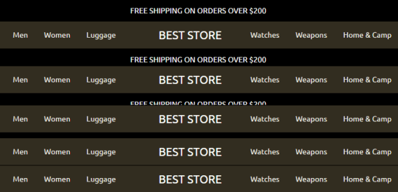
When the user scrolls or swipes down the page, the Bootstrap navbar will slide up, covering the header and giving the user more room to focus on the page content.
The effect has two parts, starting with a CSS transition.
.navbar-fixed-top { transition: all 3s ease; }
This style declaration says that if the styles associated with an element that has the navbar-fixed-top class change, take three seconds to transition to the new styles.
The second part of the effect is a bit of jQuery-powered JavaScript. This script must be included in the HTML document after jQuery since it relies on jQuery selectors and methods.
<script>
 $(window).scroll(function(){
   if ( $(this).scrollTop() > 10 ){
     $('.navbar-fixed-top').removeClass('head-room');
   } else {
     $('.navbar-fixed-top').addClass('head-room');
   }
 });
</script>
This code watches, if you will, the screen. When a user scrolls, it calls a function.
$(window).scroll(function(){ …}
If the user has scrolled down the page at least 10 pixels, the script removes the head-room class from the Bootstrap navbar. You will remember that the head-room class added 40 pixels of top margin. Without the head-room class the Bootstrap navbar will be positioned at the top of the page.
if ( $(this).scrollTop() > 10 ){
  $('.navbar-fixed-top').removeClass('head-room');
}
If the screen is fewer than 10 pixels from the top, the script adds the head-room class.
else {
  $('.navbar-fixed-top').addClass('head-room');
}
There is one potential problem. The fixed Bootstrap navbar may cover up some of your page content. So remember to add some extra top margin to the rest of the content.
Apply Your Collapsing, Fixed Bootstrap Navbar
You should now know how to create a collapsing, fixed-position Bootstrap navbar with a bit of extra room for a header up top.
This navbar can be integrated into just about any platform or theme. So whether you’re creating a theme for Shopify, LemonStand, Bigcommerce, or just about any other ecommerce system, you should be able to use Bootstrap.
For more, see “Create Responsive Ecommerce Product Pages with Bootstrap.”


