In “10 Essential Google Analytics Dashboards for Ecommerce,” I reviewed 10 existing, custom dashboards that can help ecommerce merchants. In this post, I will describe how to create your own Google Analytics ecommerce dashboard.
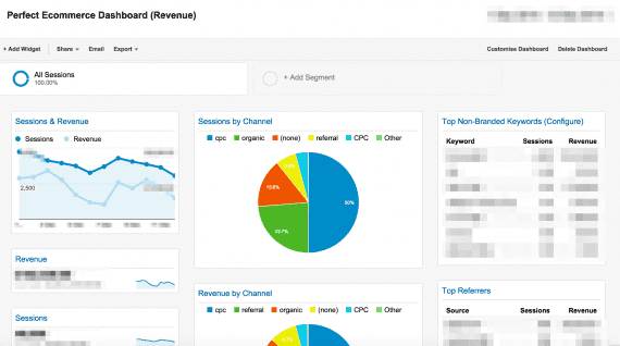
For starters, here is the ecommerce dashboard we are attempting to build (it is available in Google Analytics Solution Gallery).
Step 1: Create a New Dashboard Canvas
When you log into Google Analytics, you will be automatically directed to a list of properties. To create a dashboard, choose “Reporting.”

Choose “Reporting.”
When you click the Dashboards tab (on the left navigation area, as shown below), you will have an option to add a new dashboard (+ New Dashboard).
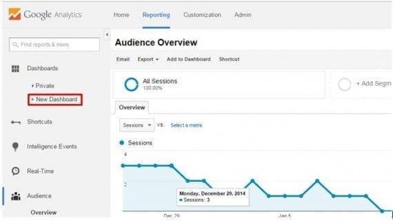
Click “+New Dashboard.”
Type in the name of the dashboard and click on “Create Dashboard.”

Name the dashboard.
Step 2: Add a Widget
This is where all of the magic happens. When you are creating a new widget, you must decide whether it will be a graphic (such as a map, chart, or timeline), or a table (list of metrics/dimensions and values).
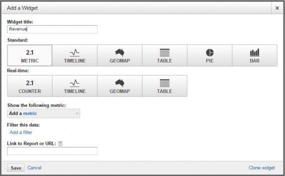
Pick the type of widget you want to create.
There are currently six types of dashboard widgets — four can be used both for standard and real-time data.
- Metric. Displays a simple numeric representation of a single selected metric.
- Timeline. Displays a graph of the selected metric over time. You can compare this to a secondary metric.
- Geomap. Displays a map of the selected region, with the specified metric plotted on the map. Hover over the map to see the actual metric values.
- Table. Displays up to two metrics describing the selected dimension, laid out in tabular format.
- Pie. Displays a pie chart of the selected metric grouped by a dimension. Mouse over a slice to see the specific metric values.
- Bar. Displays a bar chart of the selected metric grouped by up to two dimensions. Mouse over a slice to see the specific metric values.
Now, let’s add the widgets to our ecommerce dashboard.
A. Sessions and Revenue
In this example, let’s create a time-series chart (timeline) comparing Sessions to Revenue. In other words, we will show how Sessions and Revenue can be visualized. Name the widget in line with what it is actually displaying, so that it is clear to viewers of the dashboard. The metrics we intend to track are Sessions and Revenue, and the type of this widget is Timeline.
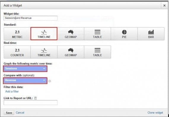
Comparing Sessions to Revenue.
After you click the “Save” button, the widget will be saved to the dashboard.
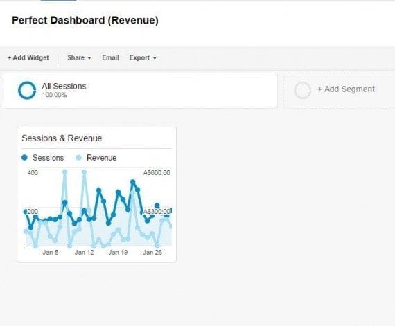
Save the widget to the dashboard.
It is worth noting that within each widget, you have filtering options. For instance, if you wanted to show only data for a particular country, — e.g., only sessions from Canada — you could use a “Country” filter option (see below). These filters will only apply to the widget, not to the entire dashboard.
Adding a filter is optional, however.
Adding a filter is optional.
The same logic applies to all widgets that you want to create.
B. Sessions by Channel
Let’s create the second widget that aims to show Sessions by Channel. For the settings for this widget, choose “Pie” for this widget type and set up dimension as “Medium.”
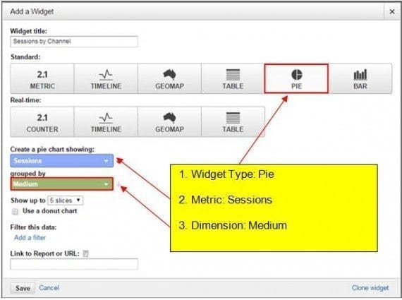
The second widget will show Sessions by Channel.
After the widget is saved, it should be displayed on the dashboard.

The second widget is on the dashboard after it’s saved.
It is worth noting that you can move widgets around the dashboard and place them side by side.
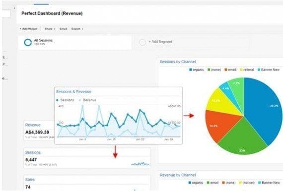
Arranging widgets on the dashboard.
C. Revenue by Channel
Now let’s add the Revenue by Medium pie chart, which is similar to Sessions by Channel, the previous widget.
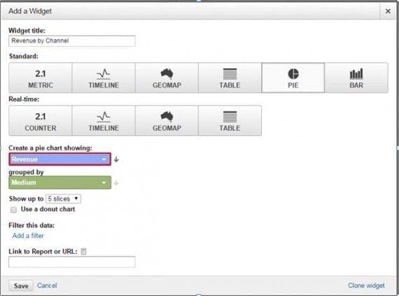
Adding the Revenue by Medium pie chart.
Here is how your dashboard should look like after adding this widget.
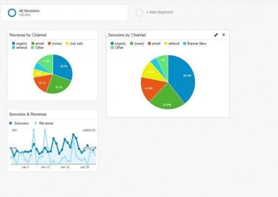
Dashboard after adding new widget.
Note that you can create up to 6-slice pie charts.
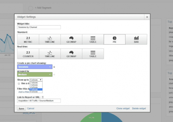
Create up to 6-slice pie charts.
D. Revenue
Now, let’s add “Revenue” as the metric. It will show total revenue for the selected date range.
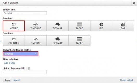
Adding “Revenue” as the metric.
The updated dashboard should look like this.
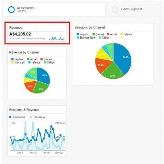
Updated dashboard appearance.
Using the same steps as above, we will add other metric widgets, such as “Sales” (transactions) and “Sessions.”
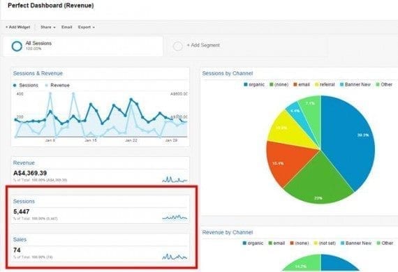
Adding “Sales” (transactions) and “Sessions.”
E. Revenue and Ecommerce Conversion Rate by Device Category
Let’s look at one more widget: the “Table” type. For instance, if you wanted your dashboard to reveal revenue by device type (desktop, mobile, tablet) and then conversion rate per device, this type of widget could come in handy.
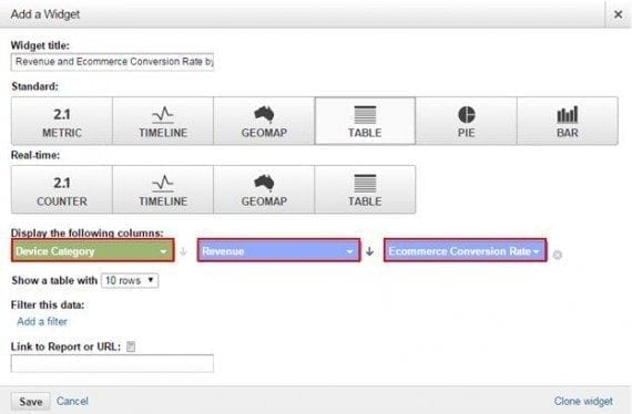
Adding a “Table” widget.
After adding the columns — device, revenue, and ecommerce conversion rate — to the sixth widget, our dashboard should look like this.
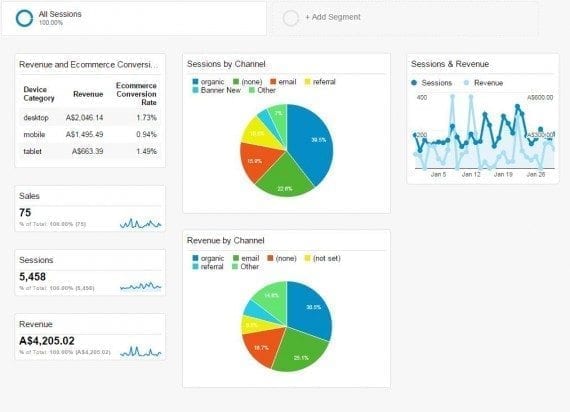
After adding the sixth widget, our dashboard should look like this.
F. Revenue by Country
Using the same table-type widget and repeating the previous steps (but this time changing the primary dimension to “Country” and metrics to “Sessions” and “Per Session Value”), we should be able to view number of visits from different countries and what monetary value they bring.
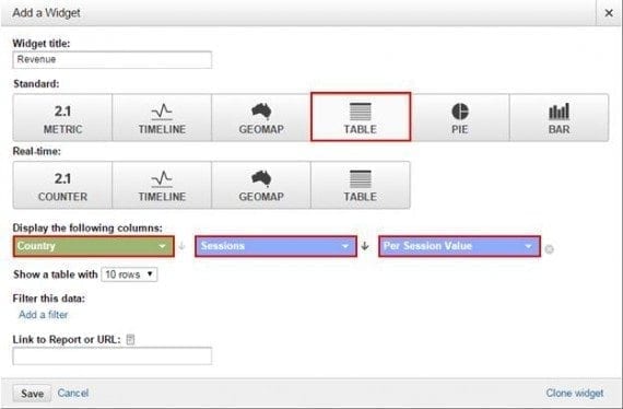
Viewing number of visits from different countries.
That is how our dashboard should look like now.
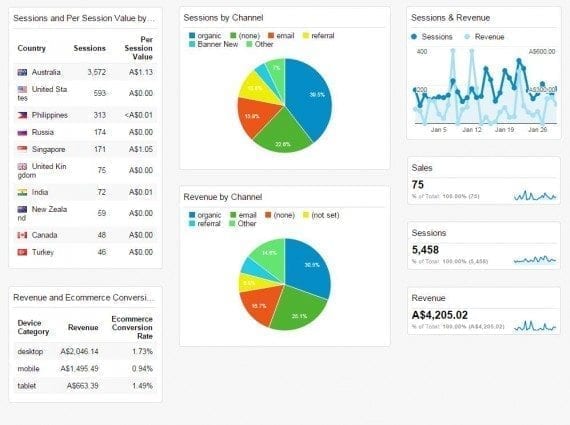
Dashboard after country-tracking widget.
Repeating the previous steps using a table, in our next widget let’s show top traffic referrals by Sessions and Revenue.

Traffic referrals by Sessions and Revenue.
We added “Source” as a dimension and then added the filter that only shows medium of “Referral.”
The next widget aims to display top landing pages by engagement.

Top landing pages by engagement.
There is an alternative way to add widgets to a dashboard that is much faster. To go about it, when any Google Analytics report is in view, simply click “Add to Dashboard” button on the top navigation area. This will produce a pop-up that allows you to select a table, chart, or both, and which dashboard to add the specific widget to.
When you view the “Behavior Overview” report, for example, you will see that you able add the report to a dashboard.
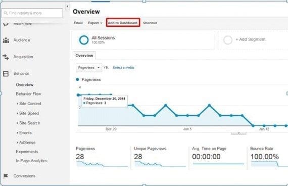
Adding the “Behavior Overview” report to a dashboard.
When you click “Add to Dashboard,” you’ll be able to choose the specific dashboard you want this report summary added to.
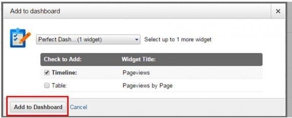
Choosing the specific dashboard.
Step 3: Organizing Your Dashboard
After you have created a few widgets, you should be able to organize and customize your dashboard with your business’s requirements.
To customize the look and feel of your dashboard, click on “Customize Dashboard” in the upper right hand navigation area.
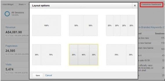
Click on “Customize Dashboard” to customize the look and feel of your dashboard.
Choose the layout that works best for you and hit “Save.” Next, you’ll want to organize the widgets in the order you think best for users of your dashboard. To do this, simply drag and drop each widget to your desired location. When you’re done, you’ll have your own customized dashboard view.
Step 4: Segmenting, Analyzing, Sharing
Advanced Segments, Unified Segments
Just as with standard Google Analytics reports, you can add segments to your dashboard. Adding segments will enable you to compare metrics generated in your dashboard with different session or user groupings.
To edit an existing segment, click the segment label at the top of your dashboard. To add a segment, click the empty “+Add” segment label. For example, here’s how to compare the performance of mobile and tablet traffic against all sessions.
Click “+ Add segment” and choose the segment you’d like to add.
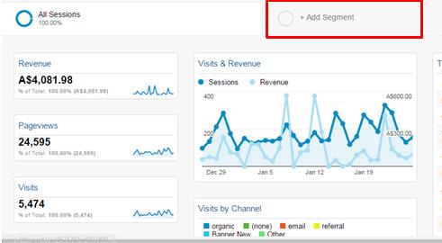
Adding a new segment.
Then choose the necessary segment.
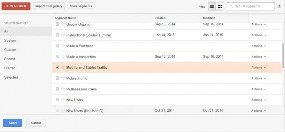
Choose the segment you’d like to add.
You can even run a time range comparison for week-on-week or month-on-month trends.
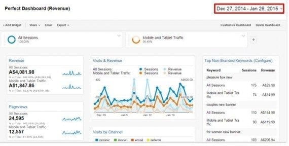
Adding a time range comparison.
Export
This option enables you to download a PDF version of the dashboard.

Download a PDF version.
You may need to email your custom dashboard(s) as a PDF file instead of sharing it within Google Analytics. This can arise if the recipient of the dashboard is less familiar with Google Analytics or if you prefer to send it to yourself as a reminder — daily, weekly, monthly, or quarterly.
In such a case, you should use the email dashboard option. Here are steps for configuring automated dashboard email reports.
- Destination. Enter the email(s) recipients.
- Subject. The subject of the email.
- Frequency. Can be a one-off (once), daily, weekly, monthly, or quarterly.
- Day of the week or month. For weekly and monthly emails you will be able to choose the day of the week/month that the dashboard will be sent to you.
- Advanced options. Allows you to have an “expiration date “— i.e., you can set this email just for a specified period of X months and then it will stop automatically.
- Content. Content to be added to the email with the file.
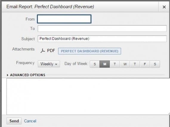
Using the email dashboard option.
Share
Sharing is a critical function you should use. If you create a useful dashboard, then share it with your colleagues; perhaps your manager should have access to it, too.
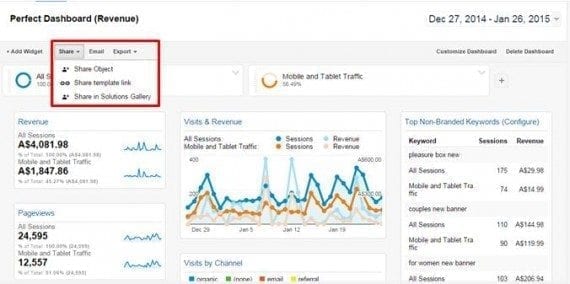
Sharing a dashboard.
Feel free to download this dashboard from the Google Analytics Solution Gallery.

