Back in the day, circa 2008, testing an ecommerce site meant having to write a lot of custom code to run the test and track the results. But now, with the range of testing tools available, site-wide tests no longer have to be a technical hurdle.
Now, running an A/B test can be as easy as copying and pasting a single script snippet into your website templates.
So, now that it’s relatively easy to test everything on your ecommerce site, how do you choose which tests get priority?
Your conversion optimization plan should address all of the key customer and prospect touch points in all of their journeys through your site.
Here are five of the top areas retailers need to test on their ecommerce websites.
1. Product Detail Pages
Getting visitors to click to a specific product page is a win – they’re expressing some interest. Making the most of each visit is crucial. But the typical product page template contains a lot of information: photos of the product, a description, details and specifications, and often options the customer can choose from, such as color and different models or sizes.
That can be a lot to digest. Understanding which is most important in your visitor’s decision-making process is key. And it will often be different for your website versus others.
At WiderFunnel, my testing and optimization firm, our work with AllPopArt, a producer of unique handcrafted pop art portraits and photos on canvas, optimized its product detail page. Following an analysis of its existing product detail page template to identify key problem areas, we developed three variations to test.
The winning template variation brought the product description and value propositions (including the fact that each work of art is hand-crafted by an American artist) above the page “fold.” The user-selectable product options (for things like size, material used, and framing) were moved below. That approach supported the buying decision by emphasizing the key value proposition and played down the options, which reduced the complexity of the purchase decision.

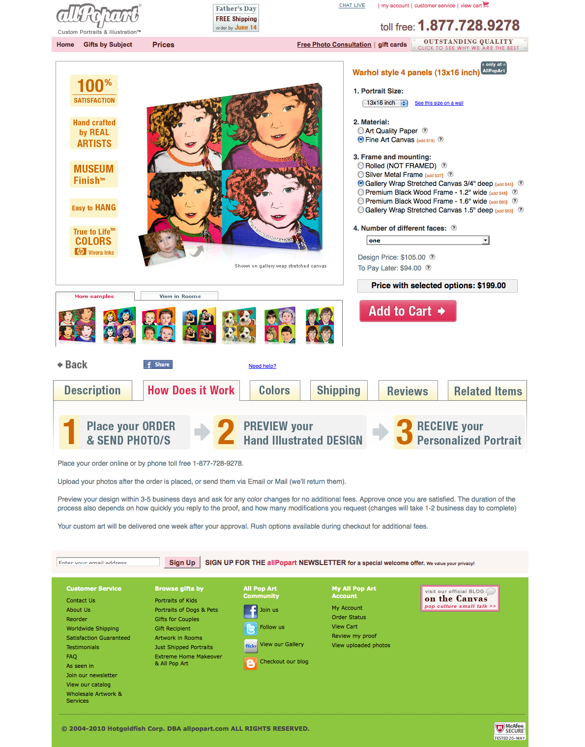
AllPopArt’s original product detail format featured many choices in the upper right, beside the dominant image.
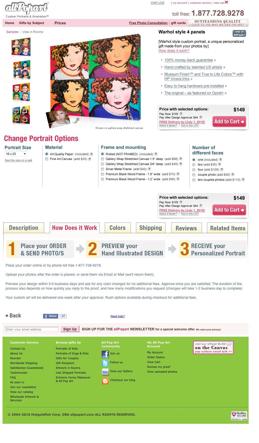
The result? The winning page (below) lifted purchase conversions by 28 percent and – even better – boosted revenue per visitor by 42 percent.

This revised version of AllPopArt’s product detail pages moved the product description and value propositions to the top right. User choices were moved below.
Keep in mind, this was tested across the entire website by A/B split testing the site-wide template. Whenever you test on template pages, make sure to test site-wide so the visitor experience is consistent.
2. Category Pages
Category pages are another prime testing opportunity. These pages show the breadth and range of your products, organized into similar groups, and need to effectively help your visitors quickly find the right product category for them.
Category pages tend to have a lot of information do convey. Finding the right balance and emphasis for your unique site is crucial. Your visitors will be scanning, looking for the information they need to choose products to explore in more detail.
We helped SpinLife, an online retailer of wheelchairs, electric scooters, and other home medical products, strike the right balance on its category pages through a series of conversion optimization tests.
In one test, a variation presented the categories in a grid pattern, which is a typical approach for many ecommerce sites. The second variation showed categories in a stacked list view. Which do you think won?
The split test results showed the list view brought SpinLife a 16.1 percent lift in the sales conversion rate. Some of the reasons for its success include making it easier for people to scan – and compare – the price range of each category. The new layout also allowed room for a column of “best sellers” on the right.
But remember, just because the list view brought SpinLife more sales, doesn’t mean it will work for your site. In another test WiderFunnel ran for eBay, for example, the winning variation was a tiled view. There are enough variables that there’s no one “best” approach. The only “best practice” is a “test practice.”
3. Home Page
Your home page can be a rich source of testing opportunities if you can dodge the inevitable political hurdles that it can create. If you’ve got top-management support and no sacred cows, go for it. Otherwise, you may want to start with a less sensitive page.
For hospitality management company Outrigger Hotels & Resorts’ home page, for example, its reservation booking widget was thought to be a key part of the puzzle. Given its effect on revenue, we tested many different placements of it.

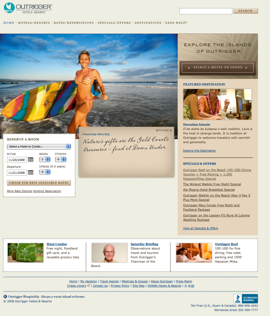
Outrigger Hotels and Resorts’ reservation booking widget — “Reserve a Room” — was thought to be key, as shown in the original version of the home page.
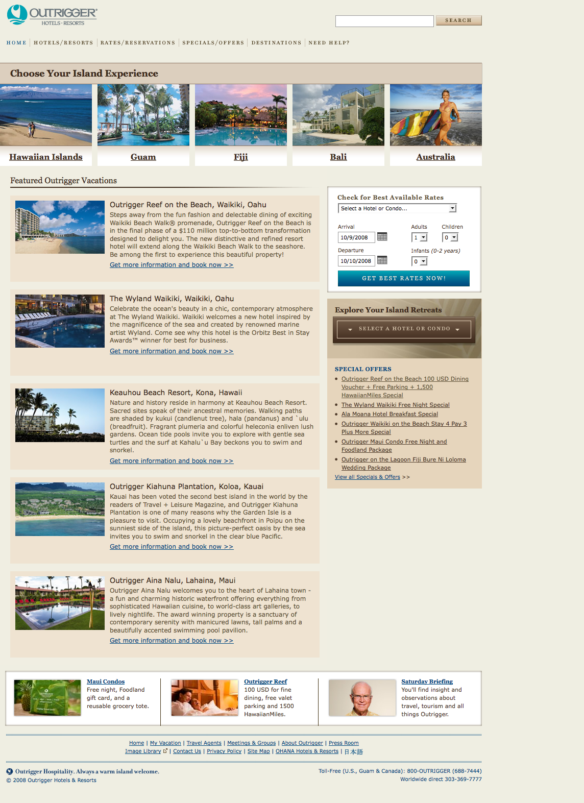
After testing multiple variations of the product imagery, layout, and booking form placement, the winning version (below) brought Outrigger a 47 percent increase in bookings from the home page.

For Outrigger Hotels and Resorts, showing the breadth of property locations was even more important than the booking widget placement. This revised home page resulted in 47 percent more bookings.
It turned out that, in this case, showing the breadth of property locations was even more important than the booking widget placement. Prospective travelers needed to get into the property details before booking. The widget didn’t need to be as prominent as some on the team thought.
4. Persistent Calls to Action
Many ecommerce sites feature a call-to-action that repeats throughout the entire site. It’s called a persistent call-to-action. Given the exposure these elements receive, it’s always worthwhile testing them to boost conversions.
For CanaDream RV Rentals & Sales, a recreational vehicle rental and sales company, the persistent call-to-action is the booking form. CanaDream understood the website had to work at differentiating its unique value proposition for its web visitors. But the booking form was not doing the job. Visitors could not easily understand their rental options and all the benefits they would receive from booking with the company.
The winning variation included a new design that addressed some of the challenges our team identified with the control version. Changes included increasing the prominence of the headline, aligning input fields to ease eye flow, and changing the headline text and call-to-action button to reflect a sense of urgency.
Thanks to testing, CanaDream now gets 106 percent more bookings with the same traffic across the entire website.
5. Forms
For ecommerce sites, forms – whether lead generation forms or the checkout path – are a key conversion point. Too often forms are left to developers to design, and not enough time is spent testing the flow of these crucial elements.
We’ve found that optimizing forms through careful testing can have a huge impact on conversion rates. One example comes to mind. During the beta launch of its online golf game, EA SPORTS™ was aggressively targeting new player signups.
WiderFunnel worked to rethink the registration process, analyzing on-page variables like site navigation controls, testimonials, calls-to-action, design, images, and layout, as well as the overall registration experience.
By applying the LIFT™ analysis — Landing page Influence Function for Tests— techniques to the registration flow, we isolated 13 areas that were reducing the player registration rate. The team designed four new registration flows to test.
One of the four new signup flows resulted in a 12.8 percent lift in new player registrations. Importantly, some design elements that were considered “best practices” were proven in testing to have more opportunity for improvement than the client expected.
One of the test isolations on this form showed clearly that, even in 2-field form, stacking form fields worked much better than orienting fields beside each other. Be careful, in other words, how you design your “log in” forms.
If this much improvement is possible with changes to a relatively simple form, think about what can be accomplished by throughout testing your shopping cart checkout process.


